In the Power BI Report Server January 2026 Feature Summary and Microsoft Power BI Blog post of November 2025 we got the opportunity to share some exciting updates on the PowerGantt Chart: Task Dependencies.
In the Microsoft Power BI Report Server Blog post of September 2025 we got the opportunity to share some exciting updates on the PowerGantt Chart: Custom Milestone Markers. Here you have our contribution to the Power BI Blog.
In the Microsoft Power BI Blog post of May 2025 we got the opportunity to share some exciting updates on the PowerGantt Chart. Here you have our contribution to the Power BI Blog.
In the Microsoft Power BI Blog post of April 2025 we got the opportunity to share some exciting updates on the Strip Plot Chart. Here you have our contribution to the Power BI Blog.
In the Microsoft Power BI Blog post of March 2025 we got the opportunity to share some exciting updates on the Attribute Control Chart. Here you have our contribution to the Power BI Blog.
We are excited to share a new Microsoft Customer Success Story showcasing how Power BI and our visuals help organizations achieve better insights and results.
In the Microsoft Power BI Blog post of November 2024 we got the opportunity to share some exciting updates on the Lollipop Bar Chart. Here you have our contribution to the Power BI Blog.
In the Microsoft Power BI Blog post of October 2024 we got the opportunity to share some exciting updates on the Cycle Plot Chart. Here you have our contribution to the Power BI Blog.
In the Microsoft Power BI Blog post of July 2024 we got the opportunity to share some exciting updates on our visual: the PowerGantt Chart. Here you have our contribution to the Power BI Blog.
In the Microsoft Power BI Blog post of June 2024 we got the opportunity to share our latest visual: the Attribute Control Chart. Here you have our contribution to the Power BI Blog.
In the Microsoft Power BI Blog post of May 2024 we got the opportunity to share some exciting updates on our visual: the Milestone Trend Analysis Chart. Here you have our contribution to the Power BI Blog.
In the Microsoft Power BI Blog post of March 2024 we got the opportunity to share some exciting updates on our visual: the Dumbbell Bar Chart. This now includes features to create a AE Timeline Plot. Here you have our contribution to the Power BI Blog.
In the Microsoft Power BI Blog post of February 2024 we got the opportunity to share some exciting updates on our visual: the Control Chart XmR. Here you have our contribution to the Power BI Blog.
In the Microsoft Power BI Blog post of June 2023 we got the opportunity to share some exciting updates on our visual: the PowerGantt Chart. Here you have our contribution to the Power BI Blog.
In the Microsoft Power BI Blog post of May 2023 we got the opportunity to share some exciting updates on our visual: the Strip Plot. Here you have our contribution to the Power BI Blog.
In the Microsoft Power BI Blog post of December 2022 we got the opportunity to share some exciting updates on our visual: the Milestone Trend Analysis Chart. Here you have our contribution to the Power BI Blog.
In the Microsoft Power BI Blog post of November 2022 we got the opportunity to share some exciting updates on our visual: the Control Chart XmR. Here you have our contribution to the Power BI Blog.
In the Microsoft Power BI Blog post of October 2022 we got the opportunity to share some exciting updates on our visual: the PowerGantt Chart. Here you have our contribution to the Power BI Blog.
In the Microsoft Power BI Blog post of September 2022 we got the opportunity to share some exciting updates on our visual: the Shielded HTML Viewer. Here you have our contribution to the Power BI Blog.
In the Microsoft Power BI Blog post of July 2022 we got the opportunity to share some exciting updates on our visual: the SMART KPI List. Here you have our contribution to the Power BI Blog.
In the Microsoft Power BI Blog post of June 2022 we got the opportunity to share our latest visual: the Milestone Trend Analysis Chart. Here you have our contribution to the Power BI Blog.
In the Microsoft Power BI Blog post of May 2022 we got the opportunity to share our latest visual: the Dumbbell Bar Chart. Here you have our contribution to the Power BI Blog.
EnterpriseDNA Reporting & Data Visualization Summit 2022 Later this month Enterprise DNA organises the Reporting & Data Visualization Summit 2022. Over 5 days, 25+ training sessions for everyone working with Power BI. And in this case it is really for… Read more: Reporting & Data Visualization Summit 2022
Our colleague Michel had the honour to talk about his passion: effective data visualization in Power BI. Really excited to share his story with the audience, but also with anyone else who tries to get most out of their Power BI visualizations.
In the Microsoft Power BI Blog post of April 2022 we got the opportunity to share our latest visual: the PowerGantt Chart. Here you have our contribution to the Power BI Blog.
In the Microsoft Power BI Blog post of March 2022 we got the opportunity to share some exciting updates in our Strip for Power BI. Here you have our contribution to the Power BI Blog. Most charts will force you to summarize… Read more: Strip Plot for Power BI
In the Microsoft Power BI Blog post of February 2022 we got the opportunity to share some exciting updates in our Merged Bar Chart for Power BI. Microsoft has included this visual in the exclusive Editors Pick list. Here you have our… Read more: Merged Bar Chart for Power BI
In the Microsoft Power BI Blog post of December 2021 we got the opportunity to share some exciting updates in our Shielded HTML Viewer. Here you have our contribution to the Power BI Blog.
Standard bar charts are ideal for showing a single measure per category. You can easily compare each of the categories with the rest. However, if you have larger number of categories (>10) in a bar chart it is possible the chart itself becomes “heavy”. The coloured bars will fill large part of the chart surface. To avoid this clutter one can use the Lollipop Bar Chart for Power BI as an alternative.
On the surface the Merged Bar Chart has a lot of similarities with small multiples. The key difference is the way these charts allow you to compare values. The Merged Bar Chart focusses on comparing multiple measures (like Player Value, Monthly Wage, clause, etc.) within one specific categorical variable (i.e. Soccer players).
One important goal of any well designed dashboard is to inform its readers by creating one overview of all KPI’s. This requires a compact and effective way to display them all together. The SMART KPI List is created specifically for this purpose.
In the February 2021 post we got the opportunity to introduce our Shielded HTML Viewer to the Power BI community: the first and only certified HTML viewer for Power BI
In January 2021 I had the opportunity to talk with Stacey Barr, THE specialist in evidence-based leadership and organisational performance measurement. We spoke about the XmR chart in general and about our Power BI Custom Visual named Control Chart XmR.
We use cookies to optimize our website and our service.
Functional
Always active
The technical storage or access is strictly necessary for the legitimate purpose of enabling the use of a specific service explicitly requested by the subscriber or user, or for the sole purpose of carrying out the transmission of a communication over an electronic communications network.
Preferences
The technical storage or access is necessary for the legitimate purpose of storing preferences that are not requested by the subscriber or user.
Statistics
The technical storage or access that is used exclusively for statistical purposes.The technical storage or access that is used exclusively for anonymous statistical purposes. Without a subpoena, voluntary compliance on the part of your Internet Service Provider, or additional records from a third party, information stored or retrieved for this purpose alone cannot usually be used to identify you.
Marketing
The technical storage or access is required to create user profiles to send advertising, or to track the user on a website or across several websites for similar marketing purposes.
 In the Power BI Report Server January 2026 Feature Summary and Microsoft Power BI Blog post of November 2025 we got the opportunity to share some exciting updates on the PowerGantt Chart: Task Dependencies.
 Make use of the new Organizational themes feature to automate the license activation of your Nova Silva visuals.
 In the Microsoft Power BI Blog post of April 2025 we got the opportunity to share some exciting updates on the Strip Plot Chart. Here you have our contribution to the Power BI Blog.
 In the Microsoft Power BI Blog post of March 2025 we got the opportunity to share some exciting updates on the Attribute Control Chart. Here you have our contribution to the Power BI Blog.
 We are excited to share a new Microsoft Customer Success Story showcasing how Power BI and our visuals help organizations achieve better insights and results.
 In the Microsoft Power BI Blog post of November 2024 we got the opportunity to share some exciting updates on the Lollipop Bar Chart. Here you have our contribution to the Power BI Blog.
 In the Microsoft Power BI Blog post of October 2024 we got the opportunity to share some exciting updates on the Cycle Plot Chart. Here you have our contribution to the Power BI Blog.
 In the Microsoft Power BI Blog post of May 2024 we got the opportunity to share some exciting updates on our visual: the Milestone Trend Analysis Chart. Here you have our contribution to the Power BI Blog.
 In the Microsoft Power BI Blog post of March 2024 we got the opportunity to share some exciting updates on our visual: the Dumbbell Bar Chart. This now includes features to create a AE Timeline Plot. Here you have our contribution to the Power BI Blog.
 In the Microsoft Power BI Blog post of February 2024 we got the opportunity to share some exciting updates on our visual: the Control Chart XmR. Here you have our contribution to the Power BI Blog.
 In the Microsoft Power BI Blog post of November 2022 we got the opportunity to share some exciting updates on our visual: the Control Chart XmR. Here you have our contribution to the Power BI Blog.
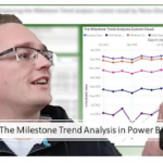 Microsoft MVP Erik van Hurck reviews another of our visuals, this time the Milestone Trend Analysis by Nova Silva. Have a look at the video here!
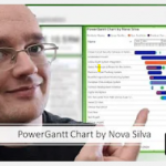 Microsoft MVP Erik van Hurck reviews the Power Gantt Chart visual by Nova Silva. Check out the video here!
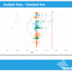 Announcing support for Analytic lines
 In the Microsoft Power BI Blog post of September 2022 we got the opportunity to share some exciting updates on our visual: the Shielded HTML Viewer. Here you have our contribution to the Power BI Blog.
 In the Microsoft Power BI Blog post of July 2022 we got the opportunity to share some exciting updates on our visual: the SMART KPI List. Here you have our contribution to the Power BI Blog.
 EnterpriseDNA Reporting & Data Visualization Summit 2022 Later this month Enterprise DNA organises the Reporting & Data Visualization Summit 2022. Over 5 days, 25+ training sessions for everyone working with Power BI. And in this case it is really for… Read more: Reporting & Data Visualization Summit 2022
 Our colleague Michel had the honour to talk about his passion: effective data visualization in Power BI. Really excited to share his story with the audience, but also with anyone else who tries to get most out of their Power BI visualizations.
 In the Microsoft Power BI Blog post of February 2022 we got the opportunity to share some exciting updates in our Merged Bar Chart for Power BI. Microsoft has included this visual in the exclusive Editors Pick list. Here you have our… Read more: Merged Bar Chart for Power BI
 This month is your chance to win a FREE license of the Lipstick Bar Chart. The Power BI Editor’s Pick this month. Download and review it NOW.
 On the surface the Merged Bar Chart has a lot of similarities with small multiples. The key difference is the way these charts allow you to compare values. The Merged Bar Chart focusses on comparing multiple measures (like Player Value, Monthly Wage, clause, etc.) within one specific categorical variable (i.e. Soccer players).
 In January 2021 I had the opportunity to talk with Stacey Barr, THE specialist in evidence-based leadership and organisational performance measurement. We spoke about the XmR chart in general and about our Power BI Custom Visual named Control Chart XmR.
 Sorting data is straightforward at first glance, but comes with some interesting caveats.
 When one set of bars simply isn’t enough