When one set of bars simply isn’t enough
December 2020 has been an exciting month for us in Power BI as we have released the Merged Bar Chart. At the same time the long awaited “Small multiples feature” has become available as a preview feature in Power BI. This feature is currently available for bar/column, line and area charts. In this article we zoom in on the small multiples variant of the bar chart and the Merged Bar Chart, to find out how to use them and when to use which.
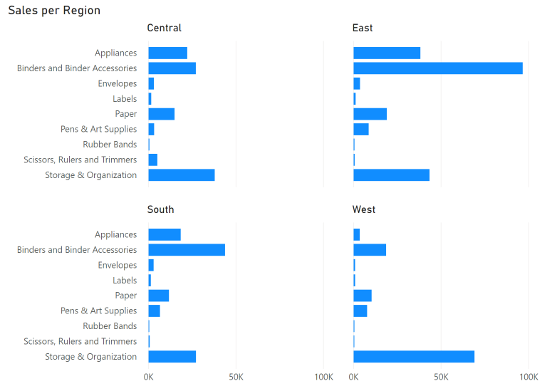
In short, the Small multiples feature allows you to split up your Bar, Column and Line charts into multiple smaller charts, separated per category. There are numerous use cases for this, such as showing your product sales per region (see below). The feature has been highly anticipated as it gives you a lot of flexibility in your report creation.
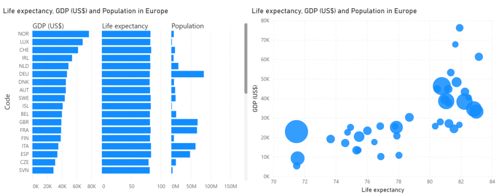
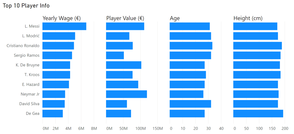
Recently, Nova Silva has released the Merged Bar Chart custom visual to the AppSource. On the surface the Merged Bar Chart has a lot of similarities with the small multiples, as it also allows you to show multiple bar charts combined. The key difference is that the Merged Bar Chart allows you to compare multiple independent variables. For example, you can use it to compare the GDP, Life expectancy and population of a range of countries as seen below. Often, we see scatter plots used for this purpose, but this has two downsides: the reader often finds it a complex visual to understand, and it is hard to compare more than 2-3 measures with it. The Merged Bar Chart solves this by grouping multiple bar charts together which helps you to uncover patterns in your data in an intuitive way.
Now, is the Merged Bar Chart still relevant after the arrival of the Small multiples feature? In short: absolutely. Both visuals serve a completely different purpose, so it all comes down to the story you want to tell with your data. There is a place for both of them in the Power BI ecosystem as no individual visual type will solve all of your problems. In the following section we will show some the key differences between the different visuals and explain when to use which.
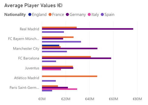
Let’s compare the Merged bar chart with a Stacked bar chart with Small multiples enabled. The bar chart is a great way to compare multiple categories on a single measurement. You could decide to subdivide every bar into a category via the legend bucket, but this makes it hard to compare the values within a category since they are not aligned. Also, the result is often a colorful mess when you have multiple categories to show.
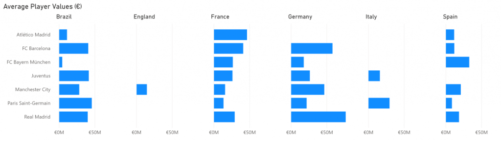
Below is a more elegant solution using small multiples. We have created an overview of the average player values in the football video game FIFA19 for a few clubs, split out for six selected countries. You are now able to see patterns per nationality much more clearly for these clubs, but you lose the overview of all nationalities combined.
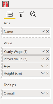
Say instead you want to show the height, weight and income of the world’s eight best players in a single visual. A clustered/stacked bar chart wouldn’t be the right way to go as it doesn’t make sense to combine these measures. This is where the Merged bar chart really shines. With it, you just select the columns you want to include in the comparison and that’s it. You don’t have to worry about the units or scales being different, as each column gets its own axis (although you can choose to plot them all on the same scale).
So: if you want to compare a single variable over multiple categories, think small multiples. Looking for comparison of independent measurements? Go Merged bar chart.
We are excited about these new ways improve your data storytelling and are very happy that our custom visual complements the charts with small multiples. What do you think? Are your reports already filled with tiny graphs created by the small multiples, or are you waiting out on this? Let us know!