
Every month Microsoft publishes a summary of all the new features in Power BI within their Power BI Blog. In the April 2021 post we got the opportunity to introduce our visual Merged Bar Chart to the Power BI community. Here you have our contribution to the Power BI Blog.
On the surface the Power BI Visual Merged Bar Chart has a lot of similarities with small multiples. The key difference is the way these charts allow you to compare values. The Merged Bar Chart focusses on comparing multiple measures (like Player Value, Monthly Wage, clause, etc. in the example below) within one specific categorical variable (i.e. Soccer players).
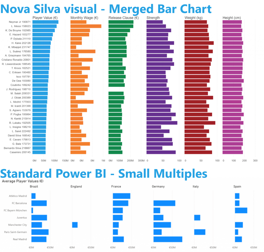
The small multiples focus on segmenting the bars by one or more categorical variables (here: Country of Birth).
If you want to compare a single variable over multiple categories, think small multiples. Looking for comparison of multiple independent measures? Go Merged Bar Chart.
Don’t hesitate and try the Merged Bar Chart now on your own data by downloading it from the AppSource. All features are available for free to evaluate this visual within Power BI Desktop.