In the Microsoft Power BI Blog post of February 2022 we got the opportunity to share some exciting updates in our Merged Bar Chart for Power BI. Microsoft has included this visual in the exclusive Editors Pick list. Here you have our contribution to the Power BI Blog.
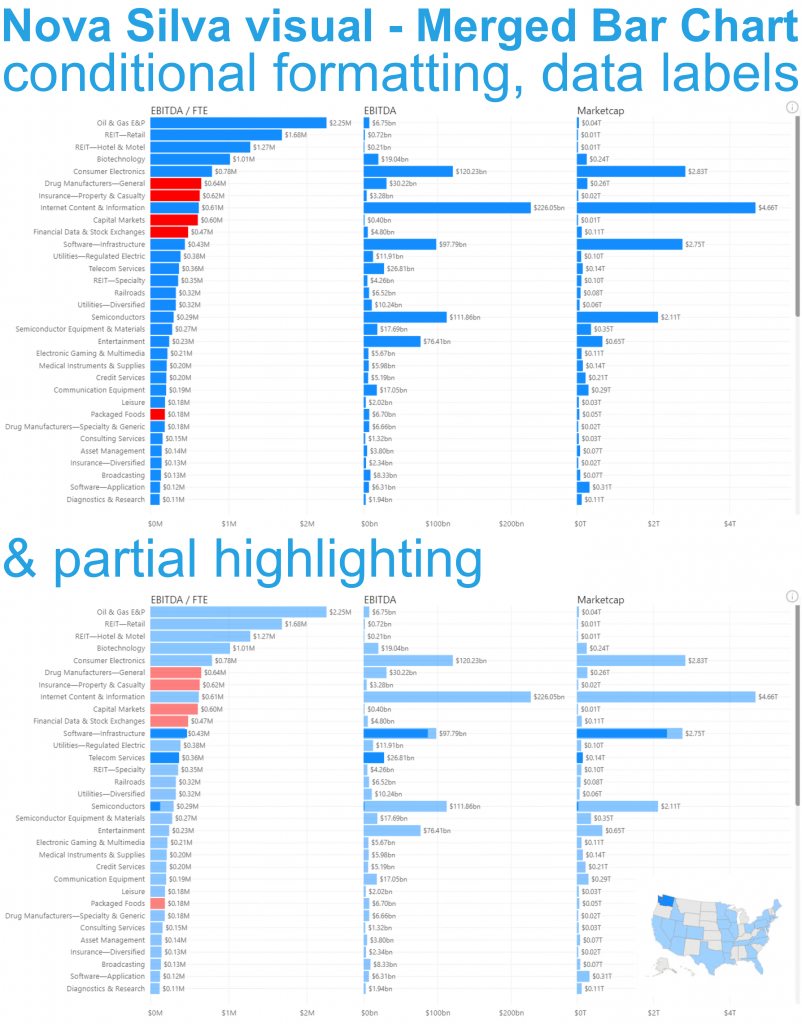
On the surface the Merged Bar Chart has a lot of similarities with small multiples. The key difference is the way these charts allow you to compare values. The Merged Bar Chart focusses on comparing multiple measures (like EBITDA & Marketcap in the example below) within one specific categorical variable (here Industries of S&P 500 stocks).
Based on your excellent feedback we have added several exciting features to this visual:
- Conditional formatting: bars within a measure can change color (the example above shows the EBITDA/FTE in red when it concerns a negative revenue growth)
- Data Labels: besides the bar you can show the data label. You can even change the location of the labels.
- Partial highlighting: when your selection results in a partial match (in the example above this is the selection of Washington State) the partial highlight will display this with the highlighted color.
Do you want to compare multiple independent measures? Go Merged Bar Chart.
Try the Merged Bar Chart now by downloading it from the AppSource. All features are available for free to evaluate this visual within Power BI Desktop.