
In the Microsoft Power BI Blog post of March 2022 we got the opportunity to share some exciting updates in our Strip for Power BI. Here you have our contribution to the Power BI Blog.
Most charts will force you to summarize or categorize data before it is displayed. This can hide important details and may be misleading. The Strip Plot shows all your data observations in one go without hiding important details. It shows each data point on a single continuous scale.
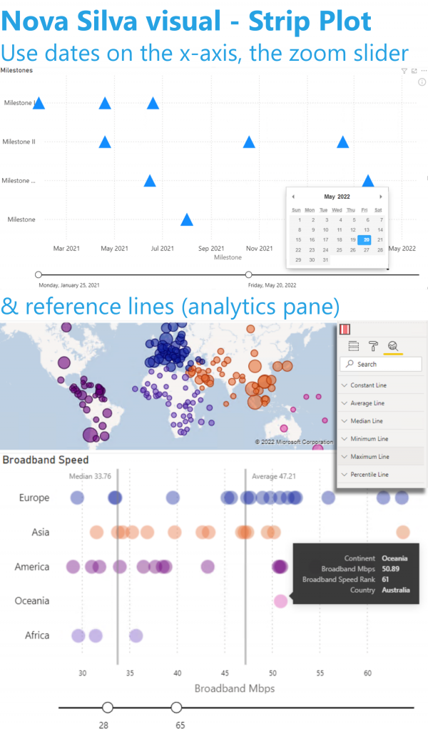
You gave us excellent feedback which allows us to further improve this visual. Based on your feedback we just released version 2 with several exciting enhancements.
You could already add numeric values, but now you can also use dates on the x-axis. The x-axis has also been enhanced with the optional Zoom-Slider.
Each visual in Power BI has three different panes: Fields, Format & Analytics. The Analytics pane allows you to add reference lines to your visual (like: fixed value, median, average, max, etc.) In version 2 you can use this functionality with the Strip Plot.
All functionality of the Strip Plot is available through the standard Power BI interface: NO need to learn any new interface.
Don’t hesitate and try the Strip Plot now on your own data by downloading it from the AppSource.