
Every month Microsoft publishes a summary of all the new features in Power BI within their Power BI Blog. In the december 2020 post we got the opportunity to introduce our Strip Plot to the Power BI community. Here you have our contribution to the Power BI Blog.
Most charts will force you to summarize or categorize data before it is displayed. This can hide important details and may be misleading. The Strip Plot shows all your data observations in one go without hiding important details. It shows each data point on a single continuous scale.
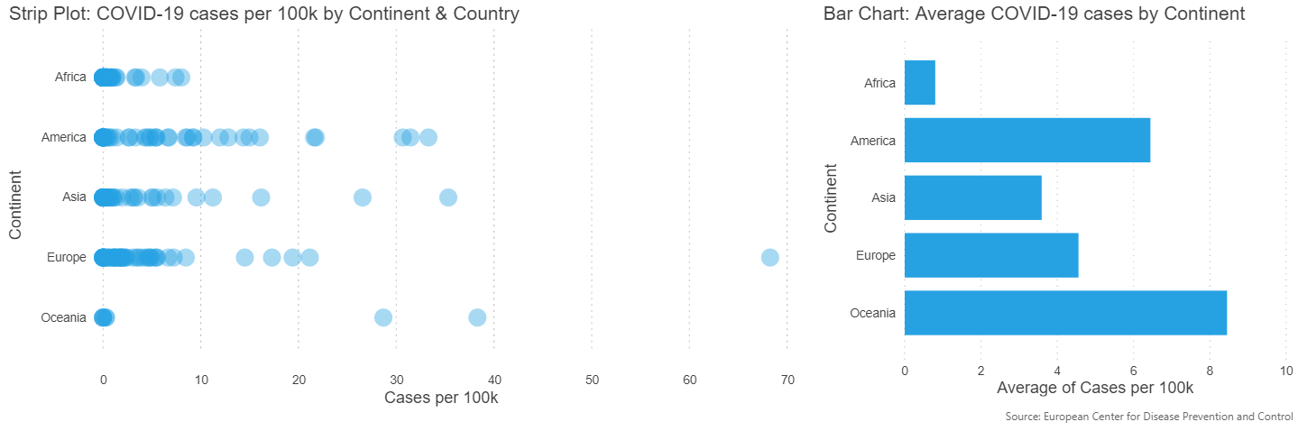
The example above illustrates this by showing the number of reported COVID-19 cases per continent (on September 1st, 2020). The bar chart shows the average per continent, where the Strip Plot shows the cases per individual country. In the Strip Plot it becomes obvious the relative high number in Oceania are caused by just two countries (outliers), where the bar chart only shows a very high average. It’s these kinds of details that become visible in the Strip Plot.
Furthermore, the Strip Plot supports all standard Power BI functionality like drilling, selection & highlighting, context menu and full tooltip support. All this functionality is available through the standard Power BI interface, so no need to learn any new interface.
Don’t hesitate and try the Strip Plot now on your own data by downloading it from the AppSource.