Exploring the Power Gantt Chart for Power BI
Microsoft MVP Erik van Hurck reviews the Power Gantt Chart visual by Nova Silva.
Check out the video here
Microsoft MVP Erik van Hurck reviews the Power Gantt Chart visual by Nova Silva.
Check out the video here
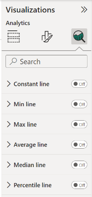
We have added support for analytics features to some of our visuals. You can now add dynamic reference lines to mark important trends or insights. The analytic lines are under the Analytics pane in the Visualizations area of Power BI Desktop or Service (Edit mode).
Dumbbell Bar Chart
Dumbbell Column Chart
Lipstick Bar Chart
Lipstick Column Chart
Lollipop Bar Chart
Lollipop Column Chart
Strip Plot
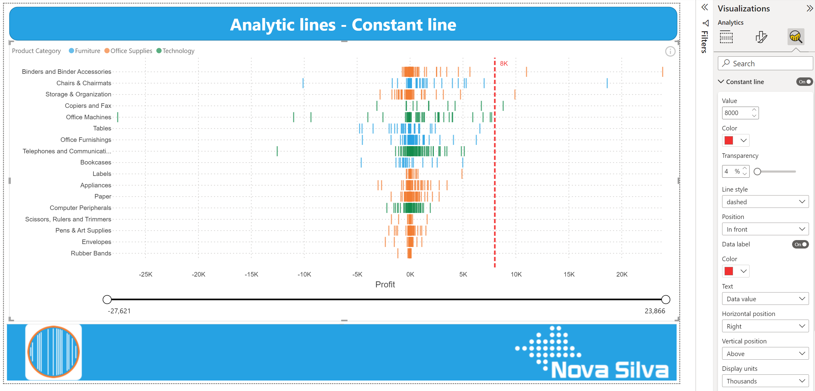
You can highlight interesting trends and insights by creating dynamic reference lines with the Analytics pane. To add further analyses to your visual, select the visual and click the Analytics icon (magnifying glass).
Available Analytic lines:
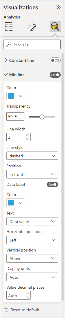
Formatting options for analytic lines are in line with the options you are familiar with from Power BI. Theme colors and settings are also supported.
Format your line by specifying the Color, Transparency percentage, Line width, style and position. For most lines you can specify the visual Measure to base your line upon, by selecting Primary or Secondary value from the drop-down menu.
If you want to have a data label, switch Data label On. You get additional formatting options for your data label, such as: Color, Text, Horizontal and Vertical position, Display units and Value decimal places.
For step-by-step instructions (with video’s and screenshots), visit our Knowledge Base and check the Tutorial: how to add Power BI Analytic lines available under each visual that supports Analytics lines. Or click the links below:
Do you want to try the Analytic lines in our visuals? Download any of the visuals available that support Analytics features from the Microsoft AppSource.
For any questions or remarks, please contact us by email at Nova Silva Support or visit our Community forum.

All HTML rendered through the Shielded HTML Viewer is sanitized to keep your data safe.
The first HTML Viewer Certified by Microsoft now is part of the first Visuals you can buy and manage directly through Microsoft.
Microsoft announced this new functionality in July 2022. Currently in preview and requires Power BI Desktop July 2022 or later.
Obviously, this makes the purchase and management of licenses easier. Here are some of the main advantages:
Besides the Shielded HTML Viewer, all our visuals will support this new license option soon.
Try the Shielded HTML Viewer now on your own data by downloading it from the AppSource. All features are available for free to evaluate the Shielded HTML Viewer within Power BI Desktop.

Your incredible feedback allowed us to implement several exciting enhancements to the SMART KPI List.
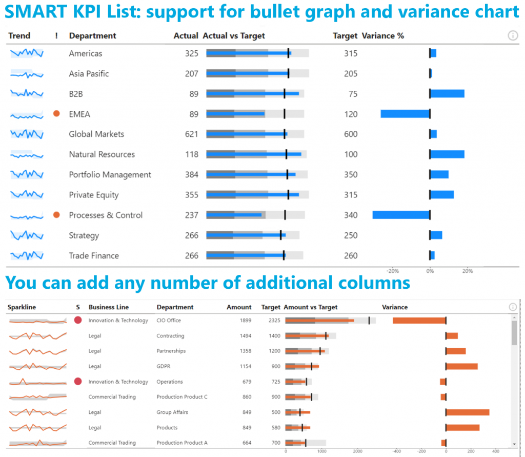
Now you can extend the existing bar chart into a bullet graph by adding the qualitative ranges behind the bar.
Previously you had to choose between a bar chart and variance chart. Now you can show either or both at the same time.
You can also add additional columns to the visual to include more context. And all columns can be set to the exact right width by dragging the edges.
Don’t hesitate and try the SMART KPI List now on your own data by downloading it from the AppSource. All features are available for free to evaluate this visual within Power BI Desktop.
Milestones in project management are points in time when important deliverables are due. Like begin/end dates of project phases, formal approvals, etc. Nothing new to most of us.
How can we use milestones to monitor the progress of our project(s)? The Milestone Trend Analysis Chart for Power BI.
Milestone Trend Analysis (MTA) is a simple method of early identifying deadline trends. It allows you to react in time with corrective actions. And it will raise the deadline awareness of all project participants and stakeholders.
Key signals in the Milestone Trend Analysis Chart are:
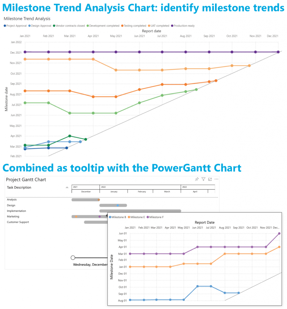
All features of the Milestone Trend Analysis Chart are available in the familiar standard Power BI user interface. No need to learn a new interface. And of course, themes, interactive selection and tooltips are supported.
Don’t hesitate and try the Milestone Trend Analysis Chart now on your own data by downloading it from the AppSource. All features are available for free to evaluate this visual within Power BI Desktop.

Data visualisations play a fundamental role in answering an important data question:”How does result A compare to result B?”. Typical examples of these questions are:
Key in answering these kind of questions is clearly visualising the difference between the two results. This is the strength of the Dumbbell Bar Chart: showing both values and the difference between them.
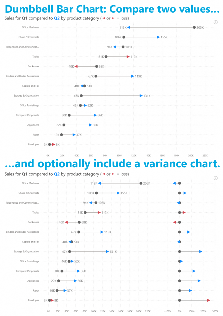
In the latest version you’ll find the features you asked for: data labels and conditional formatting. All available in the familiar standard Power BI interface. No need to learn any new interface to configure these features.
Don’t hesitate and try the Dumbbell Bar Chart now on your own data by downloading it from the AppSource. All features are available for free to evaluate this visual within Power BI Desktop.
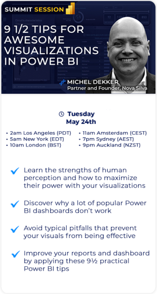
Later this month Enterprise DNA organises the Reporting & Data Visualization Summit 2022. Over 5 days, 25+ training sessions for everyone working with Power BI. And in this case it is really for EVERYONE, because you can join this event for FREE.
Register HERE for FREE now!
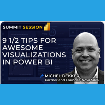
We are honoured to sponsor this event and conduct one of the training sessions. Join us on Tuesday, May 24th for our session “9½ Tips for awesome visualizations in Power BI“.
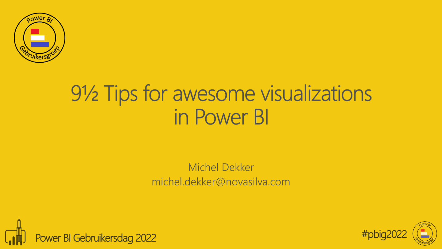
After two long years of attending all events virtually this month we finally could meet each other again. When we heard about the possibility to be part of the Dutch Power BI User Group event there was no doubt. We joined as a sponsor and enjoyed every minute of meeting all these Power BI users. Our colleague Michel had the honour to talk about his passion: effective data visualization in Power BI. Really excited to share his story with the audience, but also with anyone else who tries to get most out of their Power BI visualizations.
In case you could not join the event, here you can watch the video of our presentation. ½

The Gantt chart is an excellent tool to visualize your program and project schedules and task dependencies. The horizontal bars show for each task/activity the period between the start and end date (or time). Icons can be used to represent milestones: important moments within your project timeline.
The PowerGantt Chart allows you to review both tasks/activities and milestones right in your Power BI reports. The PowerGantt Chart supports unlimited number of task/activities, hierarchy levels and number of milestones.
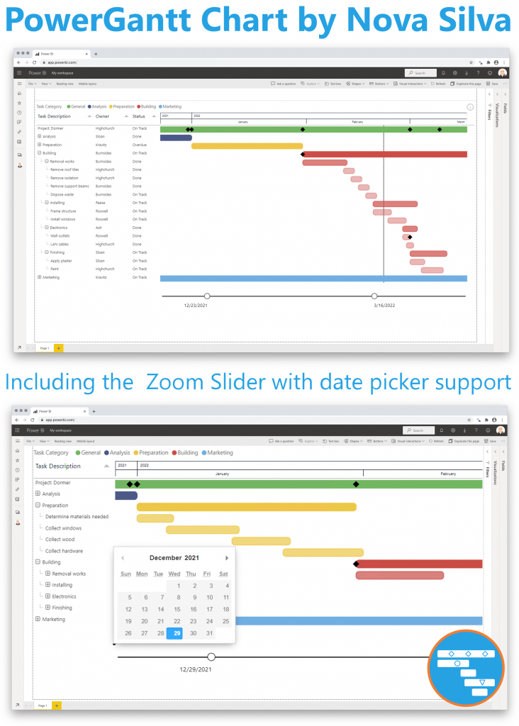
Key features of the PowerGantt Chart are:
Don’t hesitate and try the PowerGannt Chart now on your own project/program data by downloading it from the AppSource.

In the Microsoft Power BI Blog post of March 2022 we got the opportunity to share some exciting updates in our Strip for Power BI. Here you have our contribution to the Power BI Blog.
Most charts will force you to summarize or categorize data before it is displayed. This can hide important details and may be misleading. The Strip Plot shows all your data observations in one go without hiding important details. It shows each data point on a single continuous scale.
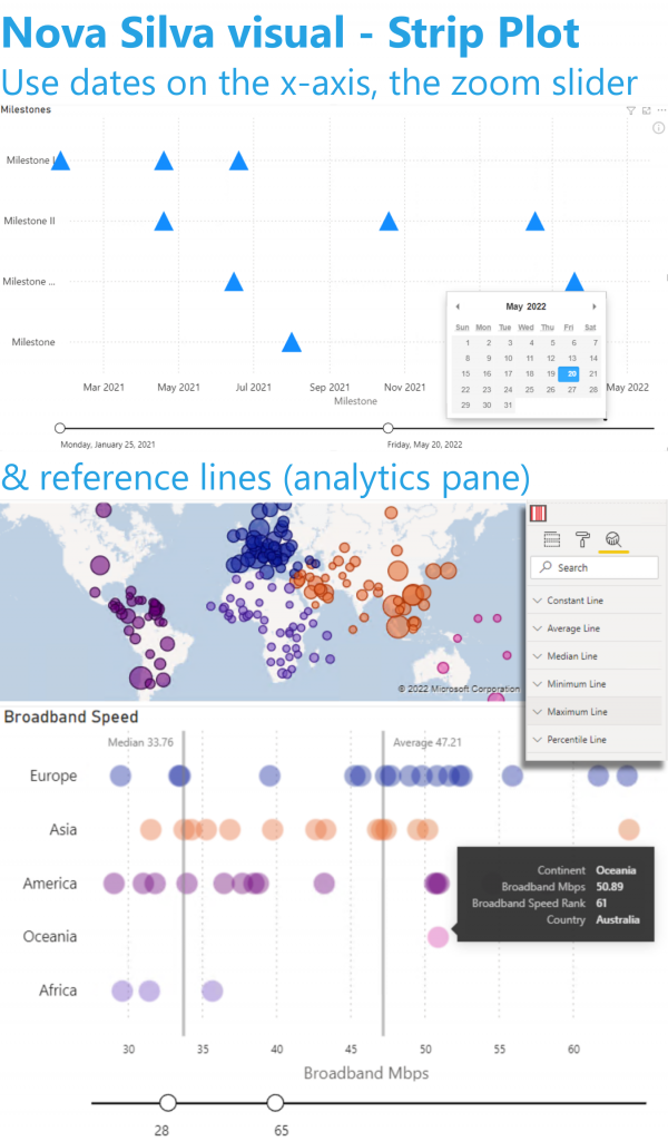
You gave us excellent feedback which allows us to further improve this visual. Based on your feedback we just released version 2 with several exciting enhancements.
You could already add numeric values, but now you can also use dates on the x-axis. The x-axis has also been enhanced with the optional Zoom-Slider.
Each visual in Power BI has three different panes: Fields, Format & Analytics. The Analytics pane allows you to add reference lines to your visual (like: fixed value, median, average, max, etc.) In version 2 you can use this functionality with the Strip Plot.
All functionality of the Strip Plot is available through the standard Power BI interface: NO need to learn any new interface.
Don’t hesitate and try the Strip Plot now on your own data by downloading it from the AppSource.