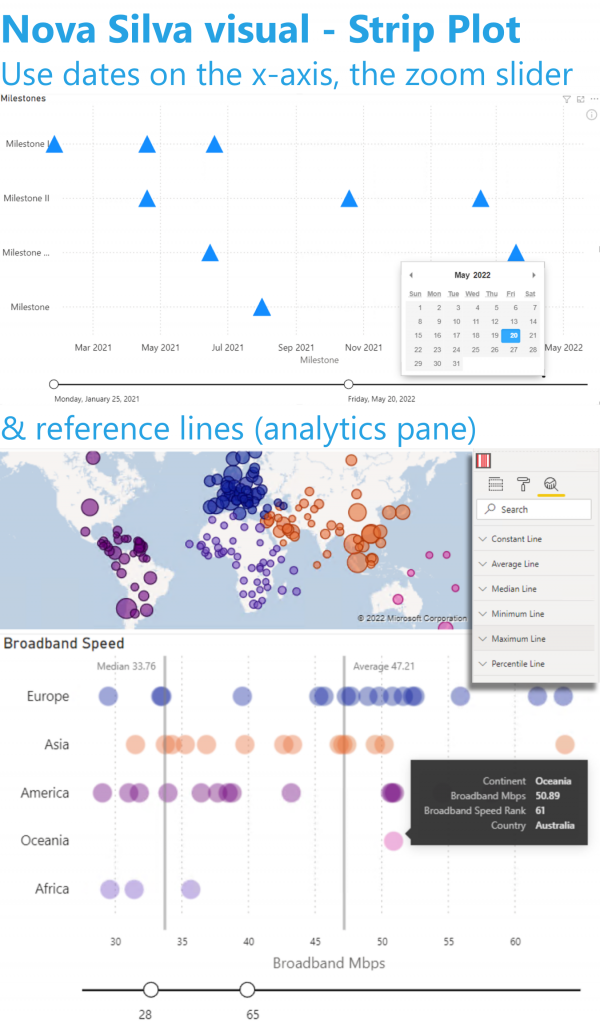
Most charts will force you to summarize or categorize data before it is displayed. This can hide important details and may be misleading. The Strip Plot shows all your data observations in one go without hiding important details. It shows each data point on a single continuous scale.
Your excellent feedback allows us to continuously improve our visuals. Based on your feedback we just released version 2.3 with several exciting enhancements.
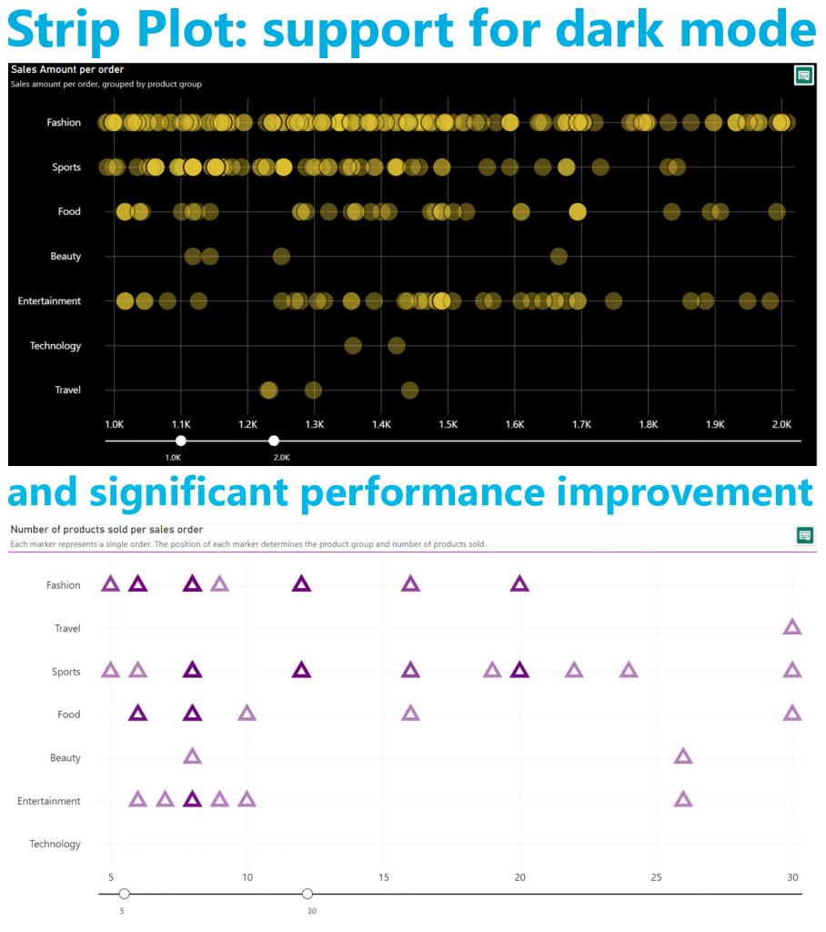
The color formatting of all visible objects can be managed now. This allows you to use the Strip Plot in dark mode, or any other preferred color scheme.
We also applied several changes to significantly improve the loading performance of the Strip Plot. You can now show up to 30,000 markers in a single visual.
And all our visuals continue to support the standard Power BI interface. We incorporate the same user experience as Microsoft in the default visuals. You can use the Strip Plot (and all our other visuals) with the latest features: On-object interaction, Subtitle, Divider, etc.
Don’t hesitate and try the Strip Plot now on your own data by downloading it from the AppSource.