Standard bar charts are ideal for showing a single measure per category. You can easily compare each of the categories with the rest. However, if you have larger number of categories (>10) in a bar chart it is possible the chart itself becomes “heavy”. The coloured bars will fill large part of the chart surface. To avoid this clutter one can use the Lollipop Bar Chart for Power BI as an alternative.
The Lollipop Bar Chart shows a marker (mostly a dot) per category. A subtle line connects the marker to the measure-axis origin. The marker combined with the line make it a Lollipop Bar Chart.
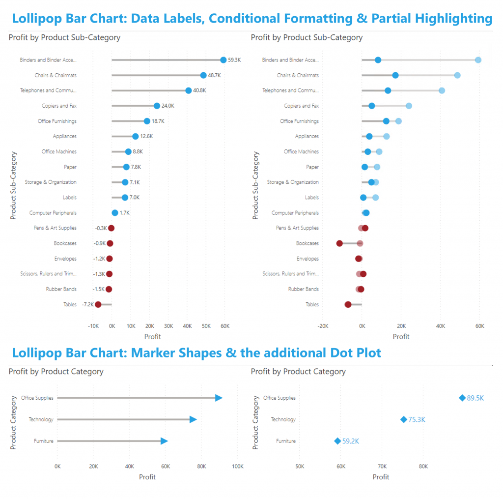
The Lollipop Bar Chart also contains an additional chart: the dot plot. Just hide the line connecting the marker to the axis.
The latest version of this chart contains several exciting enhancements:
- Conditional Formatting (both the marker and the line)
- Partial Highlighting
- Data Labels
- Marker shapes
Don’t hesitate and try the Lollipop Bar Chart now on your own data by downloading it from the AppSource. All features are available for free to evaluate this visual within Power BI Desktop.