
Every month Microsoft publishes a summary of all the new features in Power BI within their Power BI Blog. In the June 2021 post we got the opportunity to introduce our Dumbbell Bar Chart for Power BI to the Power BI community. Here you have our contribution to the Power BI Blog.
Data visualisations play a fundamental role in answering an important data question:”How does result A compare to result B?”. Typical examples of these questions are:
- How does the sales of this month compare to the sales of last month?
- What is the difference between the number of documents processed this year compared to 2020?
- How does the number of planned-visitors compare to the number of unplanned-visitors at our locations?
Key in answering these kind of questions is clearly visualising the difference between the two results. This is the strength of the Dumbbell Bar Chart: showing both values and the difference between them.
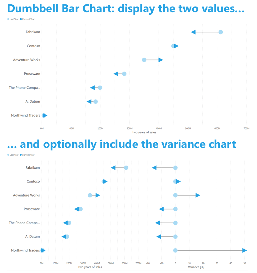
The top chart shows the two values (Last Year and Current Year. This allows the user to identify the growing (ie. Adventure Works) versus the shrinking (ie Fabrikam) brands. Optionally the user can include the variance chart (second chart) to increase the emphasis on the difference between the two values.
Don’t hesitate and try the Dumbbell Bar Chart now on your own data by downloading it from the AppSource. All features are available for free to evaluate this visual within Power BI Desktop.