Every month Microsoft publishes a summary of all the new features in Power BI within their Power BI Blog. In the April 2021 post we got the opportunity to introduce our visual Merged Bar Chart to the Power BI community. Here you have our contribution to the Power BI Blog.
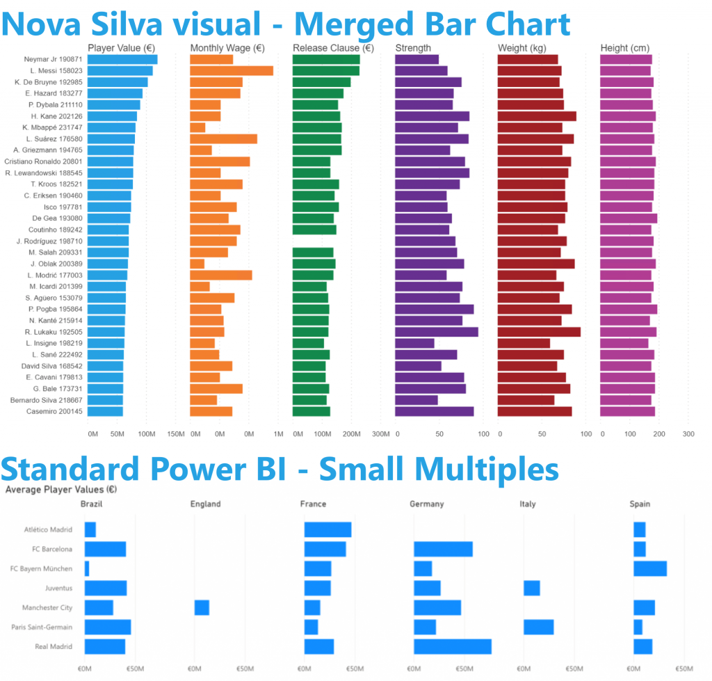
On the surface the Power BI Visual Merged Bar Chart has a lot of similarities with small multiples. The key difference is the way these charts allow you to compare values. The Merged Bar Chart focusses on comparing multiple measures (like Player Value, Monthly Wage, clause, etc. in the example below) within one specific categorical variable (i.e. Soccer players).
The small multiples focus on segmenting the bars by one or more categorical variables (here: Country of Birth).
If you want to compare a single variable over multiple categories, think small multiples. Looking for comparison of multiple independent measures? Go Merged Bar Chart.
Don’t hesitate and try the Merged Bar Chart now on your own data by downloading it from the AppSource. All features are available for free to evaluate this visual within Power BI Desktop.
Ah, the smell of coffee and nicely sorted charts in the morning is something everyone can enjoy. Sorting your data in Power BI is easy at first sight but it doesn’t always give you the results you first expect, especially with ordinal data. In this post, we zoom into sorting and some of its caveats.
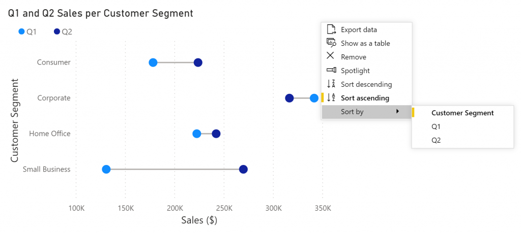
Power BI offers some readily available functionality to sort your charts ad hoc. Simply select the More Options icon in your chart, go to Sort by and select the field on which you want to sort. Easy!
Fig. 1: Sort your graphs via the Sort by option. Here you will also find options to sort ascending or descending.
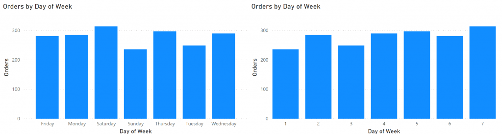
This works fine for sorting values numerically or alphabetically, such as for nominal values. Things get a little bit trickier when you are working with ordinal values such as the day of the week. By just sorting your chart on the day of the week, you will end up with Friday, Monday, Saturday, Sunday, Thursday, Tuesday, Wednesday.
Nominal data: data in which the variables have no natural order. Examples are binary data (true / false) or names (Dustin, Will, Lucas, Johnathan).
Ordinal data: data in which the variables have natural, ordered categories. Examples include Months (Jan, Feb, Mar, etc.) or questionnaire scores (poor, reasonable, good, or excellent).
Fig. 2: The left column chart has the Weekday names in the Axis bucket, while the right one has Weekday number on the Axis.
As an alternative you can replace the names of the weekdays with the weekday numbers. Creating such a column can be done in your workbook using the following DAX function:
Day of Week Number = WEEKDAY(Date[Date],2)
Mondays are now the first day of the week, the standard in most European countries. Change the last argument of the WEEKDAY function to have Sunday or Saturday as the start of the week. Updating your chart with this newly created column allows you to show the days in the correct order. However, we’ve now lost our labels.
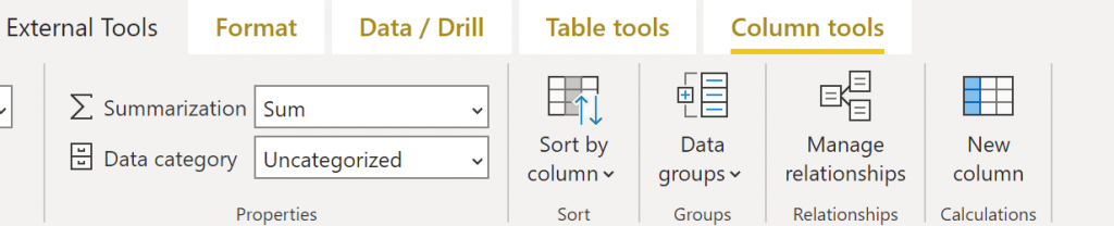
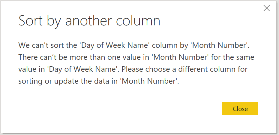
We can fix this problem by sorting our column, based on another column. We therefore must indicate on which column to sort our data. In the Report view in Power BI Desktop, select the column you want sorted. Next, go to Column tools and find the “Sort by column” options. Select the column containing the correct order, and that’s it. (Note: this option is also available in the Data and Model view, it works exactly the same way)
Fig. 3: After selecting your column in the Fields pane, you will see the Column tools tab appear in the Ribbon.
This sort order is used in all visuals whether it’s a bar chart, table or slicer. You may run into visuals that overrule sorting of the data, so keep that in mind when working with some custom visuals.
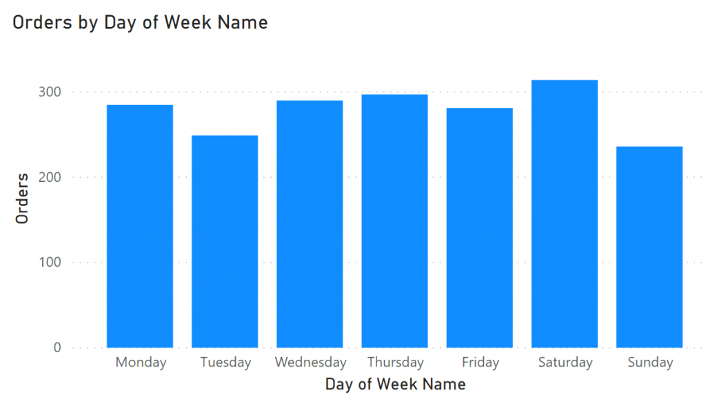
Fig. 4: The chart has been sorted in the way we want it: it shows the names of the day in chronological order
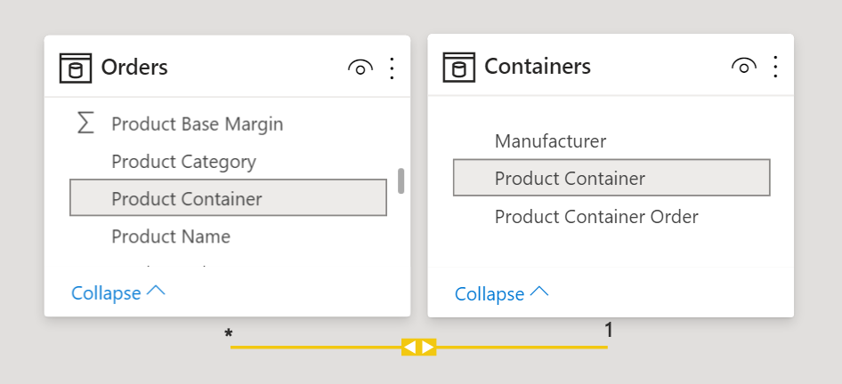
You can do this trick on any column in your data, even if you’ve created that column yourself using DAX. Do make sure that every value in the column you want sorted, has only 1 corresponding value on which to sort. Power BI will not be able to sort your weekdays if Monday sometimes has number 1 and other times number 2. In other words, both columns must have the same cardinality.
Fig. 5: Make sure that the column on which you base you sorting has the same cardinality as the column to be sorted, or Power BI will not be able to figure the correct order out!
In order to use Sort by Column, both columns must be in the same table. If you have two tables with a relationship between them, it will not be possible to sort a column based on a column in the other table. You would have to merge the two tables to resolve this. Remember to only keep relevant columns after merging as your table size can grow substantially, degrading performance.
Fig. 6: Unfortunately, we can’t perform the sorting based on column from other tables.
Unwanted side effects can occur when using DAX expressions on columns that are being sorted by another column. What makes matters worse is that there is not easy way to see which columns are being sorted on others. Take the following example: we want to calculate the percentage of the total sales for each month. We can do this by creating the following measure:
Monthly % of Year=
DIVIDE (SUM(Sales[Sales]),
        CALCULATE(SUM(Sales[Sales]),
        ALL(Sales[Month Name])))
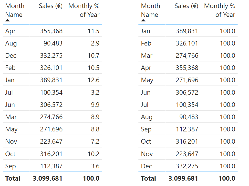
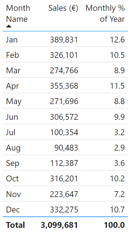
In the two tables below, we see what happens to our result as soon as we sort the Month Name column on the Month Number:
Fig. 7: Left: The Month Name column is sorted on itself. We see that our DAX statement correctly calculates the fraction of yearly sales that happened that month. Right: After sorting the Month Name by the Month Number, our DAX statement divides the monthly sales by itself. Surely this is not what we wanted!
All of our fractions are 100% after using Sort by Column! This happens because the SUMMARIZECOLUMNS function groups the data using both the Month Name and Month Number column. We must therefore make sure to clear both involved columns using the ALL function in our measurement.
Monthly % of Year=
DIVIDE (SUM(Sales[Sales]),
        CALCULATE(SUM(Sales[Sales]),
        ALL(Sales[Month Name],Sales[Month Number])))
The table below show the results that we expected. The monthly sales are now correctly divided by the total sales of the year.
Fig. 8: By making sure that both column filters are cleared in our DAX statement, we now have the expected results
In short: sorting categories in a chart numerically or alphabetically can quickly be done using the More Options menu in your visual. Sorting a column based on another one is done using the Sort by Column option but both columns must have the same cardinality. Finally, keep in mind that your measures may show unexpected behaviour when you’ve sorted on another column.
December 2020 has been an exciting month for us in Power BI as we have released the Merged Bar Chart. At the same time the long awaited “Small multiples feature” has become available as a preview feature in Power BI. This feature is currently available for bar/column, line and area charts. In this article we zoom in on the small multiples variant of the bar chart and the Merged Bar Chart, to find out how to use them and when to use which.
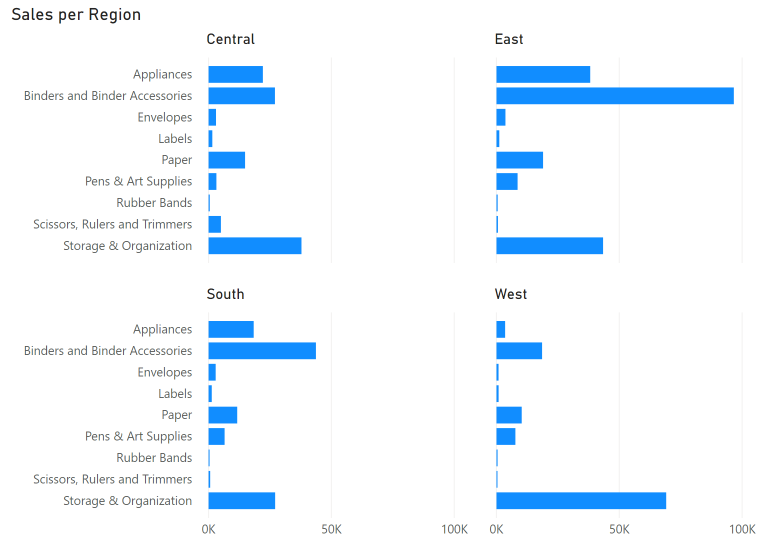
In short, the Small multiples feature allows you to split up your Bar, Column and Line charts into multiple smaller charts, separated per category. There are numerous use cases for this, such as showing your product sales per region (see below). The feature has been highly anticipated as it gives you a lot of flexibility in your report creation.
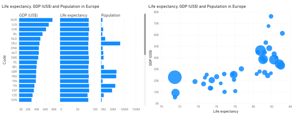
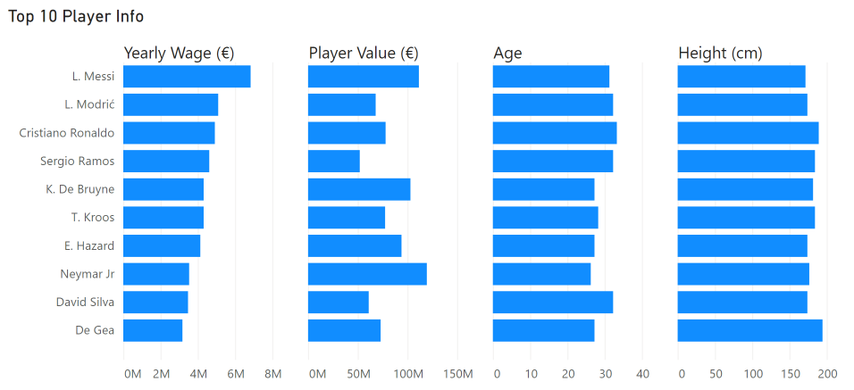
Recently, Nova Silva has released the Merged Bar Chart custom visual to the AppSource. On the surface the Merged Bar Chart has a lot of similarities with the small multiples, as it also allows you to show multiple bar charts combined. The key difference is that the Merged Bar Chart allows you to compare multiple independent variables. For example, you can use it to compare the GDP, Life expectancy and population of a range of countries as seen below. Often, we see scatter plots used for this purpose, but this has two downsides: the reader often finds it a complex visual to understand, and it is hard to compare more than 2-3 measures with it. The Merged Bar Chart solves this by grouping multiple bar charts together which helps you to uncover patterns in your data in an intuitive way.
Now, is the Merged Bar Chart still relevant after the arrival of the Small multiples feature? In short: absolutely. Both visuals serve a completely different purpose, so it all comes down to the story you want to tell with your data. There is a place for both of them in the Power BI ecosystem as no individual visual type will solve all of your problems. In the following section we will show some the key differences between the different visuals and explain when to use which.
Let’s compare the Merged bar chart with a Stacked bar chart with Small multiples enabled. The bar chart is a great way to compare multiple categories on a single measurement. You could decide to subdivide every bar into a category via the legend bucket, but this makes it hard to compare the values within a category since they are not aligned. Also, the result is often a colorful mess when you have multiple categories to show.
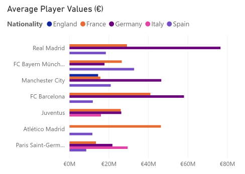
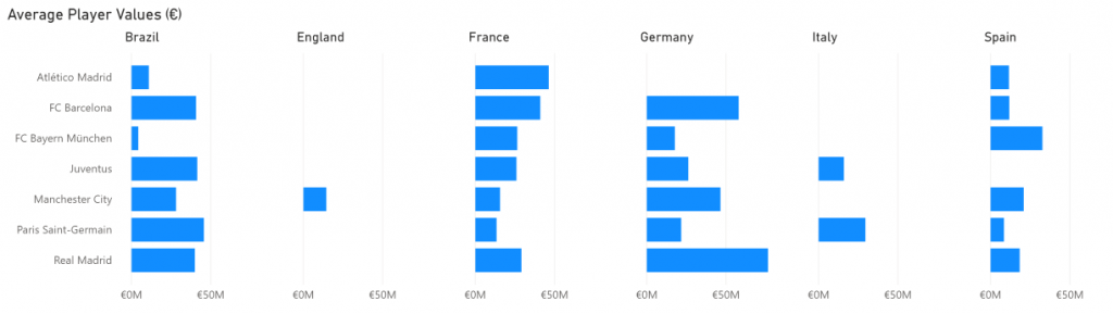
Below is a more elegant solution using small multiples. We have created an overview of the average player values in the football video game FIFA19 for a few clubs, split out for six selected countries. You are now able to see patterns per nationality much more clearly for these clubs, but you lose the overview of all nationalities combined.
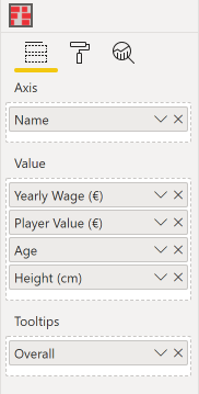
Say instead you want to show the height, weight and income of the world’s eight best players in a single visual. A clustered/stacked bar chart wouldn’t be the right way to go as it doesn’t make sense to combine these measures. This is where the Merged bar chart really shines. With it, you just select the columns you want to include in the comparison and that’s it. You don’t have to worry about the units or scales being different, as each column gets its own axis (although you can choose to plot them all on the same scale).
So: if you want to compare a single variable over multiple categories, think small multiples. Looking for comparison of independent measurements? Go Merged bar chart.
We are excited about these new ways improve your data storytelling and are very happy that our custom visual complements the charts with small multiples. What do you think? Are your reports already filled with tiny graphs created by the small multiples, or are you waiting out on this? Let us know!
Manage Cookie Consent
We use cookies to optimize our website and our service.
Functional
Always active
The technical storage or access is strictly necessary for the legitimate purpose of enabling the use of a specific service explicitly requested by the subscriber or user, or for the sole purpose of carrying out the transmission of a communication over an electronic communications network.
Preferences
The technical storage or access is necessary for the legitimate purpose of storing preferences that are not requested by the subscriber or user.
Statistics
The technical storage or access that is used exclusively for statistical purposes.The technical storage or access that is used exclusively for anonymous statistical purposes. Without a subpoena, voluntary compliance on the part of your Internet Service Provider, or additional records from a third party, information stored or retrieved for this purpose alone cannot usually be used to identify you.
Marketing
The technical storage or access is required to create user profiles to send advertising, or to track the user on a website or across several websites for similar marketing purposes.