Posted on

Use Organizational Themes (Preview) to manage your License in Nova Silva visuals

Use Organizational Themes to manage your License in Nova Silva visuals

Administrators can now use the Power BI Admin Portal to add and manage themes that are available to all users within the organization!

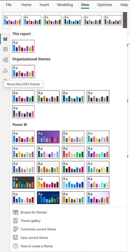
With the latest enhancements in Power BI Organizational themes (preview), administrators and creators can easily manage and apply themes. Use Organizational themes to automate the license activation of your Nova Silva visuals by simply adding the license details directly into a organizational theme file. This means there’s no longer a need for each report creator to manually insert license details across multiple reports.

Considerations

Organizational Themes is a Preview feature and is available only to admins.
Making an organizational theme available does not update existing reports automatically.
Theme gallery is available in both Power BI Desktop and the Service.

How do you set up an Organizational Theme?

Pre-requisites: Create a custom theme by going to View > Themes > Customize current theme, and Save current theme in Power BI Desktop. Locate and open the custom JSON file and add the Nova Silva license details in the visualStyles section and Save the file.

Add the following example to your Organizational theme file and replace the text between quotes with your own license information. License Name and License Key are provided to you directly via email. Be sure to copy them exactly as received.

"visualStyles": {
       "*": {
          "*": {
             "license": [{
                 "licenseName": "YOUR LICENSE NAME",
                 "licenseKey": "YOUR LICENSE KEY"
            }]
        }
    } 
}
  1. As an Administrator, go to the Power BI Admin Portal and click on Organizational themes (preview).
  2. Click the + Add theme button, in the Theme Settings pane upload the customized .JSON file (including your License in the visualStyles section).
  3. After adding the file, click Enable for theme gallery. This will make the organizational theme(s) available to Creators.
  4. As a Creator, go to View > Theme menu in Power BI Desktop, select the dropdown arrow and then select the theme you want under Organizational themes.
  5. Save and publish the report to the Power BI Service or
  6. In Power BI Service, go to Edit > View > Theme and select the Organizational theme.

The Nova Silva license information will then be applied consistently across all reports using that Organizational theme.

Posted on

PowerGantt Chart for Power BI – May 2025 Update

PowerGantt Chart for Power BI – May 2025 Update

We’re excited to announce a powerful new feature in our latest PowerGantt release: Custom milestone markers!

With this update, you can now add any icon to your PowerGantt visual to represent milestones—bringing even more clarity and customization to your project timelines. Whether you’re highlighting key deliverables, risks, or approval points, custom icons make it easier to tell your story briefly.

But that’s not all—these icons support conditional formatting, enabling dynamic styling based on status, category, or any field in your data. For example, you can automatically display a red warning icon for delayed tasks or a green checkmark for completed milestones.

Custom icons give you the flexibility to match your visual to your organization’s language and branding, making project tracking more intuitive and visually engaging than ever before.

Update your PowerGantt Chart today and make your project milestones stand out with style!

Try the PowerGantt Chart for FREE now on your own project data by downloading it from the AppSource.

Questions or remarks? Visit us at: https://visuals.novasilva.com/.

Posted on

Strip Plot for Power BI – April 2025 Update

Strip Plot for Power BI – April 2025 Update

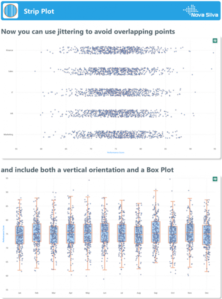
The Strip Plot is an essential tool for uncovering patterns in categorical and numerical data, allowing users to visualize the distribution of individual data points effectively. With our latest update, we’ve supercharged the Strip Plot with powerful new features that enhance clarity and flexibility.

What’s new?

  • Jittering â€“ Say goodbye to overlapping points! Jittering slightly shifts data points to improve visibility, ensuring that every value in your dataset is accounted for.
  • Box plot â€“ Combine summary statistics with raw data by overlaying a box plot on your strip plot. Now, you can easily spot medians, quartiles, and outliers while maintaining full visibility of individual data points.
  • Vertical layout â€“ Previously limited to horizontal orientation, the Strip Plot now supports a vertical layout, making it even more versatile for different analytical needs.

These enhancements empower users to gain deeper insights from their data, making trend identification and anomaly detection easier than ever. Try the updated Strip Plot in Power BI today and take your visual analytics to the next level! Download it now from the AppSource.

Questions or remarks? Visit us at: https://visuals.novasilva.com/.

Posted on

Attribute Control Chart for Power BI – March 2025 Update

Attribute Control Chart for Power BI – March 2025 Update

Earlier this year, Nova Silva introduced the Attribute Control Chart for Power BI, designed to empower users with advanced quality control insights. Initially, it supported the foundational attribute chart types, including the c chart, u chart, Laney u chart, p chart, Laney p chart, and np chart.

A diagram of a company Description automatically generated

Now, we’re excited to announce expanded capabilities with support for Rare Event Control Charts — specifically, the T chart and G chart. These charts are essential for monitoring events that occur infrequently, allowing for more nuanced control in scenarios where traditional control charts may not be sensitive enough. The T chart helps monitor the time between rare events, while the G chart tracks the count of opportunities between events. These new additions make the Attribute Control Chart even more versatile, enabling organizations to gain insights into low-frequency incidents, which are often critical yet challenging to monitor.

By expanding Power BI’s Attribute Control Chart functionality, we continue to support diverse business needs, helping teams identify issues promptly and maintain high-quality standards across all processes.

Ready to experience the Attribute Control Chart? Download it from AppSource today and explore its capabilities with your own data – try for free!

Posted on

Lollipop Bar Chart for Power BI – November 2024 Update

Lollipop Bar Chart for Power BI – November 2024 Update

We’re thrilled to continue receiving your valuable feedback, and we appreciate your contributions in helping us improve our visuals.

In our latest Lollipop Bar Chart release for Power BI, we’ve added a much-requested feature: secondary markers. This allows you to display not only the primary value but also add context by including a secondary value marker.

A screenshot of a graph Description automatically generated

This new feature integrates seamlessly with all other Lollipop Bar Chart functionalities, such as transforming the Lollipop Bar Chart into a dot plot by removing the connecting bars, as shown in the second image. This also removes the requirement to start your numeric scale at 0, allowing you to have a closer look at the values and their differences.

While standard bar charts are great for comparing a single measure across categories, they can become cluttered with larger datasets (>10 categories). The colored bars may fill too much of the chart space. To address this, the Lollipop Bar Chart offers a cleaner, more efficient alternative, minimizing clutter without sacrificing clarity.

Try the Lollipop Bar Chart for FREE now on your own data by downloading it from the AppSource.

Questions or remarks? Visit us at: https://visuals.novasilva.com/.

Posted on

Cycle Plot for Power BI – October 2024 Update

Cycle Plot for Power BI – October 2024 Update

A cycle plot is a powerful tool for visualizing and understanding seasonal patterns in time series data. Unlike traditional line graphs, which may obscure cyclical trends, cycle plots separate data into cycles (e.g., months, days, or quarters) and plot them individually for each period within a cycle.

This method highlights within-cycle variations and trends across cycles. For example, a cycle plot of monthly sales over several years would display each month’s trend over time, making it easier to identify whether certain months consistently perform better or worse. It also reveals how overall trends (like yearly growth) affect individual periods.

Cycle plots are particularly useful for businesses and analysts who need to identify seasonality in sales, website traffic, or other metrics. By visualizing data this way, decision-makers can better plan for seasonal peaks and troughs, optimize inventory, and tailor marketing efforts.

In summary, cycle plots offer a clearer and more detailed perspective on time series data, making them an essential tool for uncovering and leveraging seasonal patterns.

Try the Cycle Plot for FREE now on your own data by downloading it from the AppSource.

Questions or remarks? Visit us at: https://visuals.novasilva.com/.

Posted on

PowerGantt Chart for Power BI – Update

We are excited to receive ongoing feedback from you and want to express our gratitude for your valuable contributions. Your insights help us make significant enhancements to our visuals.

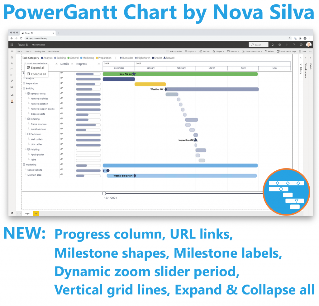
In the latest releases of the PowerGantt Chart, we have added many new features based on your feedback. These include the ability to show incomplete tasks and display progress as a separate column. We’ve also included links in the additional columns and enhanced their formatting options. You can now change the milestone shapes and wrap text in columns for better readability.

Additionally, we’ve added the option to preset the zoom slider, expand and collapse all hierarchy elements, and add milestone labels. To further improve your experience, we’ve enabled the display and formatting of vertical grid lines. These updates are designed to provide you with more flexibility and control over your project visuals.

We appreciate your continued support and look forward to receiving more of your valuable feedback. Together, we can keep enhancing PowerGantt Chart to meet your needs.

Try the PowerGantt Chart for FREE now on your own project data by downloading it from the AppSource.

Posted on

Attribute Control Chart for Power BI

Maintaining quality standards is a non-negotiable aspect of every successful operation. Enter the new Attribute Control Chart for Power BI, a robust mechanism for monitoring and controlling categorical data variations.

The Attribute Control Chart offers a comprehensive suite of six attribute charts to cater to diverse analytical needs:

  • c chart: Monitors number of defects per sample (sample size is constant).
  • u chart: Tracks the number of defects per unit (sample size varies).
  • Laney u’ chart: A modified version of the u chart to adjust for overdispersion or underdispersion in your data.
  • p chart: Observes the proportion of defective items per sample (sample size varies).
  • Laney p’ chart: A modified version of the p chart to adjust for overdispersion or underdispersion in your data.
  • np chart: Displays the count of defective items per sample (sample size is constant).

Power BI users can delve deeper into their data, facilitating timely decision-making and continuous improvement. From manufacturing to healthcare, the Attribute Control Chart equips organizations across industries with the insights needed to uphold quality standards and drive operational excellence.

Ready to experience the Attribute Control Chart? Download it from AppSource today and explore its capabilities with your own data – try for free!

Posted on

Milestone Trend Analysis Chart for Power BI – Update

Exciting news! Thanks to your valuable feedback, we’ve enhanced our Milestone Trend Analysis Chart even further. We’re thrilled to announce that you can now switch between horizontal and vertical orientations, catering to your preferred visualization style.

The Milestone Trend Analysis (MTA) Chart remains your go-to tool for swiftly identifying deadline trends, empowering you to take timely corrective actions. With this update, we aim to enhance deadline awareness among project participants and stakeholders alike.

In our latest version, seamlessly navigate between horizontal and vertical views within the familiar Power BI interface. No need to adapt to a new user interface – enjoy the same ease of use with added flexibility. Plus, benefit from supported features like themes, interactive selection, and tooltips.

What’s more, ours is the only Microsoft Certified Milestone Trend Analysis Chart for Power BI, ensuring reliability and compatibility with the platform.

Ready to experience the enhanced Milestone Trend Analysis Chart? Download it from AppSource today and explore its capabilities with your own data – try for free!

Posted on

Dumbbell Bar Chart for Power BI – AE Timeline Plot

Your valuable feedback continues to shape our Power BI visuals, and we’re thrilled to announce exciting enhancements to the Dumbbell Bar Chart. In the latest release, we’ve introduced the capability to display multiple dumbbell bars on a single row, allowing for the presentation of more than two values in a streamlined manner. This update opens up new possibilities, including the creation of the Adverse Event Timeline plot, or AE Timeline.

The AE Timeline serves as a graphical representation of the timing of adverse events in clinical trials or studies. Its primary objective is to visually convey when adverse events occurred concerning the timing of treatment or exposure. Widely used in medical research, especially during safety data analysis in drug development, the AE Timeline is now seamlessly available within Power BI.

Experience the enhanced Dumbbell Bar Chart and the innovative AE Timeline by downloading it from AppSource. All features are readily accessible within Power BI Desktop, empowering you to evaluate this visual on your own data. Dive into the enhanced functionality and discover new insights effortlessly.