Cycle Plot for Power BI – October 2024 Update
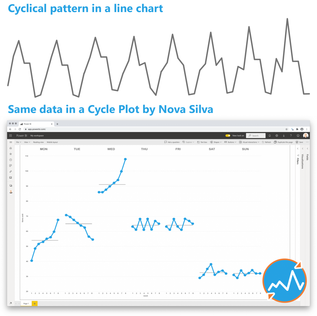
A cycle plot is a powerful tool for visualizing and understanding seasonal patterns in time series data. Unlike traditional line graphs, which may obscure cyclical trends, cycle plots separate data into cycles (e.g., months, days, or quarters) and plot them individually for each period within a cycle.

This method highlights within-cycle variations and trends across cycles. For example, a cycle plot of monthly sales over several years would display each month’s trend over time, making it easier to identify whether certain months consistently perform better or worse. It also reveals how overall trends (like yearly growth) affect individual periods.
Cycle plots are particularly useful for businesses and analysts who need to identify seasonality in sales, website traffic, or other metrics. By visualizing data this way, decision-makers can better plan for seasonal peaks and troughs, optimize inventory, and tailor marketing efforts.
In summary, cycle plots offer a clearer and more detailed perspective on time series data, making them an essential tool for uncovering and leveraging seasonal patterns.
Try the Cycle Plot for FREE now on your own data by downloading it from the AppSource.
Questions or remarks? Visit us at: https://visuals.novasilva.com/.

