Every month Microsoft publishes a summary of all the new features in Power BI within their Power BI Blog. In the July 2021 post we got the opportunity to introduce our Control Chart XmR for Power BI to the Power BI community. Here you have our contribution to the Power BI Blog.
Years ago, Stacey Barr introduced us to the magic of Control Charts. Magic it is, because it allows everyone to split their temporal data in two: random noise and real signals. And we all are looking for real signals, and don’t want to be distracted by random noise.
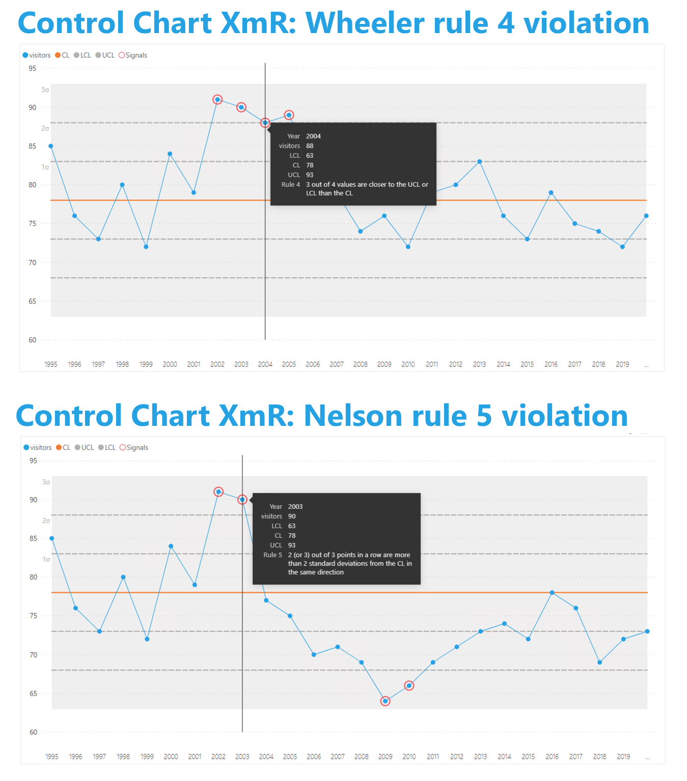
Stacey applies Control Charts based on the so-called Wheeler rules (as specified by Dr. Donald J. Wheeler). This is why our first release of the Control Chart XmR supports this set of rules. Obviously, the Wheeler rules are not the only set of rules. A couple of months ago we were contacted by a large manufacturing organization. They use Control Charts to continuously improve their processes, and this helped them in obtaining the highest CMMI maturity level.
They required support for the Nelson rules. Now the Control Chart XmR supports both the Wheeler and Nelson rule sets: the user selects the most appropriate rule set.
Don’t hesitate and try the Control Chart XmR now on your own data by downloading it from the AppSource. All features are available for free to evaluate this visual within Power BI Desktop.


