Maintaining quality standards is a non-negotiable aspect of every successful operation. Enter the new Attribute Control Chart for Power BI, a robust mechanism for monitoring and controlling categorical data variations.
The Attribute Control Chart offers a comprehensive suite of six attribute charts to cater to diverse analytical needs:
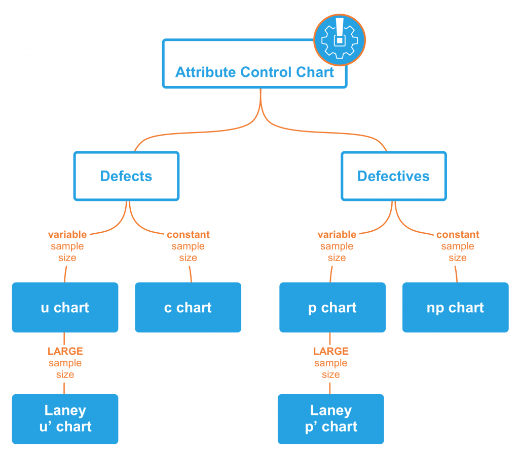
- c chart: Monitors number of defects per sample (sample size is constant).
- u chart: Tracks the number of defects per unit (sample size varies).
- Laney u’ chart: A modified version of the u chart to adjust for overdispersion or underdispersion in your data.
- p chart: Observes the proportion of defective items per sample (sample size varies).
- Laney p’ chart: A modified version of the p chart to adjust for overdispersion or underdispersion in your data.
- np chart: Displays the count of defective items per sample (sample size is constant).
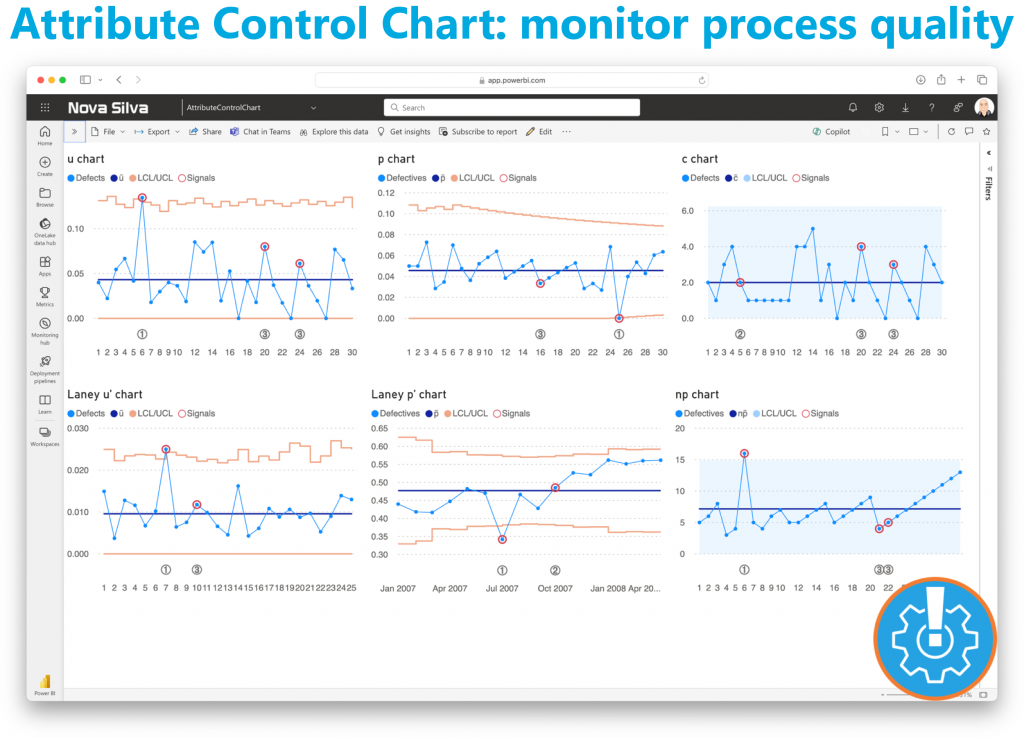
Power BI users can delve deeper into their data, facilitating timely decision-making and continuous improvement. From manufacturing to healthcare, the Attribute Control Chart equips organizations across industries with the insights needed to uphold quality standards and drive operational excellence.
Ready to experience the Attribute Control Chart? Download it from AppSource today and explore its capabilities with your own data – try for free!