
Custom sort orders in Power BI
Ah, the smell of coffee and nicely sorted charts in the morning is something everyone can enjoy. Sorting your data in Power BI is easy at first sight but it doesn’t always give you the results you first expect, especially with ordinal data. In this post, we zoom into sorting and some of its caveats.
Power BI offers some readily available functionality to sort your charts ad hoc. Simply select the More Options icon in your chart, go to Sort by and select the field on which you want to sort. Easy!
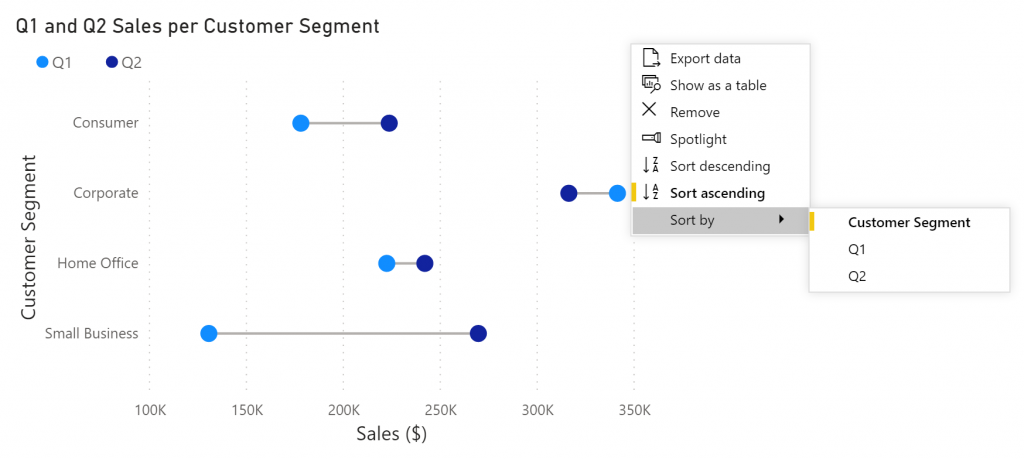
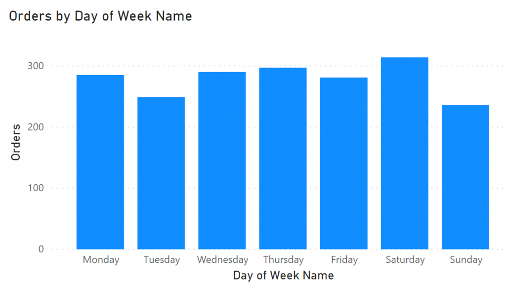
This works fine for sorting values numerically or alphabetically, such as for nominal values. Things get a little bit trickier when you are working with ordinal values such as the day of the week. By just sorting your chart on the day of the week, you will end up with Friday, Monday, Saturday, Sunday, Thursday, Tuesday, Wednesday.
Nominal data: data in which the variables have no natural order. Examples are binary data (true / false) or names (Dustin, Will, Lucas, Johnathan).
Ordinal data: data in which the variables have natural, ordered categories. Examples include Months (Jan, Feb, Mar, etc.) or questionnaire scores (poor, reasonable, good, or excellent).

As an alternative you can replace the names of the weekdays with the weekday numbers. Creating such a column can be done in your workbook using the following DAX function:
Day of Week Number = WEEKDAY(Date[Date],2)Mondays are now the first day of the week, the standard in most European countries. Change the last argument of the WEEKDAY function to have Sunday or Saturday as the start of the week. Updating your chart with this newly created column allows you to show the days in the correct order. However, we’ve now lost our labels.
Using Sort by Column
We can fix this problem by sorting our column, based on another column. We therefore must indicate on which column to sort our data. In the Report view in Power BI Desktop, select the column you want sorted. Next, go to Column tools and find the “Sort by column” options. Select the column containing the correct order, and that’s it. (Note: this option is also available in the Data and Model view, it works exactly the same way)

This sort order is used in all visuals whether it’s a bar chart, table or slicer. You may run into visuals that overrule sorting of the data, so keep that in mind when working with some custom visuals.
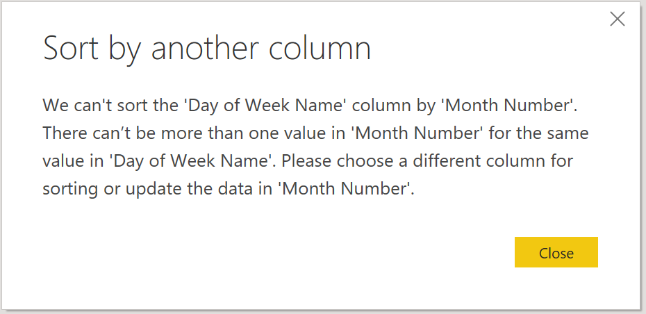
You can do this trick on any column in your data, even if you’ve created that column yourself using DAX. Do make sure that every value in the column you want sorted, has only 1 corresponding value on which to sort. Power BI will not be able to sort your weekdays if Monday sometimes has number 1 and other times number 2. In other words, both columns must have the same cardinality.
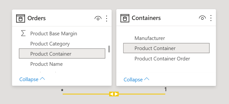
In order to use Sort by Column, both columns must be in the same table. If you have two tables with a relationship between them, it will not be possible to sort a column based on a column in the other table. You would have to merge the two tables to resolve this. Remember to only keep relevant columns after merging as your table size can grow substantially, degrading performance.
Side effects on calculations
Unwanted side effects can occur when using DAX expressions on columns that are being sorted by another column. What makes matters worse is that there is not easy way to see which columns are being sorted on others. Take the following example: we want to calculate the percentage of the total sales for each month. We can do this by creating the following measure:
Monthly % of Year=
DIVIDE (SUM(Sales[Sales]),
        CALCULATE(SUM(Sales[Sales]),
        ALL(Sales[Month Name])))
In the two tables below, we see what happens to our result as soon as we sort the Month Name column on the Month Number:
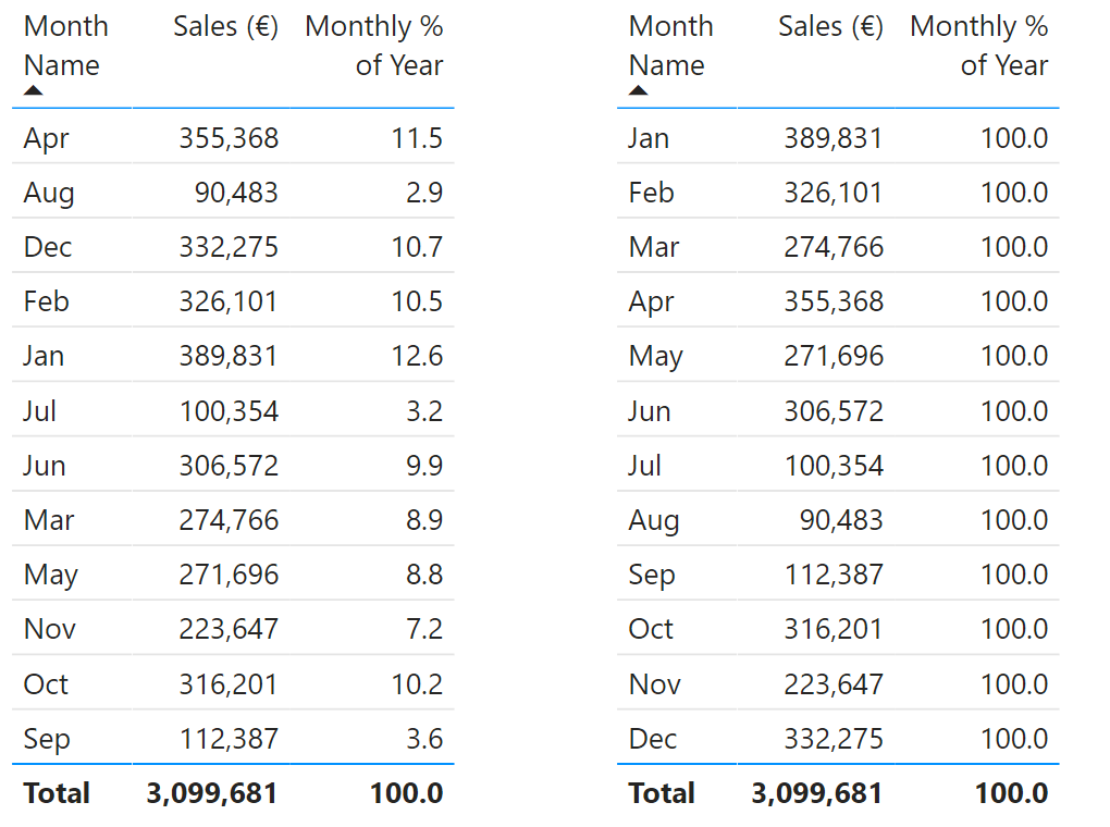
All of our fractions are 100% after using Sort by Column! This happens because the SUMMARIZECOLUMNS function groups the data using both the Month Name and Month Number column. We must therefore make sure to clear both involved columns using the ALL function in our measurement.
Monthly % of Year=
DIVIDE (SUM(Sales[Sales]),
        CALCULATE(SUM(Sales[Sales]),
        ALL(Sales[Month Name],Sales[Month Number])))
The table below show the results that we expected. The monthly sales are now correctly divided by the total sales of the year.
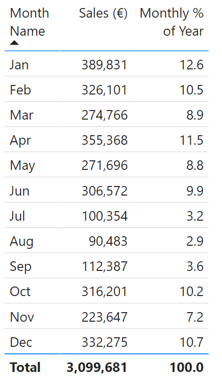
In short: sorting categories in a chart numerically or alphabetically can quickly be done using the More Options menu in your visual. Sorting a column based on another one is done using the Sort by Column option but both columns must have the same cardinality. Finally, keep in mind that your measures may show unexpected behaviour when you’ve sorted on another column.
