
Your incredible feedback allowed us to implement several exciting enhancements to the SMART KPI List.
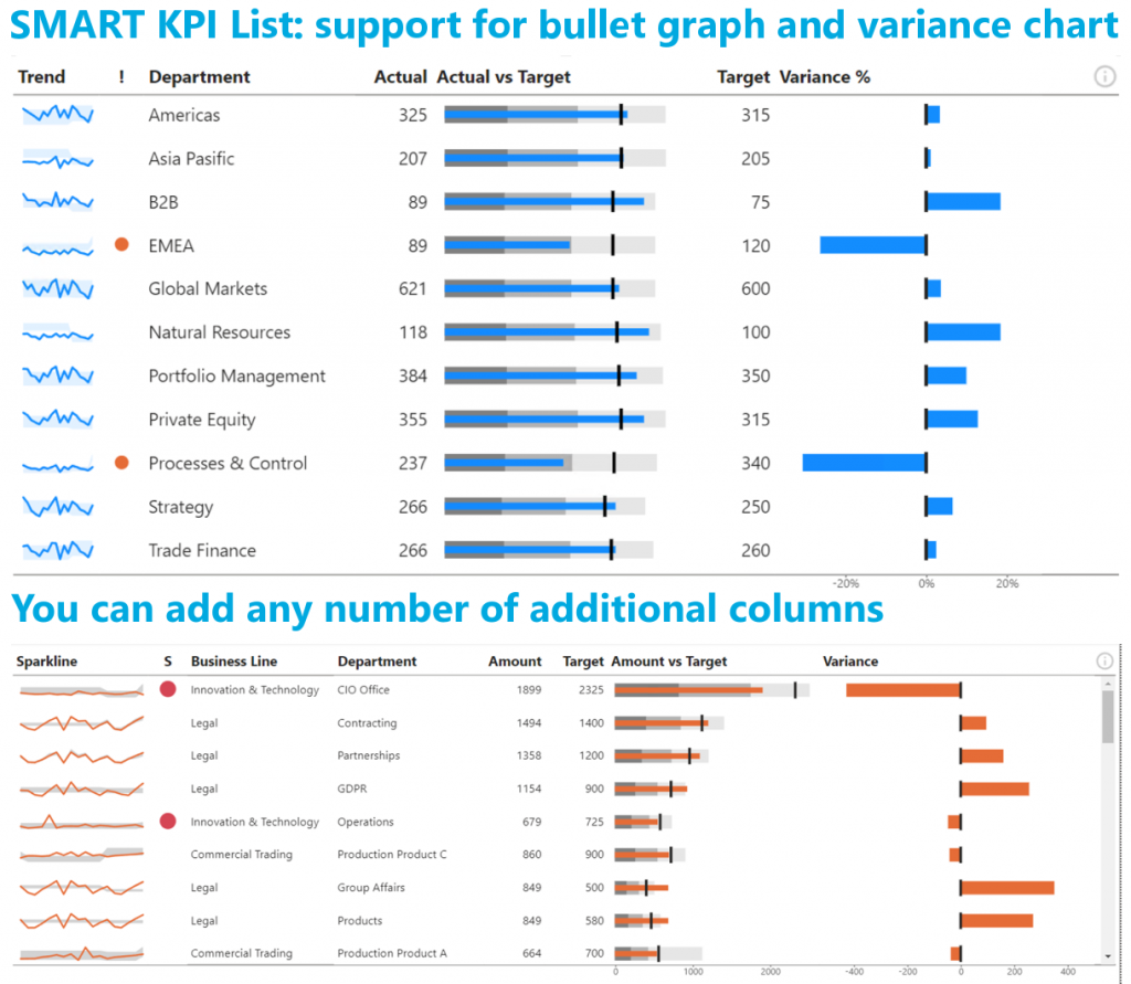
Now you can extend the existing bar chart into a bullet graph by adding the qualitative ranges behind the bar.
Previously you had to choose between a bar chart and variance chart. Now you can show either or both at the same time.
You can also add additional columns to the visual to include more context. And all columns can be set to the exact right width by dragging the edges.
Don’t hesitate and try the SMART KPI List now on your own data by downloading it from the AppSource. All features are available for free to evaluate this visual within Power BI Desktop.