Introduction: Control Chart XmR

The most effective way to detect signals of change in your KPI is to use a Control Chart
Introduction
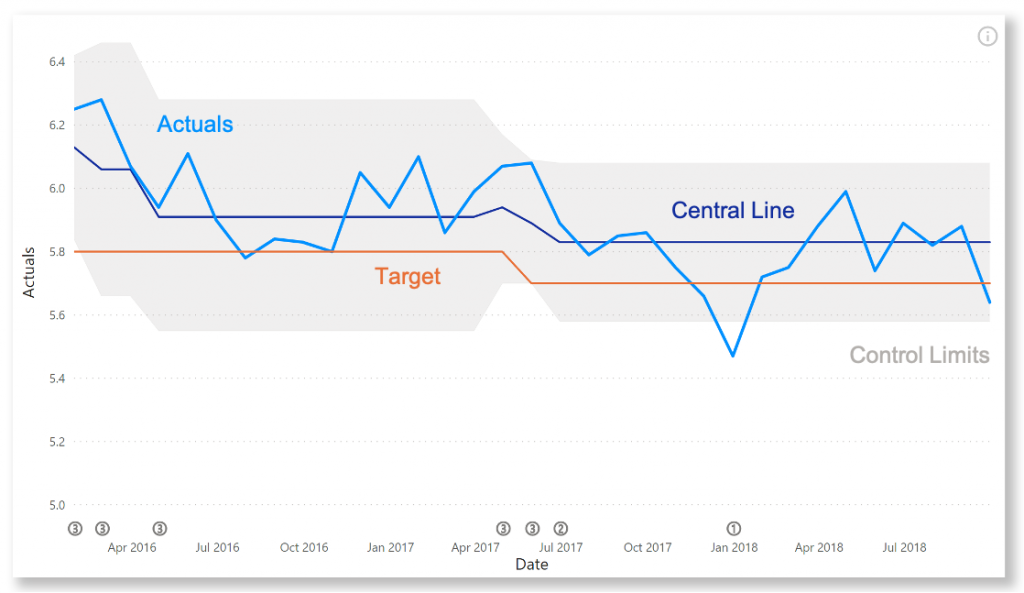
The Control Chart helps you to determine if your processes are in control. When your measurements meet certain criteria (see below), an indicator immediately tells you something is going on. This helps you to determine the source of this variation.
The Control Chart XmR consists of two charts: The upper chart (X-Chart) displays the data points over time together with a calculated average. The calculated average is then used to calculate the Upper and Lower Control Limits (UCL and LCL). The lower chart displays the Moving Range (mR-Chart) with its Average and Upper Control Limit. The mR-Chart can be hidden.
The rule set for the detection of signals is customisable. By default it is:
- A point is outside the control limits;
- 7 points in a row are above or below the center line;
- 10 out of 12 points are above or below the center line;
- 3 out of 4 points are closer to the UCL or LCL than the center line.
Besides these rules (known as the Wheeler Rules) you can also apply the Nelson Rules. These detect signals in the following situations:
- One point is more than 3 standard deviations from the mean;
- Nine (or more) points in a row are on the same side of the mean;
- Six (or more) points in a row are continually increasing (or decreasing);
- Fourteen (or more) points in a row alternate in direction, increasing then decreasing;
- Two (or three) out of three points in a row are more than 2 standard deviations from the mean in the same direction;
- Four (or five) out of five points in a row are more than 1 standard deviation from the mean in the same direction;
- Fifteen points in a row are all within 1 standard deviation of the mean on either side of the mean;
- Eight points in a row exist, but none within 1 standard deviation of the mean, and the points are in both directions from the mean.
You can add your own target line(s), to see how your process is doing compared to a certain goal. If you have determined the center line and control limits separately, you can easily add these to the visual as well.
Key features of the Control Chart XmR are:
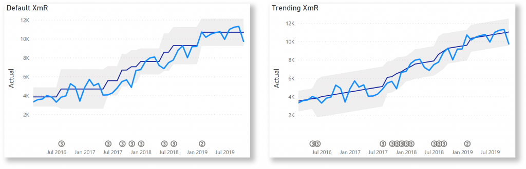
- Switch between standard and trending XmR: processes with natural trends (continuously increasing or decreasing) can be analysed with the Trending XmR function;
- Highlight signals: detected signals can be indicated below the chart, and the measurements themselves can be coloured in a separate colour;
- Work on various time scales: choose the appropriate time scale for optimal analysis, ranging from seconds to years;
- Format objects: all lines, markers and axes can be formatted independently, and support theme settings;
- Selection & Highlighting: like in standard Power BI Charts you can make use of the Selection & Highlighting functions within the Control Chart XmR;
- Context menu: like in standard Power BI Charts you have access to the context menu to include and exclude data points;
- Full Tooltip support: besides the default Tooltip behaviour (show the value of the element you hover) you can also add additional fields to the tooltip;
- Full Bookmark support: like any of the standard visuals the Control Chart XmR supports Bookmarks.
How to use: Build visual
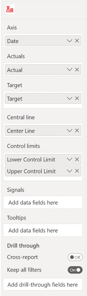
To use the Control Chart XmR, you need to have a dataset with at least a date-field and a numeric field. The available fields are:
- Axis: here you add the category you want to use as your x-axis. Make sure to use the actual dates instead of the Date Hierarchy.
- Actuals: this field contains your measurements.
- Target: this field contains your target points, which can be shown as a line or a sequence of markers. Multiple targets are supported, you can add up to three categories.
- Central line: the Central Line will be calculated automatically. You can add your own Central Line by including it in this field.
- Control limits: the Control Limits (or natural process limits) are calculated automatically, but can be added here. You can add two categories to this bucket: one for the lower limit and one for the upper limit. The order doesn’t matter.
- Signals: an indicator will be shown in the chart as soon as this field is non-empty. You can have an indicator for every point in your Date field.
- Tooltips: the fields added here will show up in the tooltip when the user hovers a specific data point.
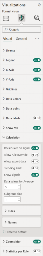
How to use: Format visual
The Control Chart XmR comes with many of the standard Power BI formatting options. Titles, axis labels, line and markers appearance, etc. It’s all there.
- License: here you can enter your PREMIUM license information to disable any license reminders.
- Legend: show/hide the legend by clicking the toggle on/off. Available subcategories:
- Position: here you can set the position of the legend to Top, Bottom, Left, Right, Top Center, Bottom Center, Left Center, Right Center.
- Title: switch on/off the legend title and add a title to the Legend Name.
- Style: change the Font family, text Size, emphasized text (Bold, Italic, Underline) and Color of the legend.
- X-axis: the X-axis are the horizontal values and title of the chart.
- Style: by default the Axis type is set to Continuous, in the Date type option you can define the formatting of the date labels on the X-axis. The options range from Year to Seconds. Note that making changes to this option does not invoke any changing to the grouping of your data. You can also set the Axis type to Categorical.
- Values: format here the Font, Size, emphasized text (Bold, Italic, Underline) and Color of the X-axis labels.
- Title: here you can rename and format the Title text, Font, Size, emphasized text (Bold, Italic, Underline), Title position (Align left, Align center, Align right) and Title color.
- Y-axis: the Y-axis are the vertical values and title of the chart.
- Range: here you can set a Start/ End value.
- Values: format here the Font, Size, emphasized text (Bold, Italic, Underline), Color, Display units and Value decimal places of the Y-axis labels.
- Title: here you can rename and format the Title text, Style, Font, Size, emphasized text (Bold, Italic, Underline), Title position (Align left, Align center, Align right) and Title color.
- Gridlines: by default the chart has horizontal thin and light background lines in the grid.
- Horizontal : turn on/off the horizontal gridlines and set the Style (Dashed, Solid, Dotted), the Color and Width.
- Data Colors: set here the colors for the Actual line, and (if enabled) the markers on that line. In the Actual (outside Control limits), for highlighting purposes, you can change the color of the Actual markers when they fall outside the Control Limits bandwidth. The Actual line itself will not change color when outside the control limits. You can also change the color for the Central line, Control limits, Signals and Target.
- Data point: contains all options to format the lines and markers in both parts of the chart such as the Actual line width (minimum line width can be set to 0 to show data points only), the CL line width and the Target line width. You can enable the Show actual markers (by default off), Show target Line (by default off) and Show target markers. Change the Marker size. Enable the Show 1 sigma and 2 sigma-lines option. Enable the Show as CL as step when you want to show the Central Line stepped. By default the Show target markers and Show control limits area options are on.
- Data labels: enable the UCL, CL and LCL values as a final value label at the end of the line(s). Available options:
- Overflow text: enable this option to show overflowed text.
- Show background: set on to change the Background color and Background opacity.
- Style: change the Font family, text Size, emphasized text (Bold, Italic, Underline) and Color of the UCL, CL and LCL data labels.
- Show MR: toggle this option on to see the mR chart, displaying the moving Range.
- Calculation: by default the Rules are set to Wheeler and Recalculate is on. For more information see Calculation card. Available options:
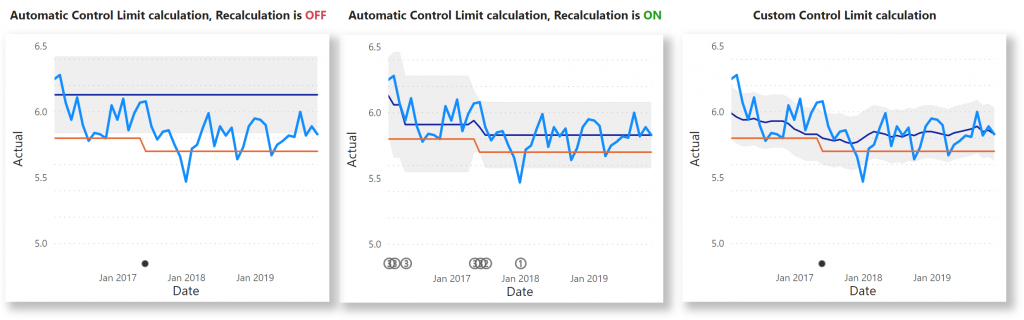
- Recalculate on signal (available if the Central line field is empty).
- Allow rule override and Allow export data enable these options to override rules and export data in Focus mode (Statistics per Rule must be On). To export data make sure the setting Allow downloads from custom visuals is enabled in the Admin Portal.
- Enable a Trending XmR chart and Show signals.
- If you switch the Recalculate on signal off, the option Use all data values for Average will show up and can be enabled.
- Set the Data values for Average (between 2 and 30). This option is not available if Recalculate on signal is off and Use all data values is on. Default value = 5.
- Subgroup size: this option allows you to group the data points for rendering and calculation. The data points in the dataset will be grouped into a new data point and only the grouped data points will be rendered in the chart. Default value = 1.
- Rules: select Wheeler or Nelson rules and switch off/ on specific rules.
- Names: when you use automatic calculation you can change the names of the LCL, CL and UCL in the legend and tooltip.
- Zoomslider: enable the zoomslider option to easily examine a smaller range of the date in the Control XmR chart without having to use a filter. The zoomslider is added on the chart’s x-axis if the axis type is continuous (date) and can be used for horizontal scrolling. Click and drag endpoints on sliders to adjust the dimensions of the chart, slide both endpoints toward the center. The closer the two endpoints are to each other, the more you zoom in to display shorter, finer segments. Click and hold down the left mouse button on the center section of the zoom bar and then scroll left or right to a particular point. You can also click on the label to display and select from the Calendar instead. The zoomslider can also be switched off/on. Available formatting subcategories:
- Color: to change the color of the zoomslider (endpoints and line).
- Style: to change the Font family, text Size, emphasized text (Bold, Italic, Underline) and Font Color of the zoomslider (date or value) labels.
- Statistics per Rule: enable this option and then click in the visual either the Focus mode icon or the ellipsis called More options and select Show as a table to see a table with all statistics about the applied rules. This table is particularly helpful if you would like to be able to know which rules are breaking on a recurring basis on your control charts. If Allow rule override and/ or Allow export data are on in the Calculation card, the options will be also available to the user.
- Format the Title: switch on/ off the show title option and change the Font, Size, emphasized text (Bold, Italic, Underline) and Title color.
The General settings contain options that affect the visual container and are consistent across all visual types. Here you can also customize the general Title and Tooltips.
Calculation card
Here you will find the options that affect your analysis the most. You can change the number of points considered for the average and each rule, and more:
- Auto recalculation: Turning this option on will induce a recalculation when Rule 2, 3 or 4 (if enabled) is violated. A new center line and control limits is calculated. When the option is turned off, then the center line will be based on the points as defined by the parameter Data values for Average.
- Allow rule override: enable this option and the Statistics per Rule to allow users to switch on and off certain rules. In Focus mode, select the Change Rules icon to get a menu with the rules and n-values. These settings will not be stored/ persisted.
- Allow export data: enable this option and the Statistics per Rule to allow users to download data in Focus mode. The setting Allow downloads from custom visuals must be enabled in the Admin Portal. For more information see Tutorial: Exporting and downloading calculated data.
- Trending XmR: Turn this option on if you have a measurement with a naturally increasing / decreasing behaviour. All rules remain the same, but the CL becomes a slope which best fits your data.
- Show signals: When one of the rules is violated, then a small indicator will be shown in the chart. In case you have add a field to the Signal bucket, then non-empty values will also result in an indicator. Hover over the indicator to see which rule has been violated.
- Data values for Average: This option determines how many points are used to calculate the center line and control limits. Make sure that this value is lower than the number of data points you have. The range is between 2 and 30. Default value is 5.
- Use all data values for Average: This option uses all data points to calculate the average instead of limiting it to a number between 2 and 30. Set the Recalculation on signal option Off, to get the Use all data values for Average option (by default Off), setting the option on hides the Data values for average.
If Rules are set as Wheeler
- Rule 1: A point is outside the control limits (doesn’t invoke recalculations).
- Rule 2: n points in a row are above or below the center line. The n can be changed, default is 7.
- Rule 3: n out of n+2 points are above or below the center line. The n can be changed, default is 10.
- Rule 4: n out of n+1 points are closer to the UCL or LCL than the center line. The n can be changed, default is 3.
If Rules are set as Nelson
- Rule 1: One point is more than 3 standard.
- Rule 2: Nine (or more) points in a row are on the same side of the mean.
- Rule 3: Six (or more) points in a row are continually increasing (or decreasing).
- Rule 4: Fourteen (or more) points in a row alternate in direction, increasing then decreasing.
- Rule 5: Two (or three) out of three points in a row are more than 2 standard deviations from the mean in the same direction.
- Rule 6: Four (or five) out of five points in a row are more than 1 standard deviation from the mean in the same direction.
- Rule 7: Fifteen points in a row are all within 1 standard deviation of the mean on either side of the mean.
- Rule 8: Eight points in a row exist, but none within 1 standard deviation of the mean, and the points are in both directions from the mean.
For any questions or remarks about this Visual, please contact us by email at Nova Silva Support or visit the community forum.