Introduction: Attribute Control Chart

Monitor process quality, facilitating timely anomaly detection and continuous improvement
Introduction
The Attribute Control Chart in Power BI offers a comprehensive view of process quality by allowing users to monitor defects/defectives and their corresponding metrics.
The schema will help you to select the most appropriate Attribute Control Chart.
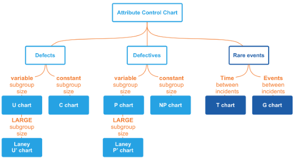
This visual supports six types of Attribute Control Charts:
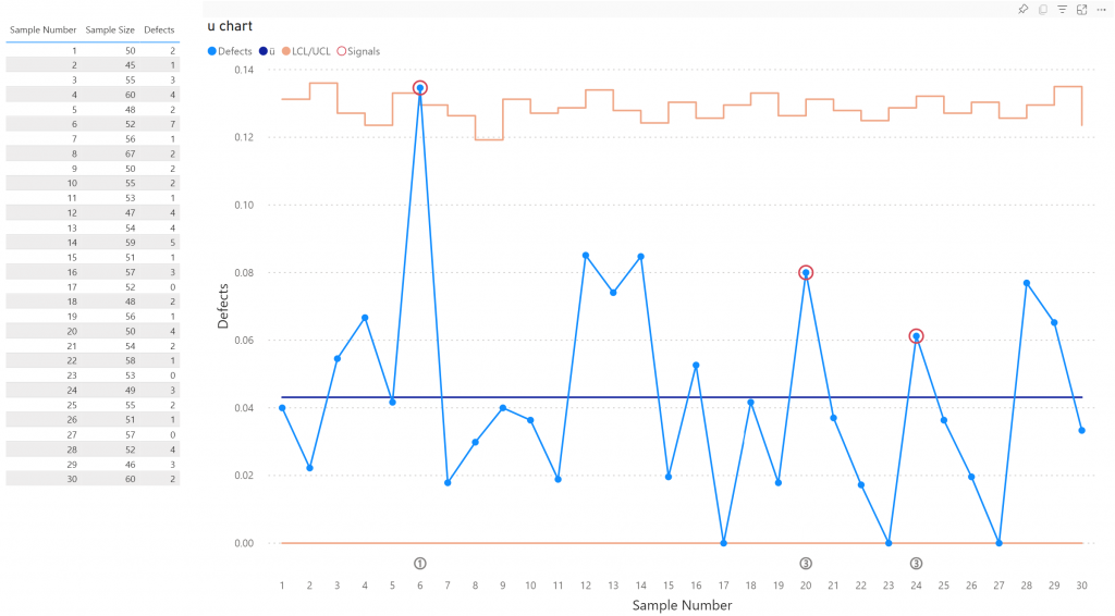
- u chart: Tracks the number of defects per unit when the sample size varies.
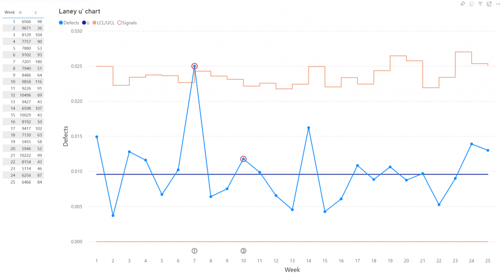
- Laney u’ chart: A modified version of the u chart to adjust for overdispersion or underdispersion in your data.
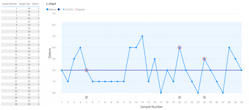
- c chart: Monitors the number of defects in each sample when the sample size is constant.
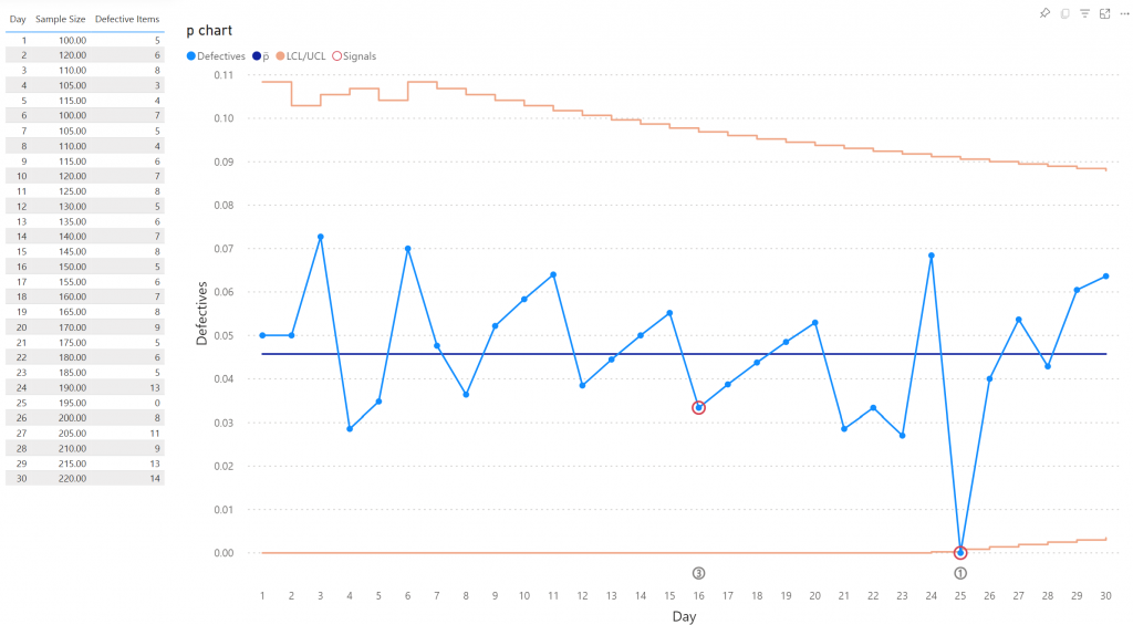
- p chart: Observes the proportion of defective items in each sample when the sample size varies.
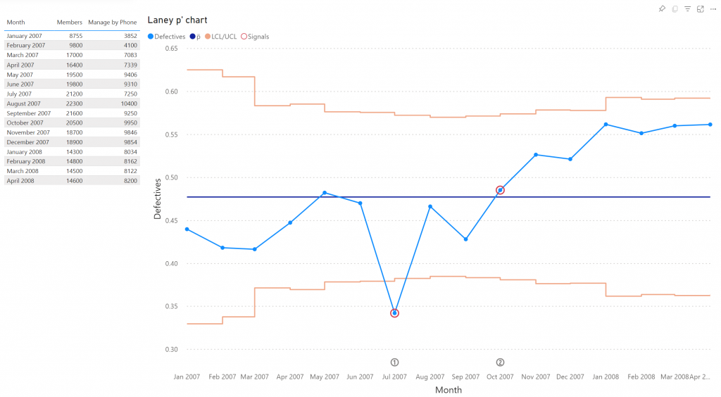
- Laney p’ chart: A modified version of the p chart to adjust for overdispersion or underdispersion in your data.
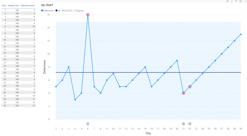
- np chart: Displays the count of defective items in each sample when the sample size is constant.
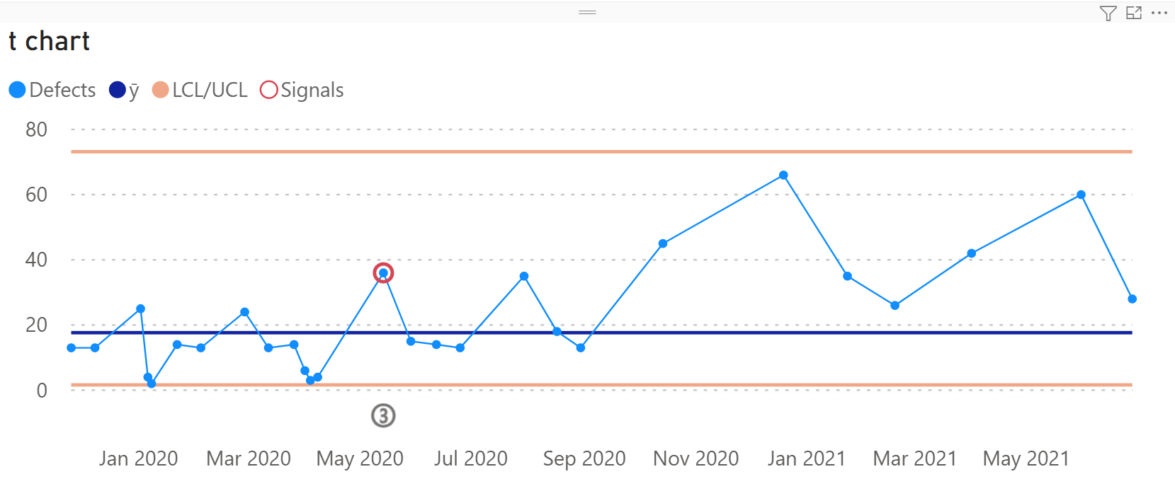
- t chart: Tracks the time intervals between consecutive rare events.
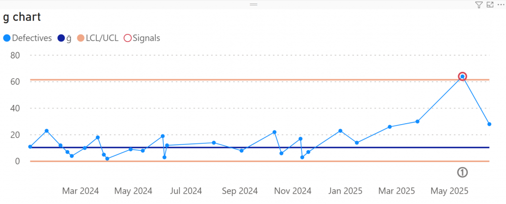
- g chart: Monitors the number of non-defective units (gaps) between rare defects.
Key features of the Attribute Control Chart are:
- Dynamic Data Analysis: Users can explore and analyze data trends by filtering and slicing data based on various attributes such as time periods, product categories, or production lines.
- Statistical Control Limits: The visual dynamically calculates and displays control limits, allowing users to quickly identify variations in the process and distinguish between common cause and special cause variations.
- Automatic signal detection: The visual automatically detects significant signals in your data, allowing users to focus on signals and ignore random noise.
- Format the objects: All lines, markers and axes can be formatted independently, and support theme settings.
- Selection & Highlighting: Like any standard Power BI Chart you can make use of the Selection & Highlighting functions within the Attribute Control Chart.
- Full Tooltip support: Besides the default Tooltip behaviour (show the value of the element you hover) you can also add additional fields to the tooltip.
- Full Bookmark support: Like any of the standard visuals the Attribute Control Chart supports Bookmarks.
- Drill-Down Capability: Users can drill down into specific data points to investigate underlying factors contributing to quality issues or improvements.
- Real-Time Monitoring: Provides real -time updates as new data is ingested, enabling users to stay informed about process performance and take timely corrective actions.
Some of the benefits of using Attribute Control Charts are: improve process visibility, early detection of anomalies and enhanced collaboration.
How to use: Build visual
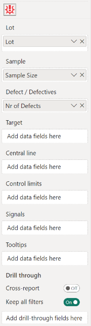
To use the Attribute Control Chart, you need to have a dataset with at least a Lot, Sample and Defect / Defectives. The available fields are:
- Lot: here you add the category you want to use as your x-axis. It refers to a group or batch of items. This can also be a date.
- Sample: this field contains the number of items randomly selected from a lot for inspections or testing.
- Defect / Defectives: are the characteristics or conditions that do not conform to the specified requirements or standards. Defects refer to individual nonconforming units, while defectives refer to the units containing one or more defects. For rare events, add here the time-between data.
- Target: this field contains your target points, which can be shown as a line or a sequence of markers. Multiple targets are supported, you can add up to three categories.
- Central line: the Central Line will be calculated automatically. You can also add your own Central Line by including it in this field.
- Control limits: the Control Limits (or natural process limits) are calculated automatically, but can be added here as well. You need to add two categories to this bucket: one for the lower limit and one for the upper limit. The order doesn’t matter. Adding the limits will overrule any automatic calculation.
- Signals: an indicator will be shown in the chart as soon as this field is non-empty.
- Tooltips: the fields added here will show up in the tooltip when the user hovers a specific data point.
How to use: Format visual
The Attribute Control Chart comes with many of the standard Power BI formatting options. Titles, axis labels, line and markers appearance, etc. It’s all there.
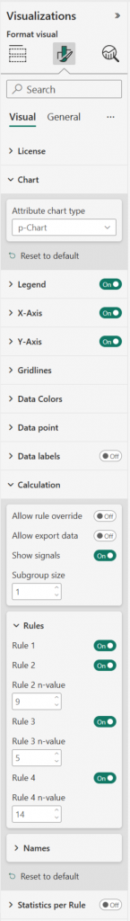
- License: here you can enter your PREMIUM license information to activate the visual with a Premium license. These fields are not used for the PER USER license.
- Chart: c-Chart, np-Chart, p-Chart (default), Laney p-Chart, u-Chart, Laney u-Chart, g-Chart, t-Chart.
- Legend: show/hide the legend by clicking the toggle on/off. Available subcategories:
- Position: here you can set the position of the legend to Top, Bottom, Left, Right, Top Center, Bottom Center, Left Center, Right Center.
- Title: switch on/off the legend title and add a title to the Legend Name.
- Style: change the Font family, text Size, emphasized text (Bold, Italic, Underline) and Color of the legend.
- X-axis: the X-axis are the horizontal values and title of the X-axis.
- Style: by default the Axis type is set to Categorical. If the axis is based on dates the Axis type is set Continuous. In the Date type option you can define the formatting of the date labels on the X-axis. The options range from Year to Seconds. Note that making changes to this option does not invoke any changing to the grouping of your data.
- Values: format here the Font, Size, emphasized text (Bold, Italic, Underline) and Color of the X-axis labels.
- Title: here you can rename and format the Title text, Font, Size, emphasized text (Bold, Italic, Underline), Title position (Align left, Align center, Align right) and Title color.
- Y-axis: the Y-axis are the vertical values and title of the Y-axis.
- Range: here you can set a Start/ End value.
- Values: format here the Font, Size, emphasized text (Bold, Italic, Underline), Color, Display units and Value decimal places of the Y-axis labels.
- Title: here you can rename and format the Title text, Style, Font, Size, emphasized text (Bold, Italic, Underline), Title position (Align left, Align center, Align right) and Title color.
- Gridlines: by default the chart has horizontal thin and light background lines in the grid.
- Horizontal : turn on/off the horizontal gridlines and set the Style (Dashed, Solid, Dotted), the Color and Width.
- Data Colors: set the colors for the Defect rate, and (if enabled) the markers on that line. In the Defect rate (outside Control limits), for highlighting purposes, you can change the color of the Defect rate markers when they fall outside the Control Limits bandwidth. The Defect rate line itself will not change color when outside the control limits. You can also change the color for the Central line, Control limits, Signals and Target(s).
- Data point: contains all options to format the lines and markers of the chart such as the Defect rate line width (minimum line width can be set to 0 to show data points only), the CL line width and the Target line width. You can enable the Show defect rate markers (by default off), Show target Line (by default off) and Show target markers. Change the Marker size. Enable the Show 1 sigma and 2 sigma-lines option. Enable the Show as CL as step when you want to show the Central Line stepped including the Upper and Lower control limits. By default the Show target markers and Show control limits area options are on.
- Data labels: enable the UCL, CL and LCL values as a final value label at the end of the line(s). Available options:
- Overflow text: enable this option to show overflowed text.
- Show background: set on to change the Background color and Background opacity.
- Style: change the Font family, text Size, emphasized text (Bold, Italic, Underline) and Color of the UCL, CL and LCL data labels.
- Calculation: See Calculation card for more information.
- Allow rule override and Allow export data enable these options to override rules and export data in Focus mode (Statistics per Rule must be On). To export data make sure the setting Allow downloads from custom visuals is enabled in the Admin Portal.
- Show signals: by default off.
- Subgroup size: default value = 1
- Rules: switch off/ on specific rules and change the n-Value. The minimum n-Value allowed is 3.
- Names: when you use automatic calculation you can change the names of the LCL, CL and UCL in the legend and tooltip.
- Zoomslider: enable the zoomslider option to easily examine a smaller range of the date in the Attribute Control Chart without having to use a filter. The zoomslider is added on the chart’s x-axis if a Date is mapped in the Lot. It can be used for horizontal scrolling. Click and drag endpoints on sliders to adjust the dimensions of the chart, slide both endpoints toward the center. The closer the two endpoints are to each other, the more you zoom in to display shorter, finer segments. Click and hold down the left mouse button on the center section of the zoom bar and then scroll left or right to a particular point. You can also click on the label to display and select from the Calendar instead. The zoomslider can also be switched off/on. Available formatting subcategories:
- Color: to change the color of the zoomslider (endpoints and line).
- Style: to change the Font family, text Size, emphasized text (Bold, Italic, Underline) and Font color of the zoomslider date labels.
- Statistics per Rule: enable this option and then click in the visual either the Focus mode icon or the ellipsis called More options and select Show as a table to see a table with all statistics about the applied rules. This table is particularly helpful if you would like to be able to know which rules are breaking on a recurring basis on your control charts. If Allow rule override and/ or Allow export data are on in the Calculation card, the options will be also available to the user.
- Format the Title: switch on/ off the show title option and change the Title Font, Size, emphasized text (Bold, Italic, Underline) and Color.
The General settings contain options that affect the visual container and are consistent across all visual types. Here you can also customize the general Title and Tooltips.
Calculation card
Here you will find the options that affect your analysis the most. You can change the number of points considered for the average and each rule.
Available options:
- Allow rule override: enable this option and the Statistics per Rule to allow users to switch on and off certain rules. In Focus mode, select the Change Rules icon to get a menu with the rules and n-values. These settings will not be stored/ persisted.
- Allow export data: enable this option and the Statistics per Rule to allow users to download data in Focus mode. The setting Allow downloads from custom visuals must be enabled in the Admin Portal. For more information see Tutorial: Exporting and Downloading Calculated Data from the Attribute Control Chart.
- Show signals: When one of the rules is violated, then a small indicator will be shown in the chart. In case you have add a field to the Signal bucket, then non-empty values will also result in an indicator. Hover over the indicator to see which rule has been violated.
- Subgroup size: this option allows you to group the data points for rendering and calculation. It is only be visible in case the Central Line and Control Limits wells are empty. The data points in the dataset will be grouped into a new data point and only the grouped data points will be rendered in the chart. Default value = 1
Rules
- Rule 1: One point is more than 3 standard deviations from the center line.
- Rule 2: n (or more) points in a row are on the same side of the center line.
- Rule 3: n (or more) points in a row are all increasing or all decreasing.
- Rule 4: Fourteen (or more) points in a row alternate in direction, increasing then decreasing.
Considerations
By default a p-Chart will show up when adding a category to the Lot, Sample and Defect / Defectives wells, go to Format visual > Chart > Attribute chart type, click to get a drop down menu and select another chart type.
If the calculation of the LCL results in a negative number, it will be replaced with 0. If you add your own LCL category with negative value, the negative value will show up in the labels and tooltips.
Using p-Chart and Laney p’-Chart for Yield: if you prefer seeing charts in terms of yields (ratio of non-defective parts) instead of defectives (ratio of defective parts), set the non-defective parts category in the Defect / Defectives field, in this case the Lower Control Limit does not go below 0 and the Upper Control Limit will not exceed 1.
u-Chart and c-Chart
The u-Chart (Unit Chart) and c-Chart (Count Chart) are quality control charts used to monitor count-type data, both are used to track defects.
The u-Chart controls the average number of defects per unit while the c-Chart controls the total number of defects per unit. A c-Chart can only be used if the sample size remains constant. If the sample sizes aren’t constant, use the u-Chart instead.
Use a u-Chart to monitor: defects in manufactured products, customer returns, damaged goods, medication errors, defects in software, failed test cases, inventory discrepancies, defects in building materials.
Use a c-Chart to monitor: number of defective units per batch, number of customer complaints per day, number of damaged items per shipment, number of medication errors per week, number of software defects per release, number of billing errors per billing cycle.
p-Chart and np-Chart
The p-Chart (Proportion Chart) and np-Chart (Nr of Defectives per Unit Chart) are control charts used to monitor proportions both are used to track defectives.
The p-Chart controls the proportion of items and is used for ‘pass/fail’ inspection, while the np-Chart controls the number items.
Use a p-Chart to monitor: proportion of defective items, proportion of customer complaints, proportion of damaged packages, proportion of medication errors, proportion of software modules with defects in a release, proportion of building materials failing quality.
Use a np-Chart to monitor: number of scratches per unit inspected, number of customer complaints per day, number of damaged packages per delivery, number of medication errors per day, number of bugs found per software module.
Laney u’-Chart and Laney p’-Chart
The Laney u’-Chart and Laney p’-Chart are attribute control charts used to monitor large sample sizes (>5000) and the data shows overdispersion or underdispersion. This can lead to false indications of out-of-control points on a traditional u- or p-Charts.
Use a Laney u’-Chart to monitor: tracking the number of medication errors per patient, the number of falls per patient, or the number of post-surgical complications per procedure; tracking the number of complaints or escalations per customer interaction, the number of errors per customer order, or the number of service failures per service call.
Use a Laney p’-Chart to monitor: the proportion of hospital-acquired infections over time, with each data point representing a weekly or monthly period; the proportion of defective units produced in a manufacturing process over time, with each data point representing a batch.
g-Chart and t-Chart
The g-Chart and t-Chart are attribute control charts that can be used for rare events and time-between-occurrence data.
Rare events are infrequent but critical process incidents, such as equipment failures, safety violations, or customer complaints. These charts focus not on how often an event occurs, but rather on the intervals between them.
Use the g-Chart to monitor the number of non-defective units (gaps) between rare defects.
Use the t-Chart to track the time intervals between consecutive rare events.
For any questions or remarks about this Visual, please contact us by email at Nova Silva Support or visit the community forum.