
Your valuable feedback continues to shape our Power BI visuals, and we’re thrilled to announce exciting enhancements to the Dumbbell Bar Chart. In the latest release, we’ve introduced the capability to display multiple dumbbell bars on a single row, allowing for the presentation of more than two values in a streamlined manner. This update opens up new possibilities, including the creation of the Adverse Event Timeline plot, or AE Timeline.
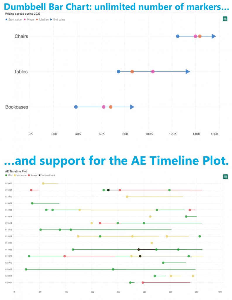
The AE Timeline serves as a graphical representation of the timing of adverse events in clinical trials or studies. Its primary objective is to visually convey when adverse events occurred concerning the timing of treatment or exposure. Widely used in medical research, especially during safety data analysis in drug development, the AE Timeline is now seamlessly available within Power BI.
Experience the enhanced Dumbbell Bar Chart and the innovative AE Timeline by downloading it from AppSource. All features are readily accessible within Power BI Desktop, empowering you to evaluate this visual on your own data. Dive into the enhanced functionality and discover new insights effortlessly.