
Data visualisations play a fundamental role in answering an important data question:”How does result A compare to result B?”. Typical examples of these questions are:
- How does the sales of this month compare to the sales of last month?
- What is the difference between the number of documents processed this year compared to 2021?
- How does the number of planned-visitors compare to the number of unplanned-visitors at our locations?
Key in answering these kind of questions is clearly visualising the difference between the two results. This is the strength of the Dumbbell Bar Chart: showing both values and the difference between them.
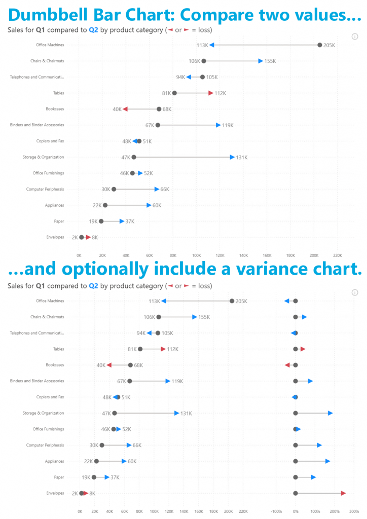
In the latest version you’ll find the features you asked for: data labels and conditional formatting. All available in the familiar standard Power BI interface. No need to learn any new interface to configure these features.
Don’t hesitate and try the Dumbbell Bar Chart now on your own data by downloading it from the AppSource. All features are available for free to evaluate this visual within Power BI Desktop.