Posted on

Attribute Control Chart for Power BI – March 2025 Update

Attribute Control Chart for Power BI – March 2025 Update

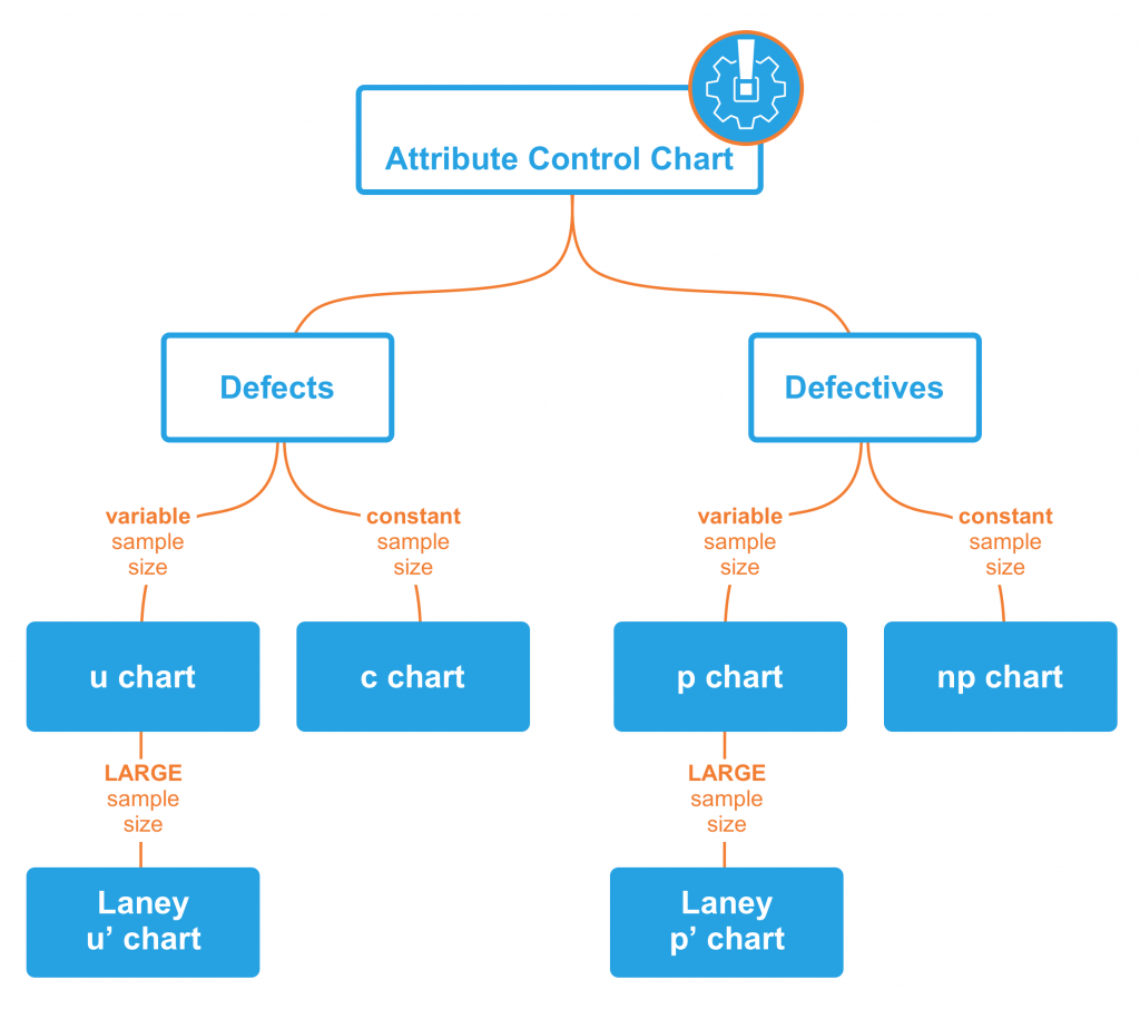
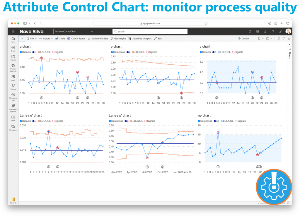
Earlier this year, Nova Silva introduced the Attribute Control Chart for Power BI, designed to empower users with advanced quality control insights. Initially, it supported the foundational attribute chart types, including the c chart, u chart, Laney u chart, p chart, Laney p chart, and np chart.

A diagram of a company Description automatically generated

Now, we’re excited to announce expanded capabilities with support for Rare Event Control Charts — specifically, the T chart and G chart. These charts are essential for monitoring events that occur infrequently, allowing for more nuanced control in scenarios where traditional control charts may not be sensitive enough. The T chart helps monitor the time between rare events, while the G chart tracks the count of opportunities between events. These new additions make the Attribute Control Chart even more versatile, enabling organizations to gain insights into low-frequency incidents, which are often critical yet challenging to monitor.

By expanding Power BI’s Attribute Control Chart functionality, we continue to support diverse business needs, helping teams identify issues promptly and maintain high-quality standards across all processes.

Ready to experience the Attribute Control Chart? Download it from AppSource today and explore its capabilities with your own data – try for free!

Posted on

Attribute Control Chart for Power BI

Maintaining quality standards is a non-negotiable aspect of every successful operation. Enter the new Attribute Control Chart for Power BI, a robust mechanism for monitoring and controlling categorical data variations.

The Attribute Control Chart offers a comprehensive suite of six attribute charts to cater to diverse analytical needs:

  • c chart: Monitors number of defects per sample (sample size is constant).
  • u chart: Tracks the number of defects per unit (sample size varies).
  • Laney u’ chart: A modified version of the u chart to adjust for overdispersion or underdispersion in your data.
  • p chart: Observes the proportion of defective items per sample (sample size varies).
  • Laney p’ chart: A modified version of the p chart to adjust for overdispersion or underdispersion in your data.
  • np chart: Displays the count of defective items per sample (sample size is constant).

Power BI users can delve deeper into their data, facilitating timely decision-making and continuous improvement. From manufacturing to healthcare, the Attribute Control Chart equips organizations across industries with the insights needed to uphold quality standards and drive operational excellence.

Ready to experience the Attribute Control Chart? Download it from AppSource today and explore its capabilities with your own data – try for free!