Description
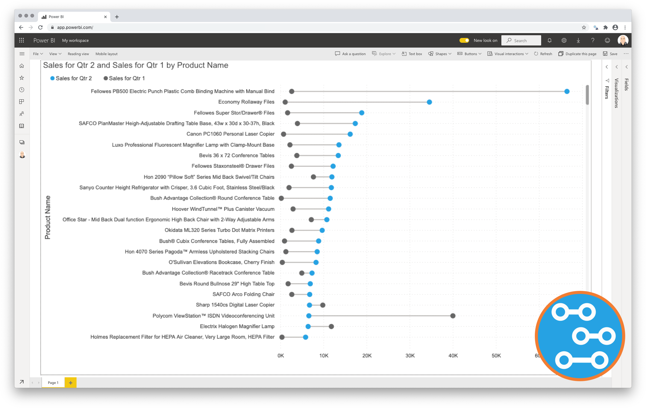
Data visualisations play a fundamental role in answering an important data question: ”How does result A compare to result B?”. The Dumbbell Bar Chart Premium is especially strong at showing this comparison. Typical examples of these questions are:
-
How does the sales of this month compare to the sales of last month?
-
Number of documents have we processed this year compared to 2020?
-
How does the number of planned-visitors compare to the number of unplanned-visitors at our locations?
Key in answering these kind of questions is explicitly visualising the difference between the two results. This is the strength of the Dumbbell Bar Chart for Power BI. Showing both the values and the difference between them.

Key features of the Dumbbell Bar Chart Premium
- Format the objects: Each of the data point objects (dot and line) can be formatted by selecting a color and size;
- The Axis formatting options are in line with the options you know from the Power BI Clustered Column & Bar Charts, so no need to learn a new interface;
- Selection & Highlighting: Like in standard Power BI Charts you can make use of the Selection & Highlighting functions within the Dumbbell Bar Chart;
- Context menu: Like in standard Power BI Charts you have access to the context menu to Include/Exclude data points;
- Full tooltip support: Besides the default Tooltip behaviour (show the value of the element you hover) you can also add additional feeds to the tooltip;
- Full Bookmark support: like any of the standard visuals the Dumbbell Bar Chart supports Bookmarks.
Watch the video tutorial of the Dumbbell Bart Chart for Power BI HERE. Do you want to try the Dumbbell Bart Chart yourself? Download it from the Microsoft AppSource for free.

Mark Wilcock –
The dumbbell chart is so useful it should be in the standard palette
I find the dumbbell bar chart so useful that I regard it as missing from the standard palette. Dumbbells plots are very popular – for example, the FT and Economist often use these. They are useful since they show both the starting point, ending point and progress made is a visually intuitive way. Until now it has not been possible to achieve this with Power BI – the best we could do was to use a clustered bar which did not give the same insight to readers. The chart is fully featured