

Description
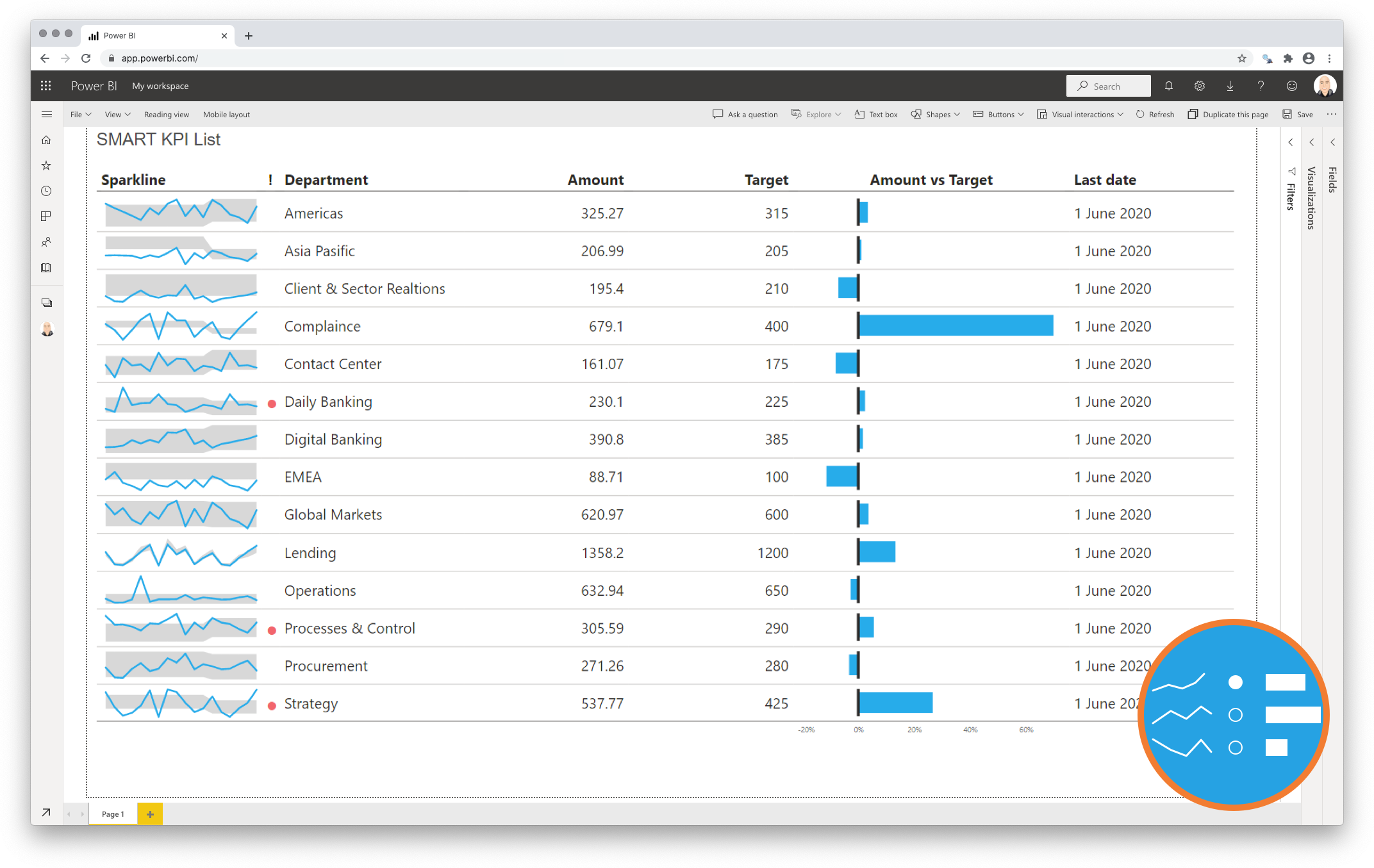
One of the principal goals of any dashboard is to inform its users by creating an overview of multiple key performance indicators (KPIs). A good dashboard shows all relevant KPIs in a single screen. We need a compact and effective way to display them. The SMART KPI List for Power BI Premium is created specifically for this purpose.
The S.M.A.R.T framework is often applied as a guide in the setting objectives. Here we use this acronym to describe this visual:
-
Specific
A specific dashboard needs to display all important indicators in one single overview. We need to surround the indicator with sufficient context. Measures that need our immediate attention can be highlighted. This is done with a red dot next to the sparkline; -
Measurable
A single value is a weak indicator of performance. This can be improved when you provide more context. A sparkline shows you the trend to determine if you are moving towards your goal. You can visualize the distance from your goal by including a target value. You can even show the difference between the current value and the target. This is done in a deviation chart (as shown in the example below); -
Achievable
The reader can compare the actual results with the target. This allows the reader to compare the performance of multiple KPI’s in one single overview. -
Relevant
The sparkline bandwidth displays the range of acceptable results. This helps the user to identify “normal” and “abnormal” results from the past. -
Time-bound
The sparkline provides the required historical context to each indicator. This strengthens the performance indicator in its role to manage performance.
Key features of the SMART KPI List for Power BI Premium
-
A comprehensive overview of your KPI’s: Create a clear overview of your KPIs in the right context to tell the complete story. No more messing around with separate tables, line charts and bar charts;
-
Format the objects: Each of the columns can be formatted individually. Additionally, for the sparkline and bars you can change basic settings like the used colours;
-
The formatting options are similar to the options you know from standard Power BI charts, so no need to learn a new interface;
-
Selection & Highlighting: Like in standard Power BI Charts you can make use of the Selection & Highlighting functions within the SMART KPI List for Power BI;
-
Context menu: Like in standard Power BI Charts you have access to the context menu to Include/Exclude data points;
-
Full tooltip support: Besides the default Tooltip behaviour (show the value of the element you hover) you can also add additional feeds to the tooltip.
-
Full Bookmark support: like any of the standard visuals the SMART KPI List for Power BI supports Bookmarks.
Watch the video tutorial of the SMART KPI List HERE. Do you want to try the SMART KPI List yourself? Download it from the Microsoft AppSource for free.


Suresh Kumar –
Hi This Cool KPI card is very useful for showing multiple metrics one KPI, i really like it