Introduction: Power BI Gantt Chart with milestones

Powerful insight into your planning and milestone performance
The Gantt chart is an excellent tool to visualize your program and project schedules and task dependencies. In the basis, it is a bar chart with tasks or activities on the vertical axis. The horizontal bars show for each task/activity the period between the start and end date (or time). Another important feature of the Gantt chart is that icons can be used to represent milestones: important moments within your project timeline.
The Power Gantt Chart for Power BI allows you to review both tasks/activities and milestones right in your Power BI reports. The Power Gantt Chart supports unlimited number of task/activities, hierarchy levels and milestones.
Key features of the Power Gantt Chart are:
- Excellent visualization of your program and project schedules: Get a high level overview at first, but dive into details using the collapse/expand buttons. Zoom and scroll into specific periods using the zoom slider;
- Progress bars: To indicate the progress and status of individual tasks;
- Unlimited number of tasks, hierarchy levels and milestones: Add as many items as you like to your chart, so you’ll never have to omit any details to your chart;
- Highly customisable: Add or remove columns, change colors of bars based on your own criteria, or change the date granularity;
- Formatting options: In line with the options you know from the Power BI Line Chart, so no need to learn a new interface. And of course, theme colors and settings are supported;
- Improved Tooltip support: Create independent tooltips for tasks and for milestones to show exactly the data you want.
How to use: Build visual
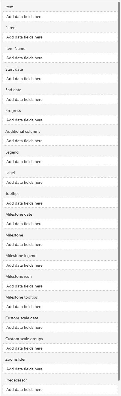
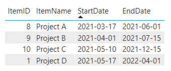
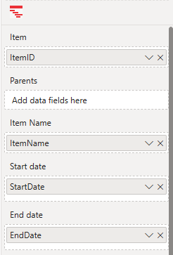
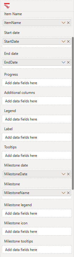
The large number of fields allows you to customize the Power Gantt Chart to exactly suit your needs. However, you don’t need to include them all to get started using the chart. At minimum, you need to specify four of the first five fields: Item, Item Name, Start date and End date. All other fields are optional. The following table shows example values of these fields and the resulting Power Gantt Chart.
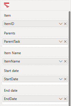
- Item: each of the rows (projects/phases/tasks/etc.) you want to include requires a unique identifier. The field added here contains the unique identifier.
- Parents: to create a hierarchy of items, add a field here that refers to the unique identifier (ID) of the corresponding parent item. Rows where the parent value is NULL are treated as top-level items in the hierarchy. Child items will appear nested under their corresponding parent. You can define up to 10 levels by adding multiple parent fields.
- Item Name: add a field here with the descriptive name of each row.
- Start date: the field you add here will determine where the bar will start. Support for two date-fields (actual, baseline). Make sure this field is a Date or Date/Time field.
- End date: the field you add here will determine where the bar will end. Support for two date-fields (actual, baseline). Make sure this field is a Date or Date/Time field.
- Progress: each row in the Power Gantt can display the progress expressed as a fraction (value between 0 and 1) or as a percentage. Include the field containing the progress here to show the progress bar. Please note, make sure to set the summarization of this column to “Don’t summarize”. This prevents items being dropped in case no progress is entered.
- Additional columns: if needed you can show additional columns on the Power Gantt. These additional columns will be placed between the Item name and the bars. For example, add the owner, the duration of a task or hyperlinks to your overview here.
- Legend: items can be grouped into categories. If you add a field containing these categories here each of the bars will be colored accordingly. At the top of the Power Gantt a legend will map each of the categories to a color.
- Label: add a field here to show labels in your task/ project bars.
- Tooltips: the fields added here will show in the tooltip when the user hovers over a specific bar.
- Milestone date: the field added here determines the position of the Milestone marker on the Power Gantt.
- Milestone: add one or two field(s) here containing a descriptive label of the milestone.
- Milestone legend: milestones can be grouped into categories. If you add a field containing these categories here each of the Milestone markers will be colored accordingly. At the top of the Power Gantt a legend will map each of the milestone categories to a color.
- Milestone icon: Add a category to show image URLs for SVG, PNG, JPG, and GIF formats. Icons need to be provided as Base64-encoded images, including the necessary Meta-Data header. SVG images can use
currentColorfor fill and border, allowing the icons to dynamically adapt to milestone color settings. - Milestone tooltips: the fields added here will show in the tooltip when the user hovers over a specific milestone marker.
- Custom scale date and Custom scale groups: if these fields are left empty, the Year-Month date scale will show up by default. Use the custom scale date and scale groups fields to add a custom date scale with custom groups. The aggregated hierarchy levels will show the custom hierarchy: anything that groups dates into a grouping, like the weeks of the year, ISO week numbers, Fiscal period, etc. You can add up to 4 categories to the Custom scale groups. Make sure to set to “Don’t summarize” and “Show items with no data”. If you have categories in the Custom scale groups field but no category in the Custom scale date, it will default to a standard Year-Month date scale. See Video Tutorial: how to add a custom date scale.
- Zoomslider: set dynamically the timeframe shown by default in the zoomslider. Support for two date-fields (start, end). Make sure this field is a Date or Date/Time field.
- Predecessor: add Finish-to start (FS) dependencies in your PowerGantt. You can add up to 10 predecessor categories, allowing multiple predecessor lines.
How to use: Format visual
The Visual specific settings contain cards with formatting properties broken up into subcategories that allow you to change the default behavior of the visual:
- License: here you can enter your PREMIUM license information to activate the visual with a premium license. These fields are not used for the PER USER license.
- Grid: these settings allow you to change the formatting of the grid content (excluding the column headers). The available formatting subcategories are:
- Vertical gridlines: here you can turn on/off the vertical gridlines and set Color and Width. You can also enable Show on date scale to add gridlines to the date scale and change the Style to solid, dotted or dashed.
- Horizontal gridlines: turn on/off the horizontal gridlines and set the gridline Color and Width.
- Rows: change the Height and Padding between rows.
- Outline: set the Color and Width of the outline.
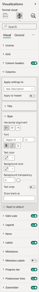
- Style: change the Horizontal alignment (Left, Center Right), Vertical alignment (Top, Middle, Bottom), Font family, text Size, emphasized text (Bold, Italic, Underline) and Color of the items in the grid (Item and Additional columns).
- Column headers: headers can be switched off/on and customized. Available subcategories:
- Outline: add an outline (None, Top only, Bottom only, Left only, Right only, Top + bottom, Left + right, Frame).
- Style: set the Font family, text Size, emphasized text (Bold, Italic, Underline), Color and Background Color of the column headers. Here you can also enable Text wrap.
- Columns: format each column in the grid. Options available:
- Apply settings to: select the column you want to format from the drop-down menu. Enable the option Apply to header to apply also the settings to the column header.
- Title: rename here the column names.
- Style: change the Horizontal alignment (Left, Center Right), Font family, text Size, emphasized text (Bold, Italic, Underline), Text color, Background color and Background transparency of the columns. Here you can also enable Text wrap. Enter custom text in the Show blank as field to define how blank (null) values are displayed.
- Date scale: can be to switched off/on and customized. Available subcategories:
- Type: here you can change the type of date scale (Year, Year-Quarter, Year-Month, Year-Week, Year-Iso-Week). This option is available in standard date scale types. If you have a custom date scale with categories in the fields Custom scale date and Custom scale groups, the Show only groups in custom scale option will show up instead. Month offset option where you can set an offset for fiscal years. Here you can also enable the Overflow text.
- Range: set here the Start and End dates to view a date range.
- Style: set the Font family, text Size and emphasized text (Bold, Italic, Underline). The Color and Background color of the Date scale is set in the Column headers.
- Today line: show/hide the today line by switching it off/on. Change the Style (solid, dotted, dashed), Color and Width of the line.
- Legend: show/hide the legend by clicking the toggle on/off. Available subcategories:
- Position: here you can set the position of the legend to Top, Bottom, Left, Right, Top Center, Bottom Center, Left Center, Right Center.
- Title: switch off/on the legend title and rename the Legend Name.
- Style: change the Font family, text Size, emphasized text (Bold, Italic, Underline) and Color of the legend.
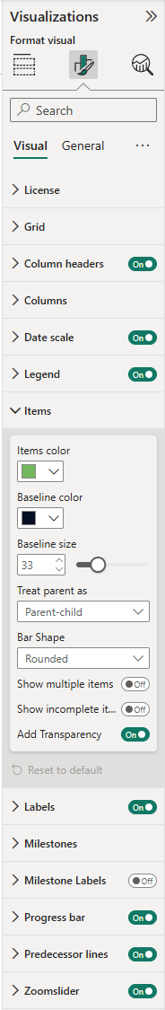
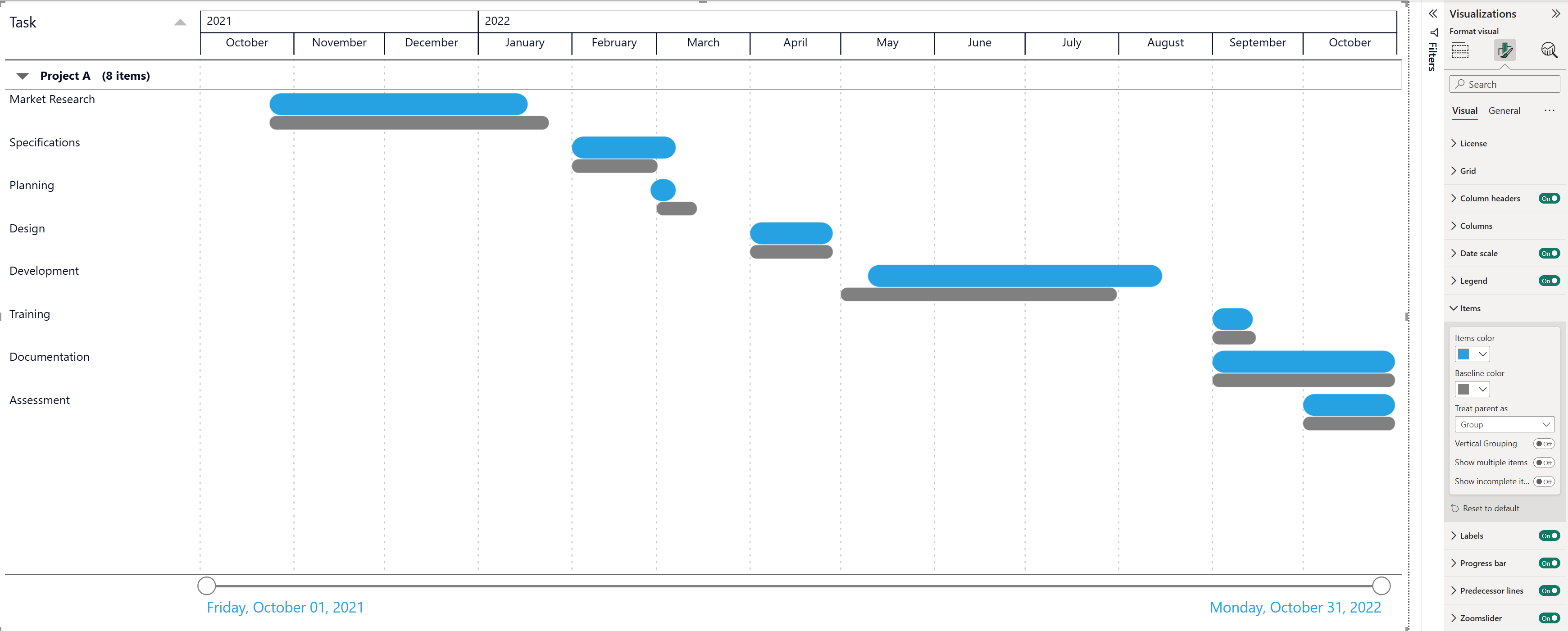
- Items: here you can customize the appearance of the items (bars) and baselines. If you have added a category to the Legend field, you can assign colors to each category specified in the Legend. If you have added category to the Parents field, the option Treat parent as is set to Parent-Child by default. You can change this to Group to display tasks grouped instead. Depending on your configuration, the following options are available:
- Items color: change the colors of the items (bars). By default, your report theme color is applied.
- Baseline color: if you add a Baseline to the Start and End date fields, you can modify the color of the baseline bar (default is black).
- Baseline size: by default 33%. Set here the relative height of baseline bars.
- Bar Shape: by default Rounded. Set here the shape of the Item and Baseline bars to Rounded or Squared.
- Parent-child or Group: when a parent category is added to the Parents field, you can choose whether to treat the hierarchy as Parent-Child or Group.
- Vertical Grouping: available when Treat parent as is set to Group.
- Show multiple items: enable this option to display multiple items or tasks that overlap in a single row.
- Transparency: available when Show multiple items is enabled (default is 60). Adjusting transparency helps users distinguish overlapping items by increasing or decreasing opacity.
- Show incomplete items: by default, items without a valid start/end date are filtered out. Enable this option if you want to display incomplete parent-child or group items to preserve hierarchy visibility.
- Add Transparency: available when Parent-child is selected. Enabled by default, this makes child items appear lighter than parent items.
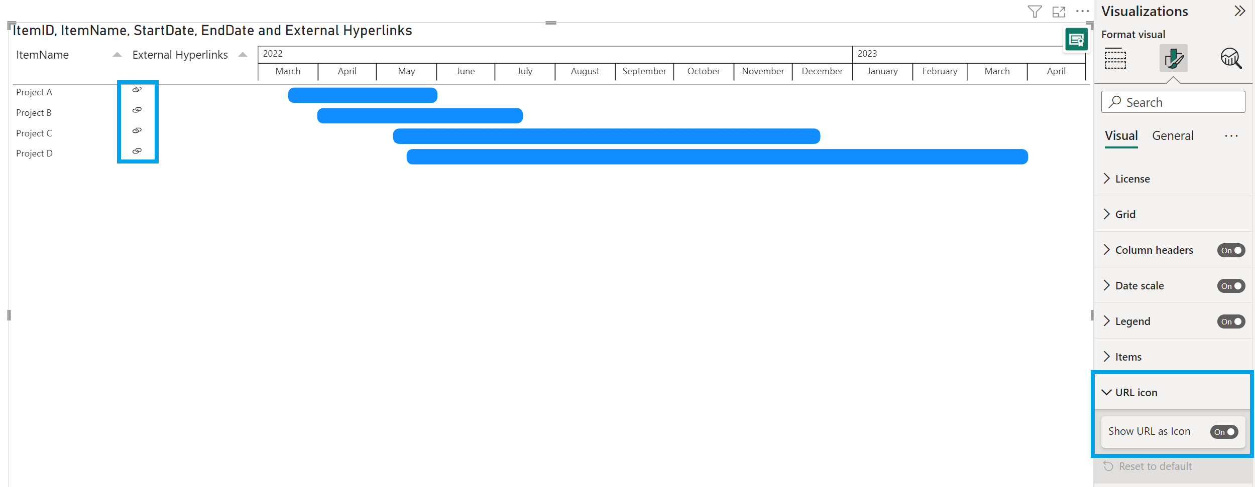
- URL icon: this option is only available if you have formatted the URLs as hyperlinks in Power BI Desktop and if you drag and drop the data field to the Additional columns in the Build visual pane. Here you can set the Show URL as Icon option off.
- Labels: if you add labels to your task/project bars, here you can show/hide all labels by clicking the toggle on/off. Available options: Item Column set this option off to hide the Item Names in front of the Item bars. Enable Overflow text or change the Position (Outside start, Inside start, Center, Inside end, Outside end) of the labels. You can also set the Style (Font family and Size, Bold, Italic, Underline and Font Color) of the labels. Show blank as option to display (Blank) labels as a specific value or text. The (Blank) labels and tooltips values for the items mapped on the label field will be replaced by the specified value.
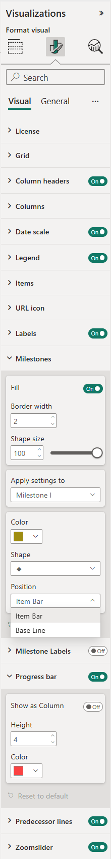
- Milestones: this option is only available if you add a data field to the Milestone Date. Here you can switch the Fill of the milestone shapes off/on, increase/ decrease the Border width, change the Color, and the Shape (circle, plus, diamond, rectangle, vertical bar, star, square, rotated square or triangle), change the Position of the milestones from the Item Bar to the Base Line and Shape size. If you also add a category to the Milestone Legend field, you have the following formatting options:
- Switch the Fill of the milestone shapes in the legend and grid off/on
- Increase/ decrease the Border width to set the width of the milestone shapes in the grid.
- Shape size increase/ decrease this setting to make the shapes or custom icons larger or smaller.
- Apply settings to: select the milestone you want to format from the drop-down menu and change the Color, Shape and Position of the milestones.
- Milestone Labels: available when you add a Milestone Date. By default off, if you enable it, the label will be placed above the milestone shape. You can show the milestone dates or the values for the items mapped on the Milestone field. Formatting options: Overflow text, Apply settings to (available when you add a second category to the Milestone), Position (Top left, Top, Top right, Left, Right, Bottom left, Bottom, Bottom right), Show background. Style (Font family, Size, Bold, Italic, Underline and Font Color). The multiple milestone shape will not get a milestone label.
- Progress bar: add a category to the Progress field to see a progress bar within the task/project bars. Change here the Height (thickness) and Color of the progress bar. You can also enable the option Show as Column to take the progress bar outside the Item, and have it as a separate column. If this option is on, you will be able to change the Bar Shape (Rounded, Squared), Border color and Color of the ‘progress column’. The progress bar can be also switched off/on.
- Predecessor lines: control how predecessor lines are displayed in your visual: Toggle lines On or Off. Adjust the thickness of the predecessor lines in the Stroke width. Choose a Color. In the Line style, select Dashed (default), Solid, or Dotted. Use the Opacity slider control to adjust the transparency of the predecessor lines for better readability.
- Zoomslider: helps you to easily examine a smaller range of the date/time in the PowerGantt chart without having to use a filter. The zoomslider is added on the chart’s x-axis and can be used for horizontal scrolling. Click and drag endpoints on sliders to adjust the dimensions of the chart, slide both endpoints toward the center. The closer the two endpoints are to each other, the more you zoom in to display shorter, finer segments. Click and hold down the left mouse button on the center section of the zoom bar and then scroll left or right to a particular point. Click on the date label to display and select from the Calendar instead. The zoomslider can also be switched off/on. Available formatting subcategories:
- Color: to change the color of the zoomslider (endpoints and line).
- Style: to change the Font family, text Size, emphasized text (Bold, Italic, Underline) and Font color of the zoomslider date labels.
The General settings contain cards that affect the visual container and are consistent across all visual types. Here you can also customize the general Title and Tooltips.
Try it yourself! Experience the Power Gantt Chart by trying it out for free. Click the button below to download the visual.
How to use: Examples
In this section you’ll find a couple of examples to get you started.
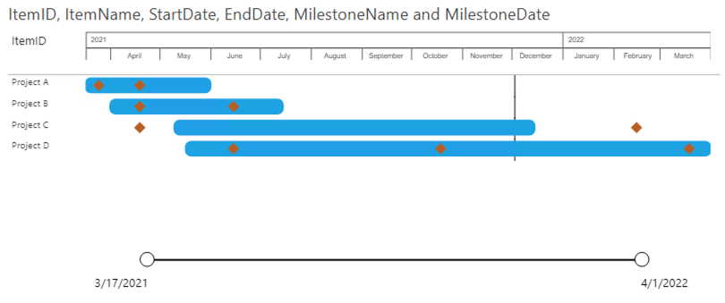
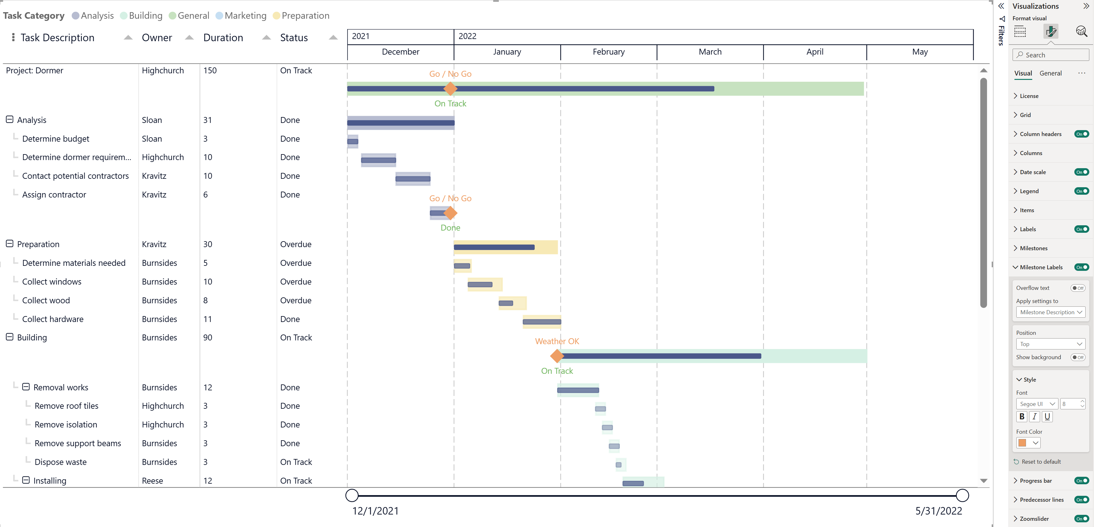
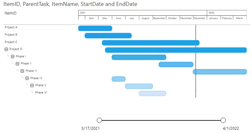
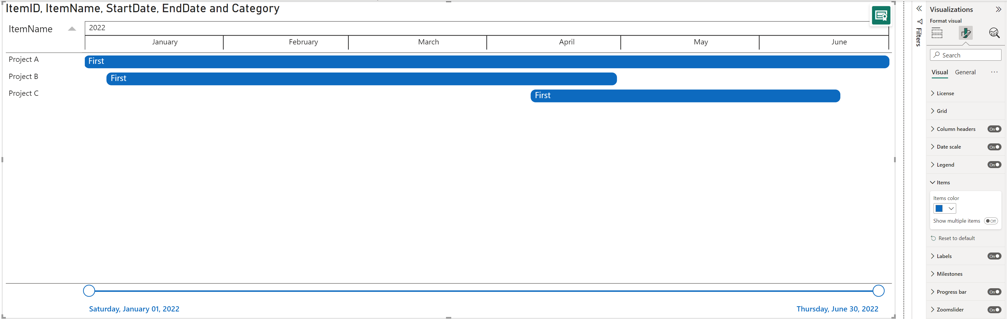
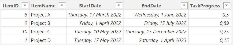
1: Only items
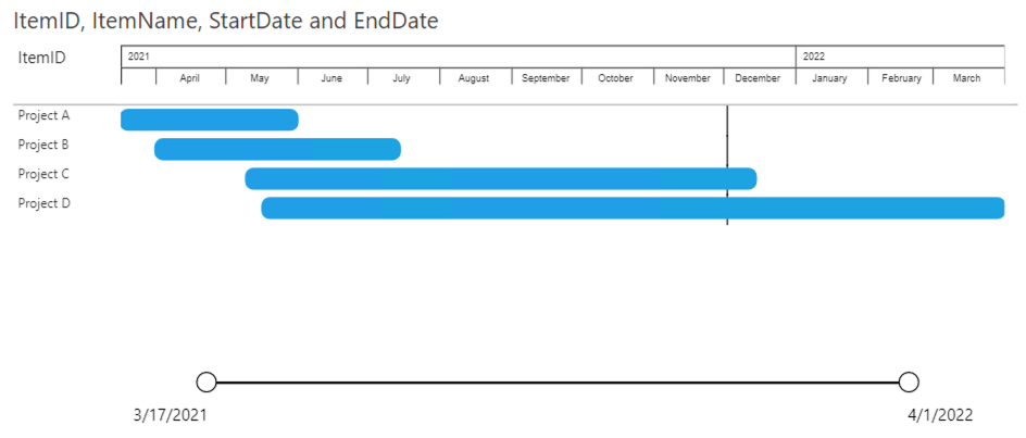
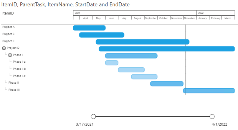
Based on these four fields the Power Gantt will display the 4 projects (A, B, C and D) as you can see above. Each of the items (here Projects) has a bar from the start date until the end date. The Zoomslider at the bottom allows you to narrow the time period shown. This can be done by dragging one of the round date markers horizontally towards the opposite marker.
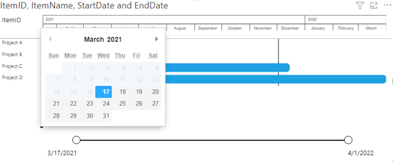
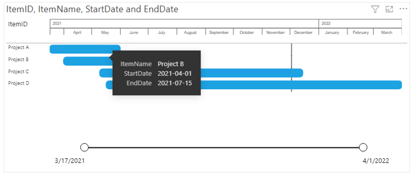
Selections work on the entire row. You can select the row by clicking on the bar or any of the fields (item name or additional columns) in the PowerGantt chart.
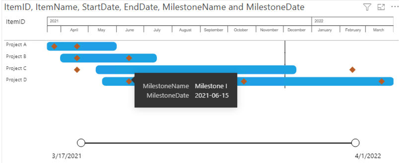
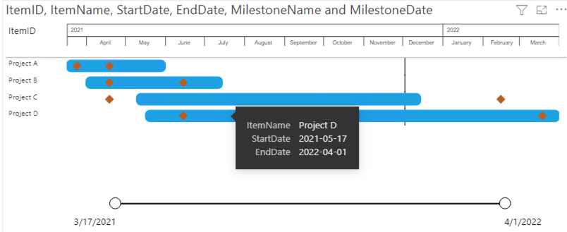
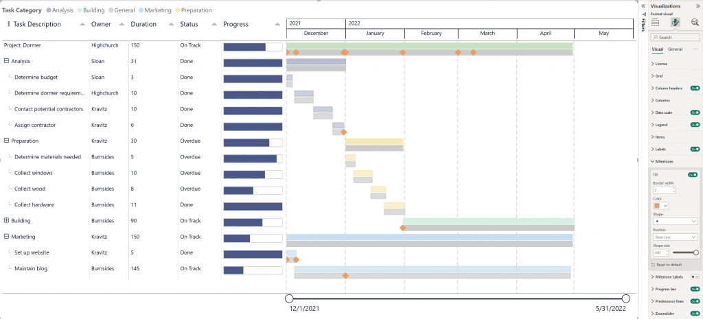
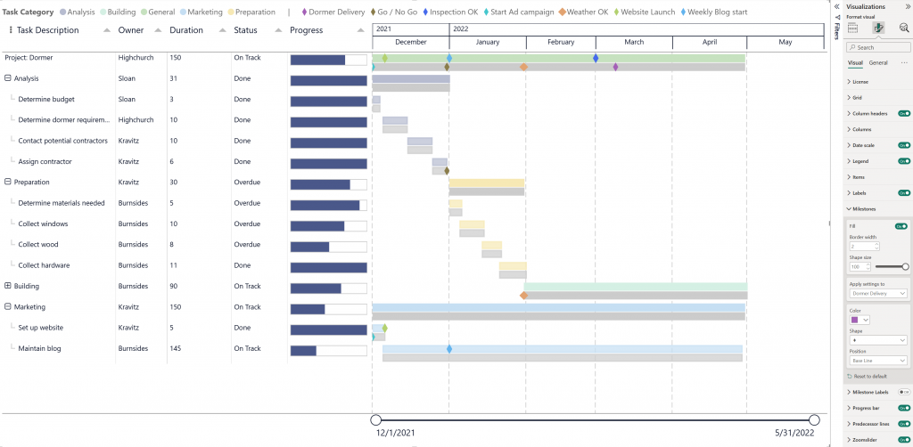
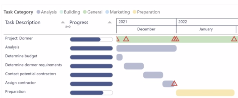
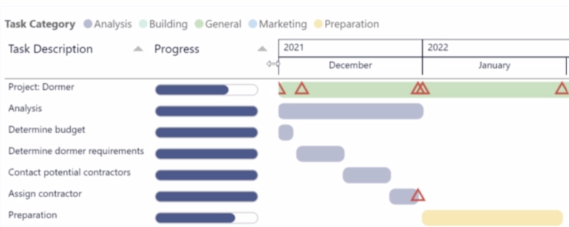
2: Items & milestones
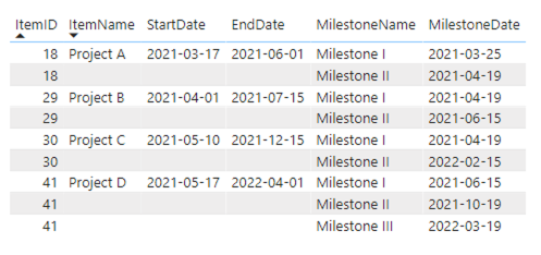
In this second example we’ll add the milestones to our data. To make sure there are no limitations to the number of milestones you can add per item you need to include them as shown in the table above. The first milestone can be added as a column to the item. All subsequent milestones need to be added as additional rows with the same ItemID, while the rest of the row remains empty.
Note: in case an ItemID exists multiple times and has multiple Start dates, then only task with the oldest Start date is shown. To prevent this situation, make sure to only enter data to the ItemID column in rows intended for the milestones. Alternatively, duplicate these rows.
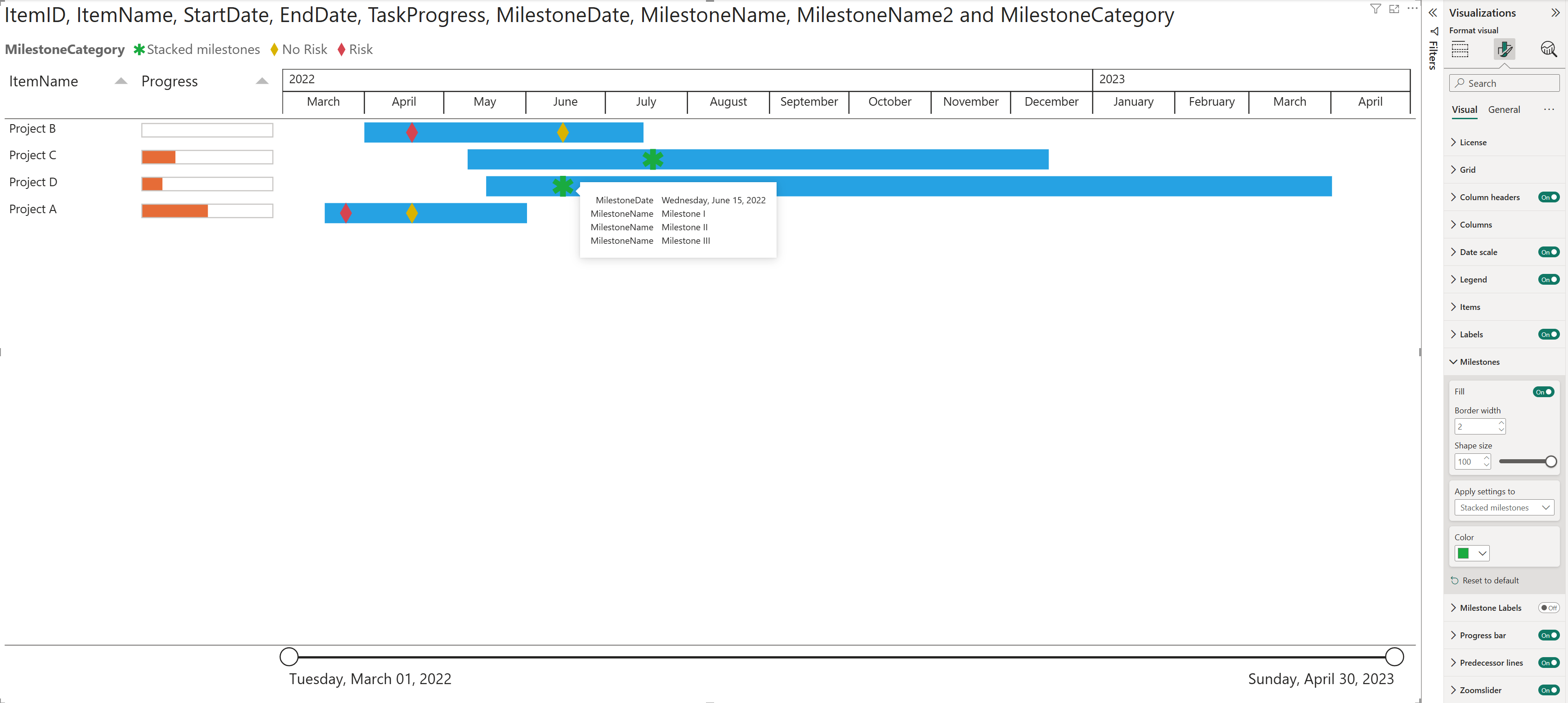
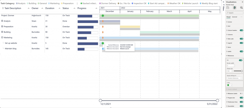
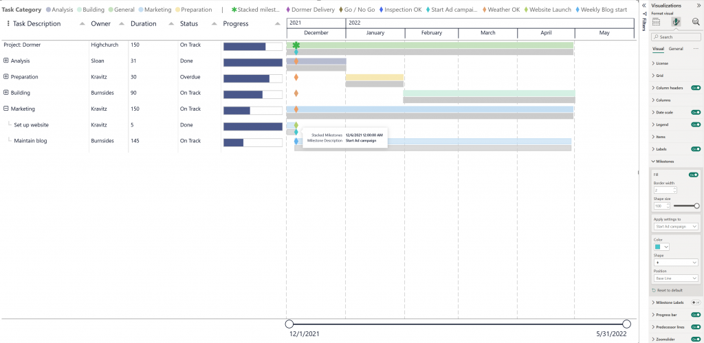
2.1: Showing stacked milestones
Stacked milestones represented by an asterisk “✱” will show up in the bars and in the legend when two or more milestones are finishing together and have the same completion date. The asterisk symbol will help you to quickly identify the items/ projects that have several milestones/ activities ending in the same date. When hovering over the Stacked milestones you get a tooltip where you can see the multiple milestones. You can format the color of the Stacked milestones and both the color and shape of the Milestones.
2.2: Add a secondary milestone label
Add a secondary value to the Milestone field in your PowerGantt and enable the Milestone Labels in the Format pane. This lets you display two distinct labels for each milestone, providing more context and flexibility for your data storytelling.
The secondary milestone label is rendered with a separate label, positioned by default at the bottom of the milestone marker. You can customize the appearance of each label individually — both the primary and secondary — by adjusting their position, font style, size, color, and more.
These customizations can be managed under the “Apply settings to” option in the Format pane, allowing you to style each label type independently to best suit your report’s design.
2.3: Change Milestone Position: Item Bar or Base Line
By default, milestones are displayed on the Item Bar. Users can move the milestones to display on the Base Line bar instead.
Change Milestone Position
- Open the Format visual pane and expand the Milestones card.
- Under Position, select either Item Bar (default) or Base Line.
If you add a category to the Milestone Legend, the Apply settings to dropdown lets you target the position setting to a specific category, allowing the different categories to appear on either the Item Bar or the Base Line bar.
When a Milestone Legend is added and you have Stacked milestones, the Position option is not available. To move stacked milestones, first reposition each category individually using Apply settings to. This will split the milestones across bars by category, at which point the stacked icon will no longer be displayed, since the icons are no longer on the same bar. This behavior also offers a practical way to break up stacked milestones when needed.
Note that the result depends on how many milestones are stacked:
2 stacked milestones: moving one category to a different bar fully separates the icons, and each milestone displays its own category icon.
3 or more stacked milestones: only the first milestone moved will display its own category icon. The remaining milestones will continue to show the stacked milestone icon (green asterisk ✱), as there are still multiple milestones on the same bar.
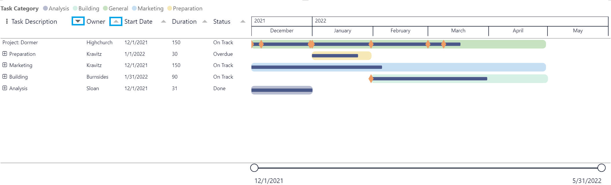
3: Items with hierarchy
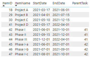
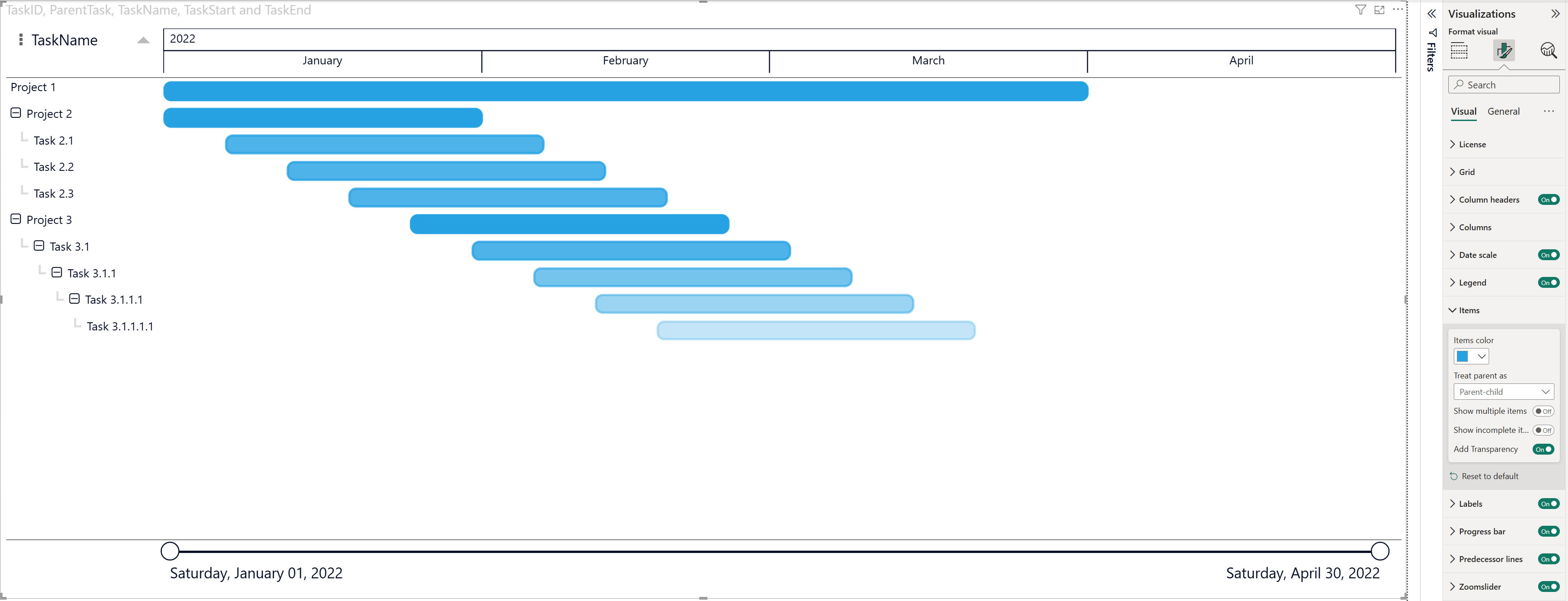
In this third example we’ll create an item hierarchy. The most flexible way to include hierarchy is the use of a so-called parent-child relation. To achieve this, we’ll create a column in which a child refers to its parent. If there is no parent specified the item will be displayed on the highest level. As you can see in the table above: items 18, 29, 30 and 41 have no value in the ParentTask column, so they will be placed at the highest level in the Power Gantt chart.
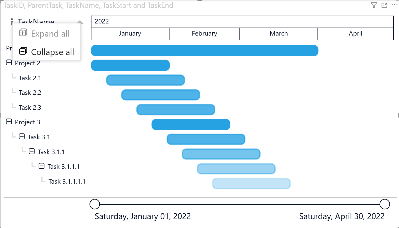
Expand and Collapse Items with Hierarchy
When a Parent field (for example ParentTask) is used, the visual supports hierarchical task structures. This allows users to easily expand or collapse parent items to show or hide their child tasks.
To expand or collapse: hover over the column header, click the three dots (⋮) menu, choose Expand all or Collapse all.
This functionality is useful when working with complex task hierarchies, such as projects containing multiple levels of subtasks.
Considerations and Limitations:
The Expand/ Collapse state is persisted in Power BI Desktop and in Power BI Service when using Edit mode.
In this mode, expanding or collapsing items will cause the visual to scroll back to the top if you are scrolled further down the hierarchy.
In Power BI Service in View mode, expanding or collapsing parent-child items does not reset the scroll position to the top.
3.1: Treat parent as Parent-child or Group
By selecting the appropriate Treat parent as setting, you can control whether the visual renders a true task hierarchy (Parent-child) or a simple categorical grouping (Group), depending on your reporting needs.
When you add a category to the Parents field well, the visual will default to a Parent-child relationship. If you instead want to organize tasks as a simple category grouping without a hierarchical expand/collapse structure, change Treat parent as to Group.
To configure a parent–child hierarchy, your dataset must contain:
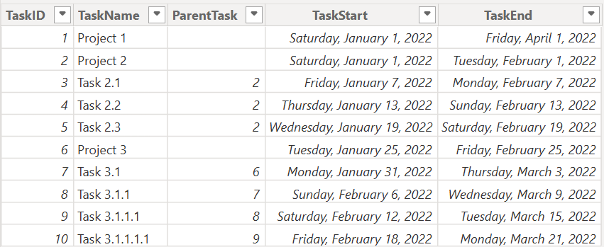
- TaskID – A unique identifier for each task. Assign this column to the Item field well.
- TaskName – The name displayed in the Gantt chart. Assign this to Item Name.
- ParentTask – The TaskID of the parent task (leave blank for top-level items). Assign this to the Parents field to enable the hierarchy.
- TaskStart – The start date of the task. Assign this to the Start Date field well.
- TaskEnd – The end date of the task. Assign this to the End Date field well.
In addition to Parent-child, the Power Gantt Chart also supports a simpler hierarchy model using Group. This option is ideal when you want to organize tasks by category (for example, by Project, Department, or Phase) without creating a true parent–child ID relationship.
To configure grouping, your dataset should contain:
- Project (or Category field) – The column used to group tasks (e.g., Project, Department, or Phase). Assign this field to the Parents field and set Treat parent as to Group in the Format pane.
- TaskID – A unique identifier for each task. Assign this column to the Item field.
- Task – The name displayed in the Gantt chart. Assign this column to Item Name.
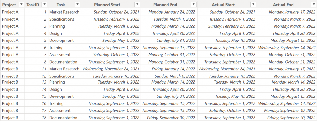
- Planned Start / Actual Start – The start date of the task. Assign this to the Start Date field.
- Planned End / Actual End – The end date of the task. Assign this to the End Date field.
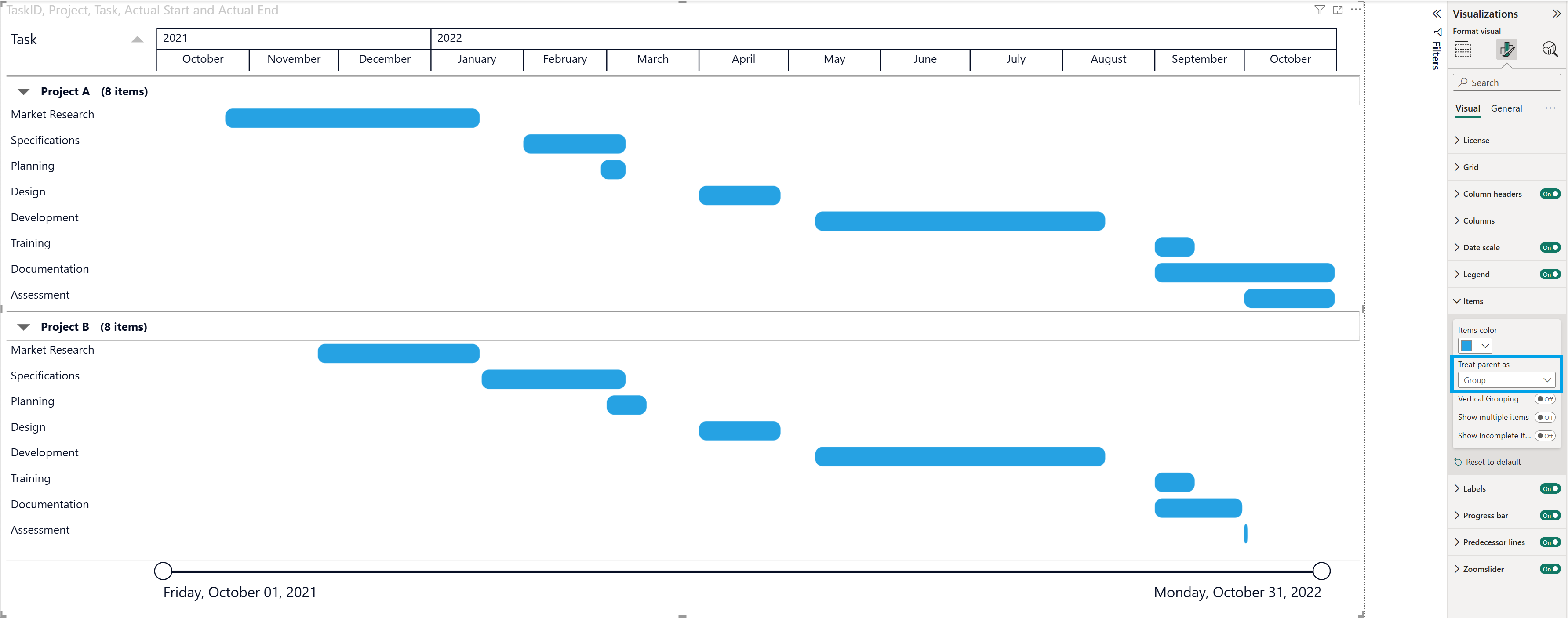
3.2: Vertical Grouping
When using Treat parent as Group, you can further control how grouped items are displayed by enabling Vertical Grouping in the Format pane → Items card.
Vertical Grouping visually separates groups by stacking them more clearly and adding spacing between group sections. This improves readability when you have multiple groups (for example, Project A and Project B) with several tasks in each group.
- Tasks are grouped here by Project.
- Each project appears as a collapsible group header.
- When Vertical Grouping is On, the groups are visually separated, making it easier to distinguish one project from another.
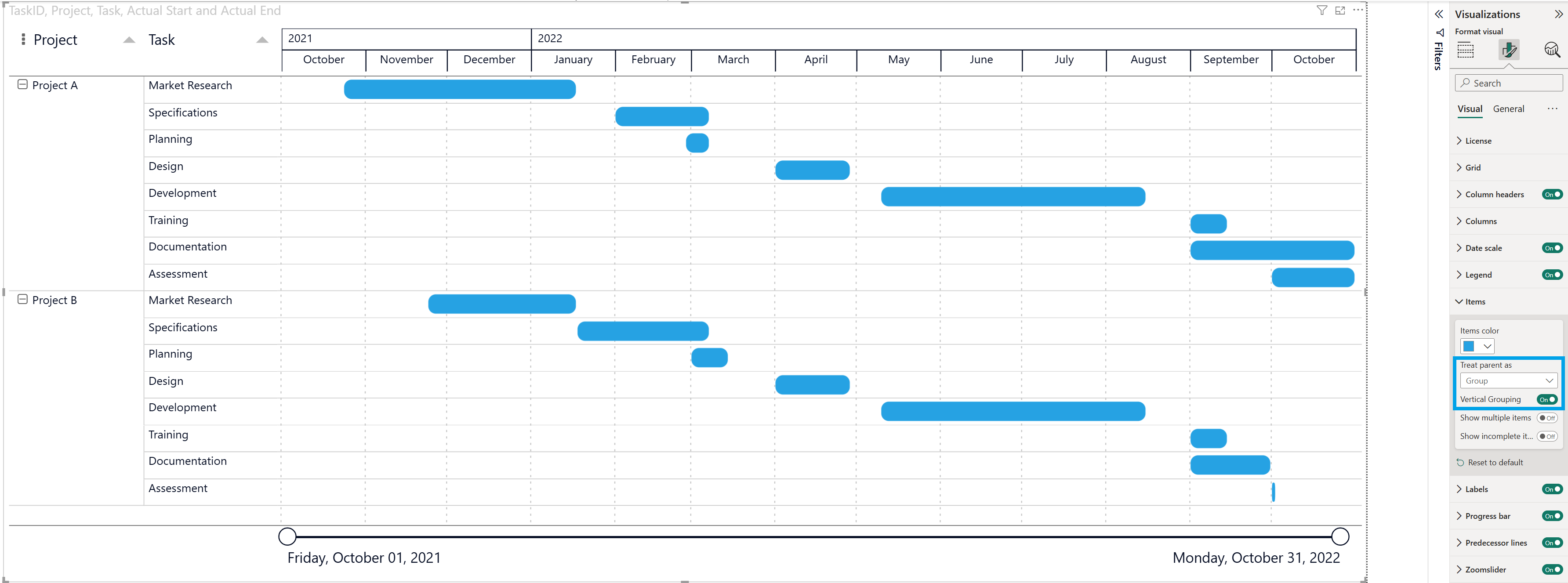
For this example the gridlines have been enabled (Format pane → Grid) to further enhance visual clarity and make the timeline easier to read.
3.3 Multiple Parent Levels
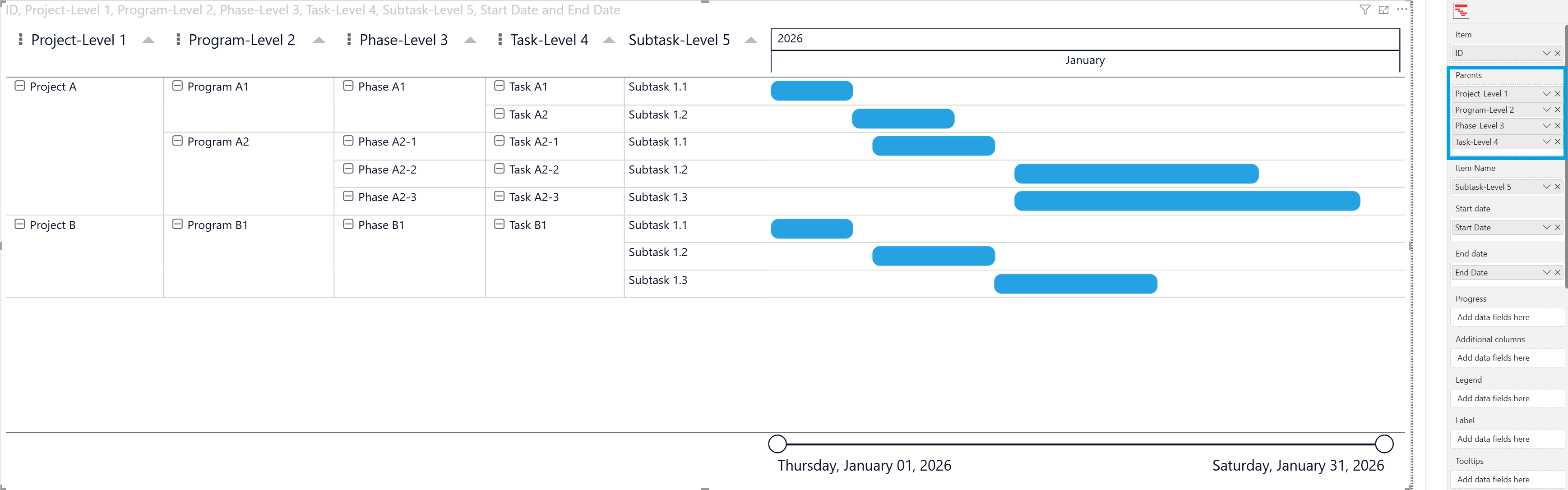
PowerGantt supports hierarchical timelines that allow you to organize work across multiple levels such as for example Project → Program → Phase → Task → Subtask.
Each row in the dataset should represent the lowest level item (for example, a subtask), while the parent columns define the hierarchy above it.
To support multiple hierarchy levels, the dataset should contain one column per level.
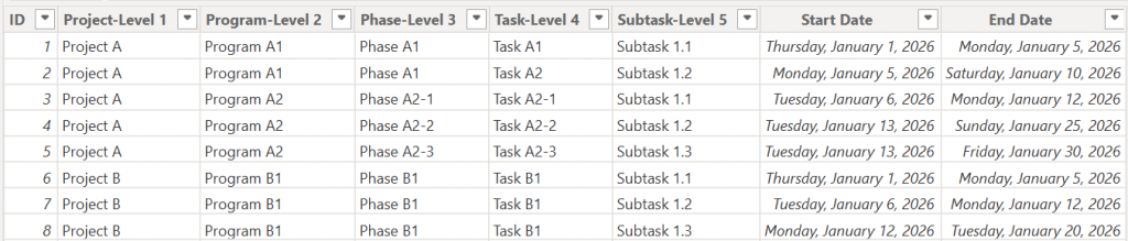
- ID – A unique identifier for each task. Assign this column to the Item field.
- Parents – Columns ordered from top to lowest hierarchy (e.g., Project, Program, Phase). Assign these to the Parents field. Supports up to 10 parent levels.
- Task – The name of the lowest-level item displayed in the chart. Assign it to the Item Name field. If empty, the ID value will be displayed instead.
- Start Date – The start date of the task. Assign this column to the Start Date field.
- End Date – The end date of the task. Assign this column to the End Date field.
Expand and Collapse Vertical Groups or Parent Levels
PowerGantt allows you to expand or collapse all vertical groups and parent levels. To expand or collapse: hover over the column header, click the three dots (⋮) menu, choose Expand all or Collapse all.
You can also expand/ collapse manually per row by clicking the + / − icons next to each parent item. This lets you expand or collapse individual items without affecting the rest of the structure.
When a group or top parent level is collapsed, the item bars are hidden.
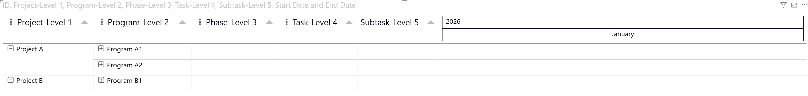
If you want to keep the bars visible even when levels are collapsed, you can enable the Show multiple items option under the Format pane → Items. This setting allows multiple tasks to remain visible within the same row when the top parent levels or vertical groups are collapsed.
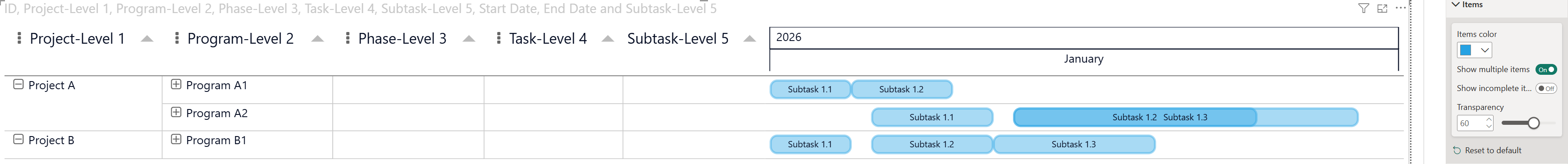
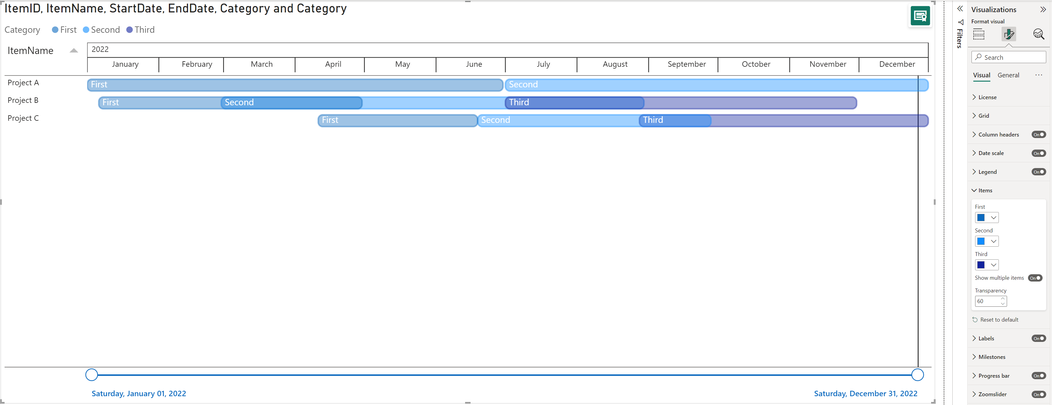
4: Show multiple items
By default the Show multiple items option is Off and the Gantt chart will show the first item from your dataset.
You can group multiple start and end dates to a single item and switch the Show multiple items option On, under Format your visual → Visual → Items.
If no category is set in the Legend but have multiple items (rows) under the same project with different start/ end dates, you will see different opacities of blue (standard color) with a default transparency of 60%. You can change the Items color in the palette and the Transparency by increasing the number for a lighter opacity or decreasing for a darker opacity.
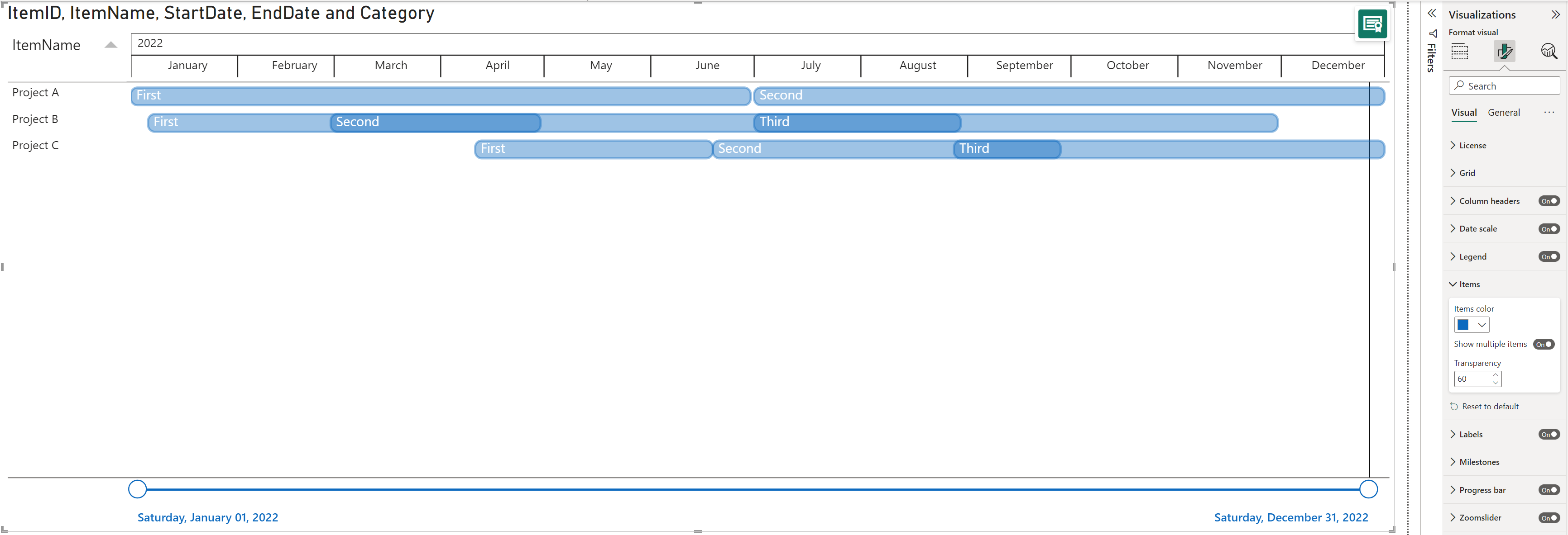
If a category is set in the Legend, you will get the categories you have added listed under the Items and you will be able to change the colors per item.
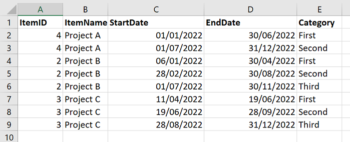
5: Add a Baseline
Use a baseline to compare your original timeline with the current timeline of a project. This will help you to identify which tasks performed on time or ahead of schedule and which ones got delayed.
To create a baseline, go to your table and add two columns, one with the Baseline start dates and another with the Baseline end dates.
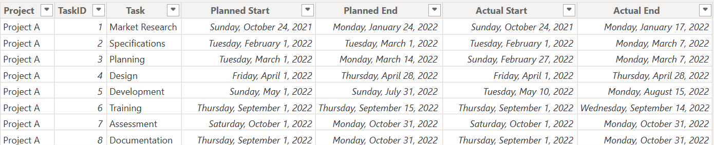
Then add the current start/ end date and then the baseline start/ end date categories from the Fields panel to the Start date and End date fields in the Visualizations panel.
The black bar below the active taskbar (in blue) represents your baseline. Move the cursor over the bars to see the actual and baseline dates in the tooltip.
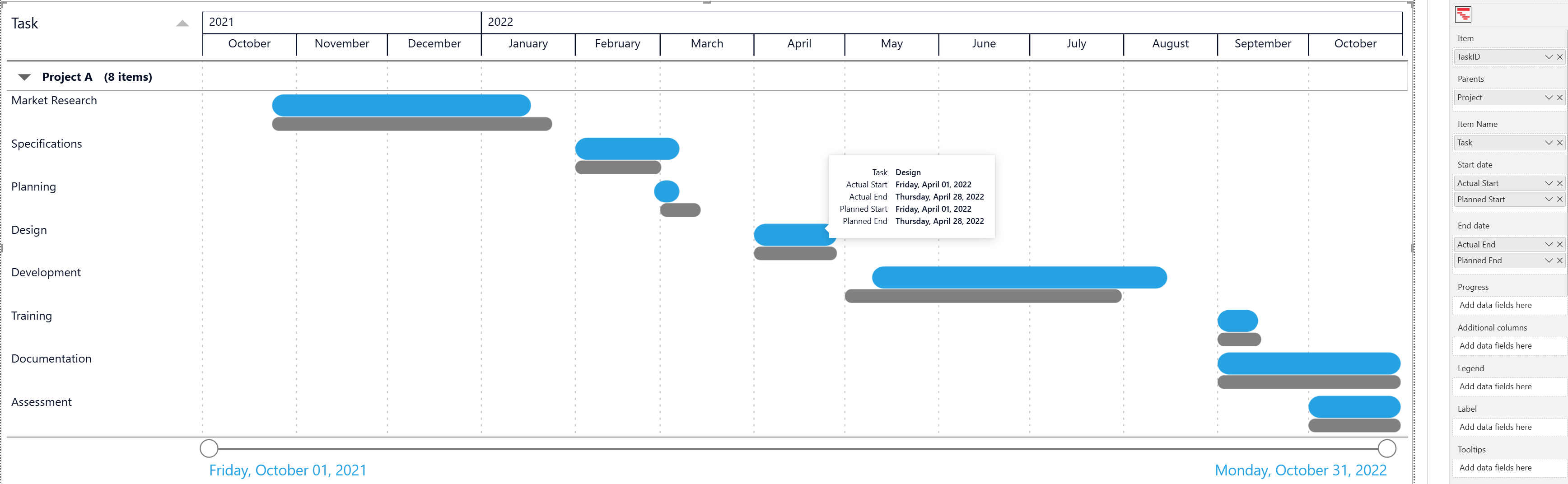
Go to the Items in the Format pane to change the Items color and Baseline color.
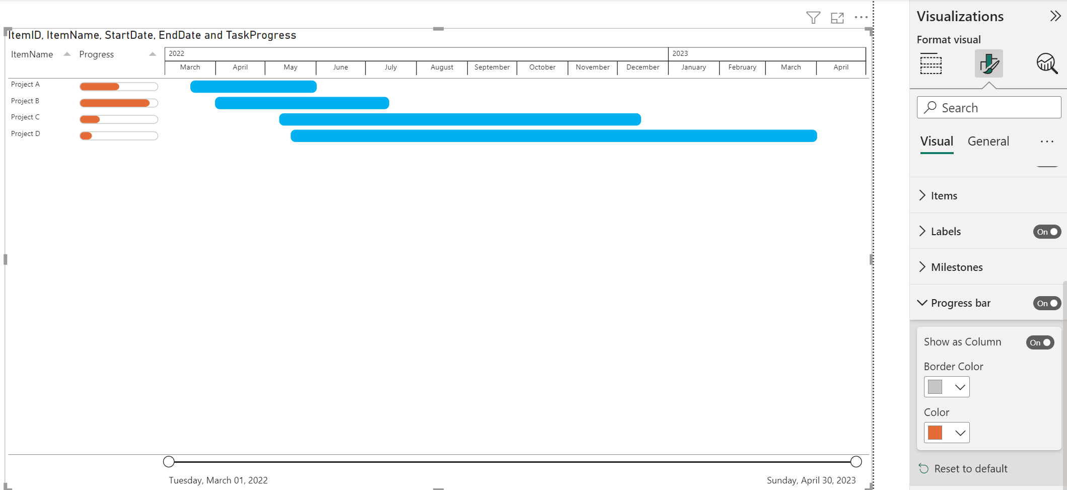
6: Show Progress as a bar or as a column
Add a progress bar to display how much of the planned activity or goal has been completed in your project. By default the progress bar will be drawn in the item/task bars. Change the Height and Color of the progress bar in the Progress card.
To set a progress bar, go to your table and add a column with the progress values.
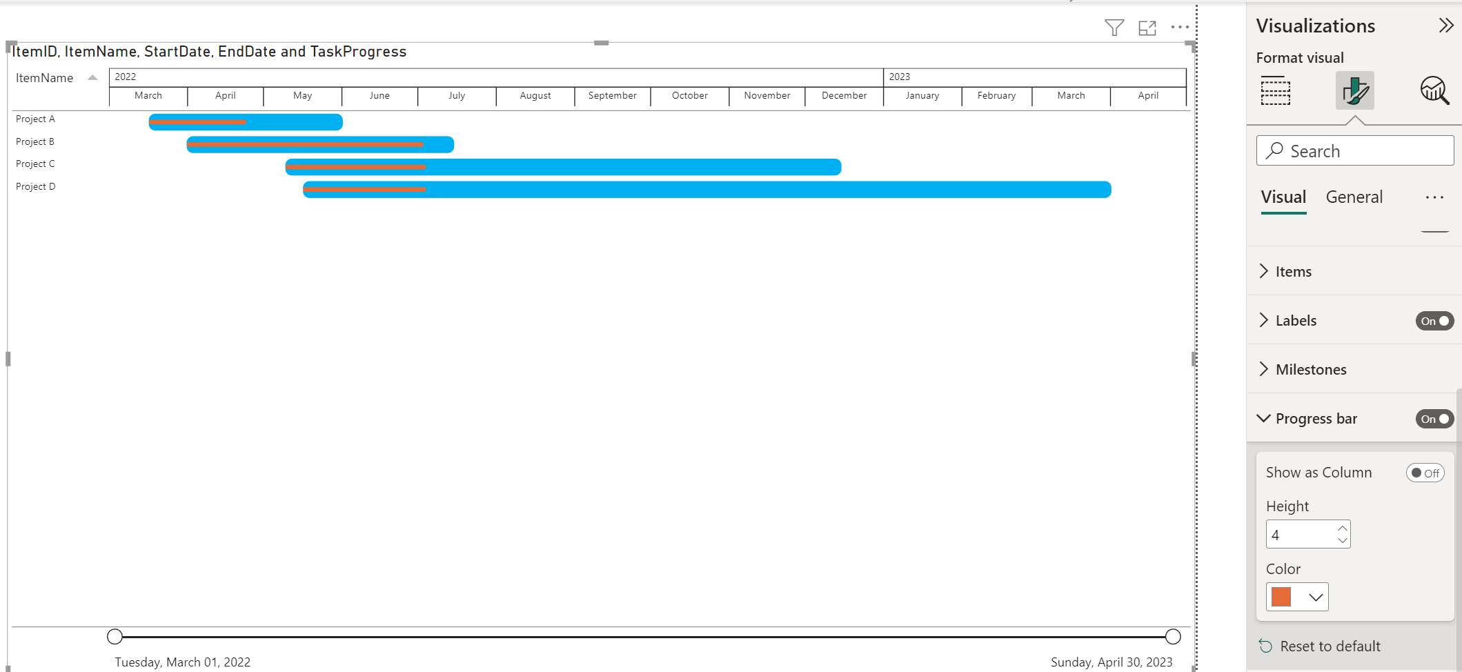
Enable the option Show as Column to take the progress bar outside the Item bars, and have the progress bars as a separate column. If this option is on, you will be able to set a Border color and Color.
7: Add hyperlinks (URLs)
Use Power BI Desktop to add hyperlinks (URLs) to a dataset. You can add those hyperlinks to your PowerGantt in either Power BI Desktop or the Power BI service. Then you can display the URL or icon as Additional columns. When report viewers select a link, it opens in another browser page.
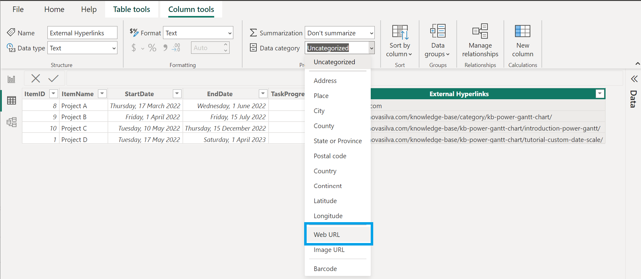
- Format the URL as hyperlinks in Power BI Desktop.
- In Power BI Desktop, if a field with a hyperlink doesn’t already exist in your dataset, add it as a custom column.
- In Data view, select the column.
- On the Column tools tab, select Data category → Web URL.
After you’ve formatted the URLs as hyperlinks, switch to Report view, click Refresh in the Home tab and add the field that you categorized as a Web URL to the Additional columns in the Build visual pane. By default, Show URL as Icon is enabled. If you don’t want to display a link icon, you can display the URL instead.
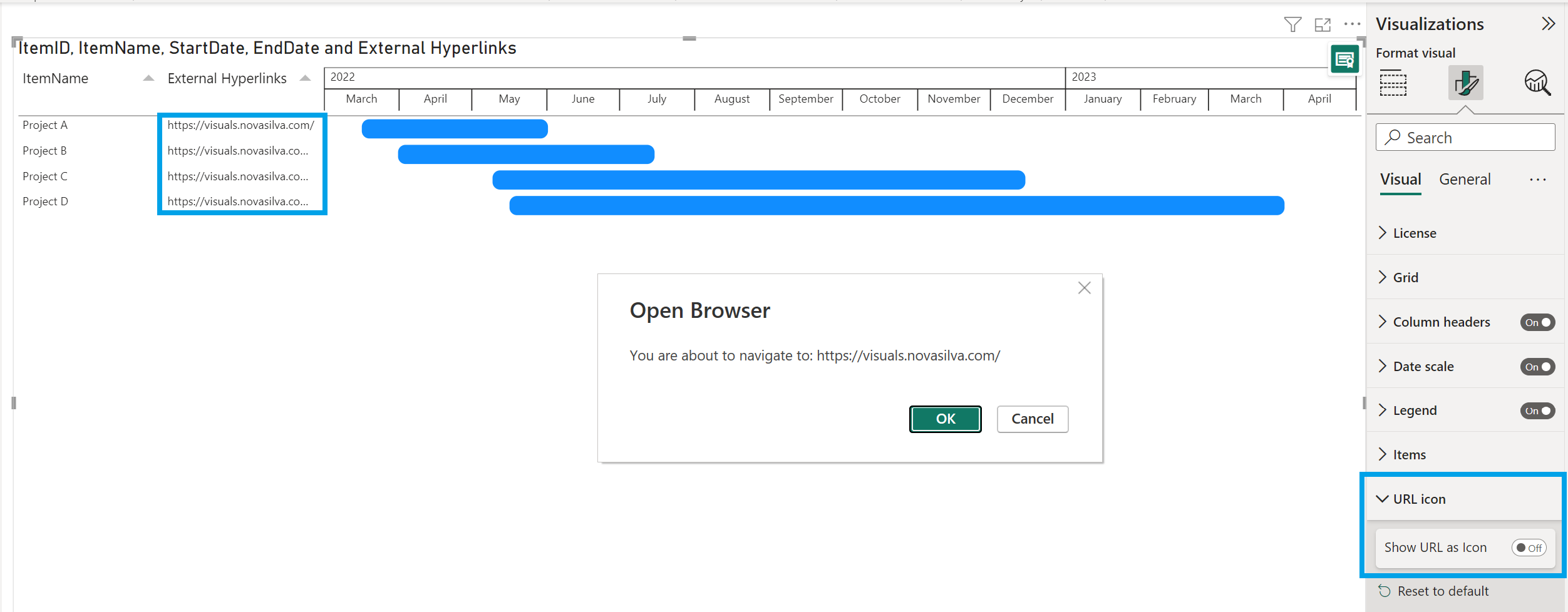
- Select the visual to make it active.
- Select the Format visual to open the Formatting tab.
- Under Visual → URL icon → Show URL as Icon, select Off.
When report viewers click on a URL link or icon, it opens in another browser page.
(Optional) Publish the report from Power BI Desktop to the Power BI service. When you open the report in the Power BI service, the hyperlinks work there, too.
8: Use the Zoomslider
Use the zoomslider to easily examine a smaller range of the date/time in the PowerGantt chart without having to use a filter. The zoomslider is added on the chart’s x-axis and can be used for horizontal scrolling.
- Click and drag endpoint(s) to adjust the dimensions of the chart.
- Slide both endpoints toward the center, the closer the two endpoints are to each other, the more you zoom in to display shorter, finer segments.
- Click and hold down the left mouse button on the center section of the zoom bar and then scroll left or right to a particular point.
- Click on the date label to display and select from the Calendar instead.
To hide the zoomslider, just go to the formatting pane and toggle off the switch. Here you can also customize the appearance, like the color of the zoomslider and the font, size and color of the date labels.
8.1: Set the timeframe dynamically in the Zoomslider
Add a start and/ or end date in the Zoomslider field. The PowerGantt will take these into account to set the start/ end position(s) of the zoomslider. These fields can be based on a calculation, so this makes it dynamic.
The visual will be refreshed and the zoomslider will be reset to your setting when
- refreshing
- changing a filter
- navigating to a page or navigating through the PowerGantt hierarchy
Considerations and Limitations:
The zoomslider start and/ or end date(s) will be taken from the first data-point (assuming they are both defined).
The date(s) categories mapped in the Zoomslider field need to be a Date (right-click on the category and switch from Date Hierarchy to the date column name).
The date(s) need to be valid date(s) and need to fall within the data-domain of the zoomslider. If this is not the case, they will be ignored.
If no date(s) is set in the Zoomslider field, it will take the domain min/max as a start and end date of the endpoints (default zoomslider).
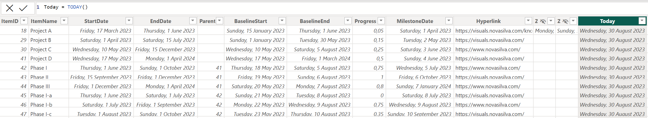
Example: Adding a dynamic calculation based on date (Today + 30 days) to the zoomslider
- Open Power BI Desktop and go to the Table view tab
- Add a new column and rename it to for ex. “Today”
- Enter the following DAX formula:
=Today() - Press Enter to complete the formula
- You should now have a new column with the current date
- Go to the Report view tab
- Set “Today” in the Zoomslider field
- Right-click on it and change from Date Hierarchy to Date (select Today)
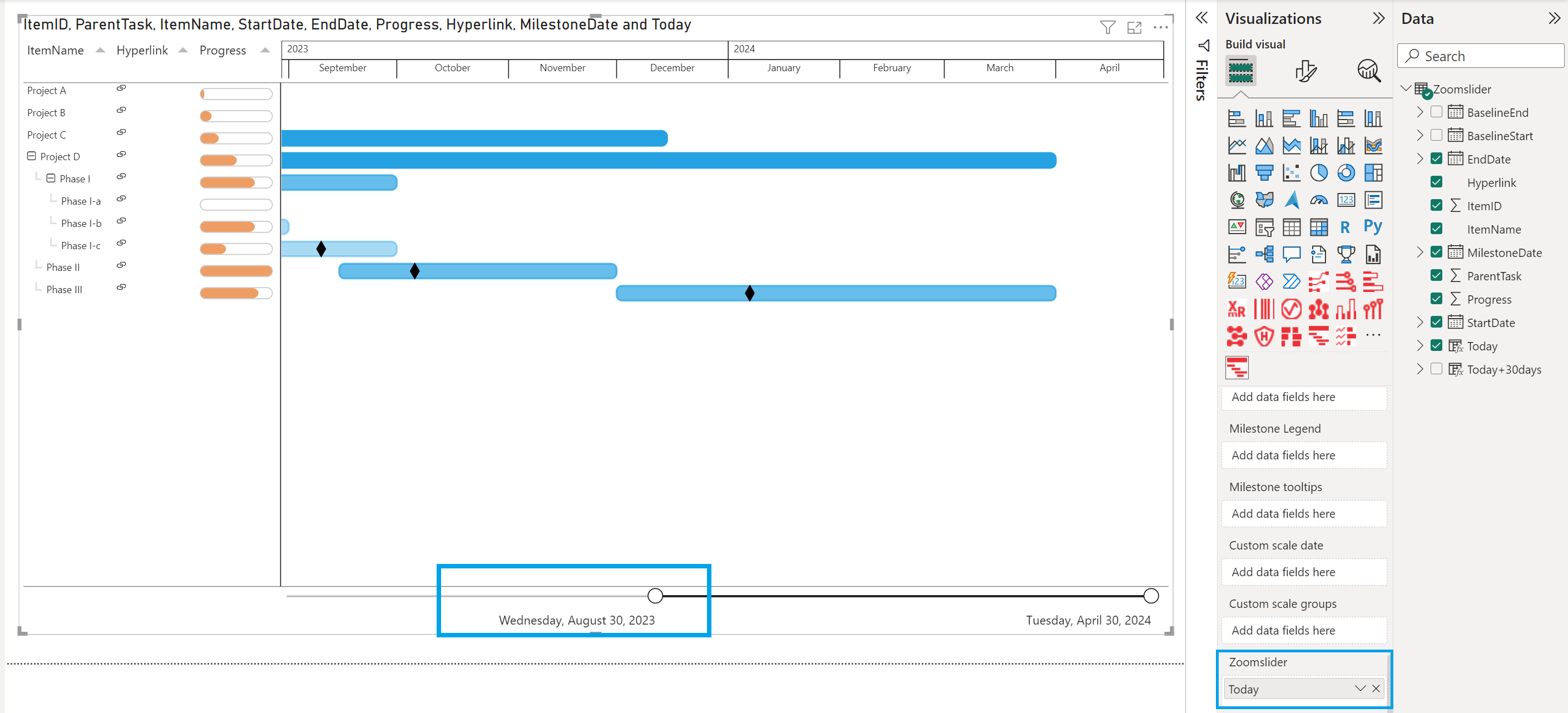
- Add another column and rename it to for ex. “Today+30days”
- Enter the following DAX formula:
=[Today]+30and press Enter - You should now have another column with the current date+30 days
- Go to the Report view tab
- Set “Today+30days” to the Zoomslider field
- Right-click on it and change from Date Hierarchy to Date (select Today+30days)
- The zoomslider will show the timeframe set.
- Save and Publish to the Power BI Service for report viewers to see tasks/ projects in the specified timeframe.
You can also manually add a start and/ or end date to your zoomslider columns in the dataset instead of a calculation.
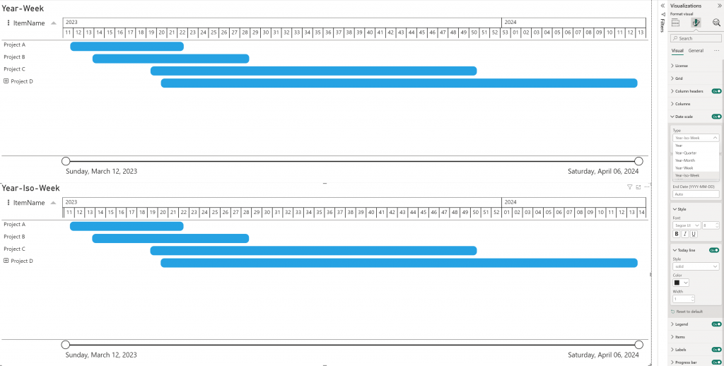
Setting ISO week or a Month Offset for fiscal years in the Date scale
You can set the date scale type to Year, Year-Quarter, Year-Month and Year-Week to suit the level of detail required for your analysis.
Year-Iso-Week
By default, the PowerGantt Chart uses the standard week numbers (US week system) from Power BI, where weeks start on Sunday instead of Monday, differing from the ISO week standard (ISO-8601).
Previously, reflecting ISO weeks required creating your own custom date scale using DAX calculations or M query to implement ISO week numbering.
This is no longer necessary; you can now simply select the Year-Iso-Week option under the Type drop-down menu in the Date scale settings, to see ISO weeks reflected accurately in the PowerGantt Chart.
Month offset
The PowerGantt chart includes an option to set an offset for fiscal years, allowing you to align the chart’s groupings with your organization’s fiscal calendar. When the offset property is set to 0, the date scale behaves as usual, meaning the year will start in January, following the standard calendar year. The month offset property accepts values ranging from -11 to 11. For example, if your fiscal year 2025 starts on October 1st, 2024, you can specify an offset of -3 months.
The groupings for weeks, months, and quarters will treat October 1st as if it is January 1st, aligning them with your fiscal year.
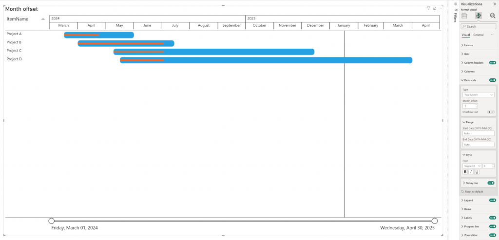
This option is available if the Type date scale is on Year, Year-Quarter, Year-Month and Year-Week.
Set a Custom Scale date
Now every user of the PowerGantt Chart can also define and include their own custom scale date. Adding a custom scale date to your PowerGantt Chart allows you to visualize project timelines and tasks more effectively. A custom scale date provides greater flexibility and precision in representing project schedules because there are unlimited number of custom date/time scales, like: fiscal years, special weeknumbers, AM/PM split of the day, etc..
In the Video Tutorial: Setting up a Custom scale date and Tutorial: How to add a Custom scale date you will see how to achieve this.
For good design practices to create date tables in your data models when using Power BI Desktop, see Create date tables in Power BI Desktop in the Microsoft Learn platform.
Set Drill Through
Drill through works in the PowerGantt Chart as in any standard Power BI visual.
Drill through in Power BI allows you to explore in visuals additional details related to a specific category. By setting up Drill through, you can define specific fields and go automatically from the main page to another page to show information of the item you drilled from. You can set up drill through in your reports in Power BI Desktop or Service.
See Tutorial: Setting up Drill through for more information.
Add a status indicator
Adding a status indicator (such as an emoji or icon) in Power BI Desktop involves adding a column that determines in which condition you want to display which icon. This can be done with DAX or M Query.
Here an example on how to add a status indicator into your PowerGantt:
- Open Power BI Desktop and navigate to the Data pane.
- Add a New column (right-click on the Table in the Data pane).
- Enter your DAX formula.
- While editing the formula, press Windows logo key + . (period) to open the emoji picker.
- Or click the magnifying glass in the bottom left to search for specific emojis.
- Select an emoji to add it into the Power BI formula bar.
- Press Enter to save and create the new column.
- You should now have a new column in your Data pane.
- Drag or set the new column in the Additional columns field.
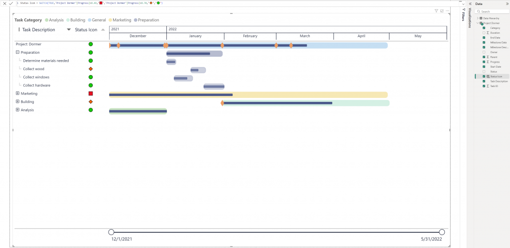
SWITCH function (DAX)
Status = SWITCH(TRUE,Project[Progress]<0.49,"🟥",Project[Progress]<0.70,"🔶","🟢") 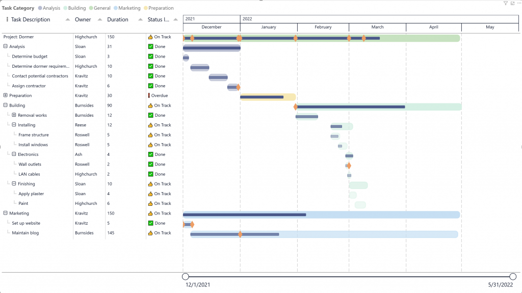
IF function (DAX)
Status Indicator = IF([Status] = "Done", "✅ Done", IF([Status] = "On Track", "👍 On Track", "❗ Overdue"))By following these steps, you can effectively use emojis or icons as status indicators in your PowerGantt Chart, enhancing the visual appeal and readability of your projects.
Add custom milestone markers
You can now add custom icons to your PowerGantt to represent milestones, bringing even more clarity and customization to your project timelines. Whether you’re highlighting key deliverables, risks, or approval points, custom icons make it easier to tell your story briefly.
These icons support conditional formatting, allowing you to style them dynamically based on any status, category, or progress. For example, you can automatically display a red warning icon for delayed tasks or a green checkmark for completed milestones. This functionality makes it easier to track project health visually and efficiently.
Custom icons let you align visuals with your organization’s terminology and branding, making project tracking more intuitive and consistent with your communication style.
Icons can be used via Base64-encoded image URLs with appropriate metadata headers. Supported formats include: SVG, PNG, JPG and GIF. For SVGs, you can use currentColor for fill and border. This allows icons to dynamically adapt to the milestone color settings.
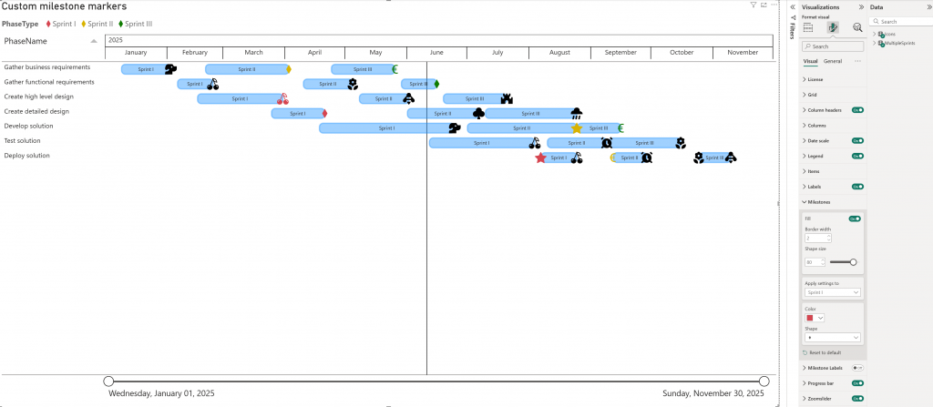
Conditional formatting for icons can be applied to the Item Name, Additional columns, and/or Milestone icon fields.
For more information see Tutorial: Adding custom icons.
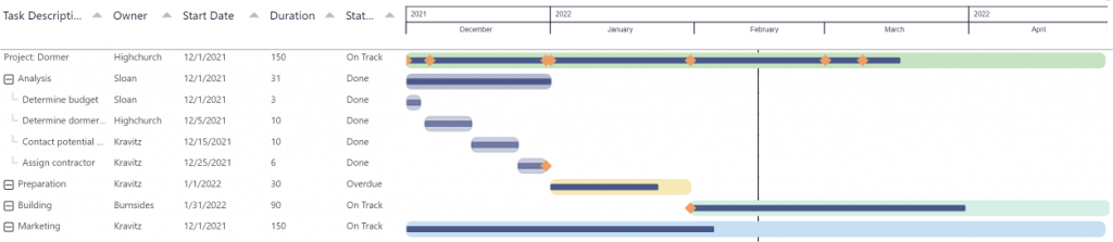
Adding Predecessor lines
The PowerGantt chart supports the Finish-to-Start (FS) dependency type. This is the most common project scheduling dependency, where a project/task can begin only after its predecessor has finished. This dependency type is especially important in projects where tasks follow a strict sequence. Using it ensures accurate scheduling, prevents idle time, and helps project managers maintain workflow efficiency.
Example: Finish-to-Start Dependency
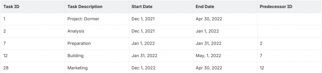
In this example:
- Preparation (Task ID 7) depends on the completion of Analysis (Task ID 2).
- Building (Task ID 12) depends on Preparation (Task ID 7).
- Marketing (Task ID 28) depends on Building (Task ID 12).
Steps to Add Predecessors
- Define the dependency field in your dataset
- Add a column (e.g., Predecessor ID) to your dataset to capture task dependencies. You may include up to 10 columns if multiple predecessor relationships are needed.
- For each project/task, specify its predecessor by entering the Task ID of the task it depends on.
- You can add up to 10 predecessor categories to the Predecessor field, allowing multiple dependency lines.
- Load your dataset
- Import your dataset into PowerGantt.
- Map data fields in the visualization pane, map the relevant fields from your dataset to the PowerGantt chart, such as TaskID, Start Date, End Date, and the Predecessor field.
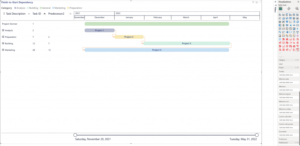
Finish-to-Start Dependency illustrated: Project 1 must finish before Project 2 can start.
Example: Project 1 = Analysis (finishes) → Project 2 = Preparation (starts). You cannot start Preparation until Analysis is complete.
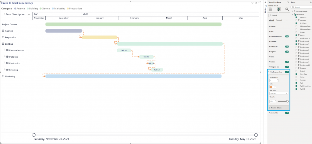
In the Visualizations pane, go to Format visual → Visual → Predecessor lines to format the predecessor lines.
Adjust the column width
Resize columns to enhance the readability of the visual. Adjusting column widths can only be done in Edit mode.
Follow this steps to adjust manually the column width in the PowerGantt:
- Open Power BI Desktop or switch to Edit mode in the Service.
- Hover over the Column headers by moving the mouse cursor to the right edge of the column header or over the boundary between two column headers.
- When you are in the right spot, the cursor will change to a left right arrow icon.
- Drag the mouse to the right to make the column wider or to the left to make it narrower.
- Release the mouse button once you have achieved the desired column width.
- If needed repeat the process for the other columns.
Sorting
By default, data in the PowerGantt Chart is sorted ascending by Start date.
Sorting can be adjusted in two ways:
- Clicking on the column headers to toggle between ascending and descending orders.
- Clicking on … (More options). The sorting options are Sort descending, Sort ascending and Sort by.
To Sort by column header, click a column header arrow to toggle between ascending and descending order. This arrow in the header indicates that the column is sorted. An upward arrow indicates ascending order; a downward arrow indicates descending order. To sort by a column other than Item Name, add the desired category to the Additional Columns field.
To sort via More options (Power BI sorting), click the … (More options) icon in the top-right corner of the visual, then:
- Select Sort ascending or Sort descending to change the sort direction, and/ or
- Select Sort by and choose the field to sort on.
The active sort field and order are indicated with a checkmark. By default, this is set to ascending by Start Date.
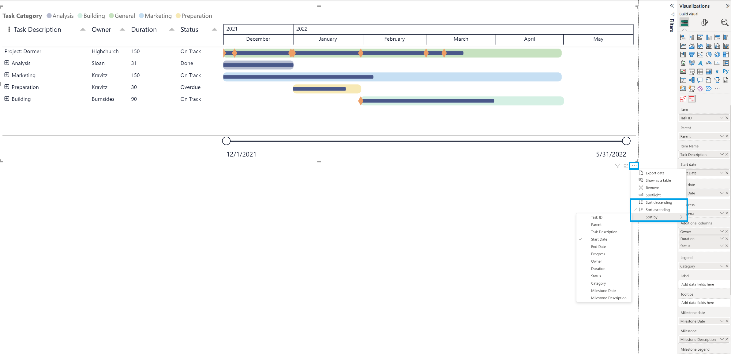
To clear the Power BI Sort, simply select the More options (…) icon in the visual, select Sort by and reselect the currently active category that is sorted by to reset it. This will remove the Sort (defaults to ascending by Start date). If you have applied the Sort by column just click again on the header arrow to reset it back to be sorted by Start date.
Considerations and Limitations:
- Highercase has preference to lowercaser in alphabetical order, for example, “Z” precedes “a”.
- Digits and punctuation marks has preference to letters.
- The Legend is always sorted ascending alphabetically.
Legend is sorted ascending alphabetically or numerically. If you would like to see the items in the grid in the same order as the legend, do the following:
- Add the category you have in the legend also as additional column,
- Sort the added additional column,
- or use the PBI Sort.
For any questions or remarks about this Visual, please contact us by email at Nova Silva Support, or visit the Community forums. Or just simply experience the Power Gantt Chart by trying it out for free!