Description
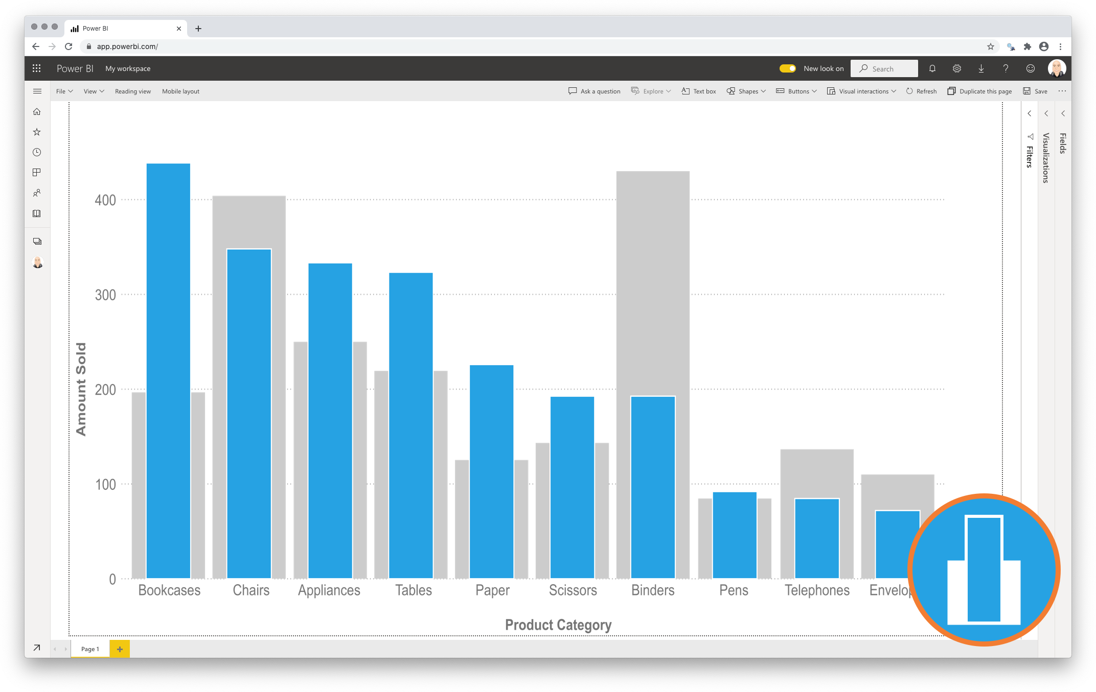
The Clustered Column Chart compares one or multiple measures across categories. Frequently the user compares two measures within a category. This standard chart becomes cluttered and less effective when your goal is to compare the two measures within a category. Comparing actual and budget results is a good example of this. The Lipstick Column Chart for Power BI Premium is an excellent alternative for this. It lowers the clutter and makes it easier to compare the values.
The Lipstick Column Chart shows the primary measure per category on the foreground. The chart places the secondary measure behind the primary for a precise comparison of both values. Since both values are placed on top of each other it also becomes a more compact alternative to show both measures per category.

Key features of the Lipstick Column Chart
-
Format the objects. You can format each of the bars. It works exactly like the bars in the Power BI Clustered Column Chart;
-
The Axis formatting options are in line with the options you know from the Power BI Clustered Column Charts. No need to learn a new interface;
-
Selection & Highlighting. Selection & Highlighting functions within the Lipstick Column Chart work like you are used to in other Power BI charts;
-
Context menu. Like in standard Power BI Charts you have access to the context menu to Include/Exclude data points;
-
Full tooltip support. The default Tooltip behaviour (show the value of the element you hover). You can even add additional fields to the tooltip.
Watch the video tutorial of the Lipstick Column Chart for Power BI HERE. Do you want to try the Lipstick Column Chart yourself? Download it from the Microsoft AppSource for free.

