Description
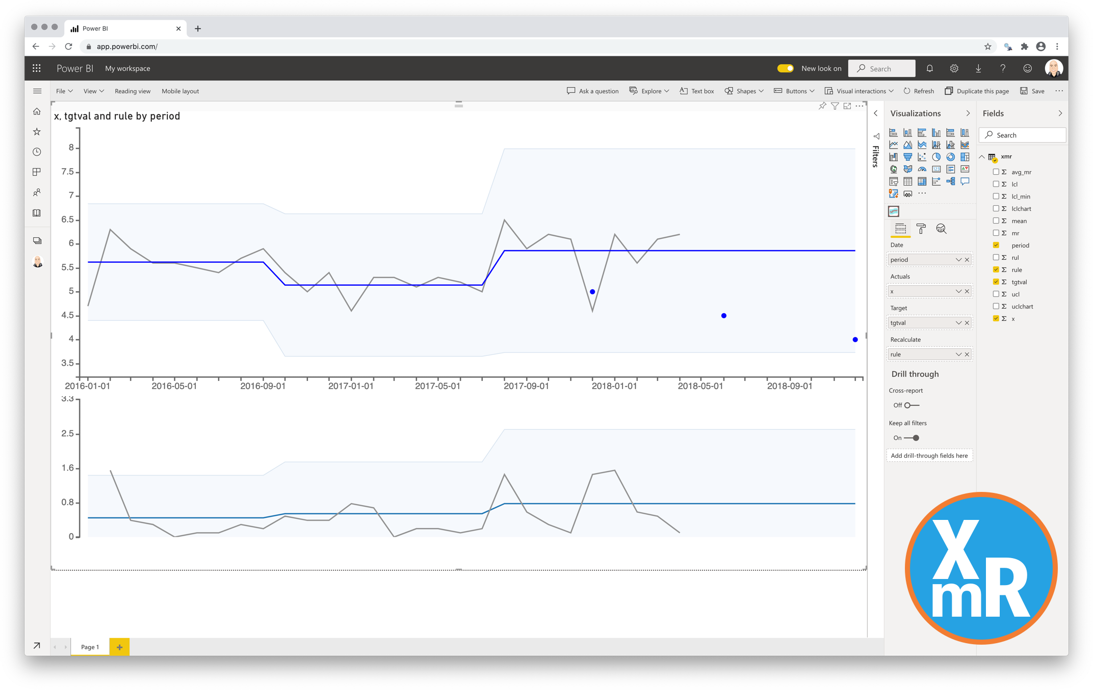
The Control Chart XmR for Power BI is actually two charts. The chart called the X-chart is the first. This chart displays the actual results and the bandwidth of “normal” values. The chart called the mR-chart is the second. This chart shows the difference between consecutive data point measurements. The two charts together allow the user to separate the noise from the real signals. These charts will help you to focus on the real signals and ignore distracting noise.
The upper chart (X-chart) displays the data-points over time (Actuals) together with a calculated average (Average – center-line (CL)). The X-chart also determines the Upper and Lower Control Limits (the bandwidth). The lower chart displays the Moving Range (mR-chart) with its Average and Upper Control Limit.

The Control Chart XmR can calculate all the derived figures automatically. It can even detect the signals in your data. The rules being used for the automatic signal detection and recalculation are:
- 7 points in a row are above or below the center-line
-
10 out of 12 points are above or below the center-line
-
3 out of 4 points are closer to the UCL or LCL than the center-line
You can also override the automatic calculation by applying your own derived figures from data. This gives you complete freedom to implement your own rules for detecting signals.
Key features of the Control Chart XmR for Power BI
-
Format the objects: By selecting a specific color and size you can format the data point objects (dot and line);
-
The Axis formatting options are in line with the options you know from the default Power BI charts, so no need to learn a new interface;;
-
Selection & Highlighting: Like in standard Power BI Charts you can make use of the Selection & Highlighting functions within the Control Chart XmR for Power BI;
-
Context menu: Like in standard Power BI Charts you have access to the context menu to Include/Exclude data points;
-
Full tooltip support: Besides the default Tooltip behaviour (show the value of the element you hover) you can also add additional feeds to the tooltip.
Watch the video tutorial of the Control Chart XmR for Power BI HERE. Do you want to try the Control Chart XmR yourself? Download it from the Microsoft AppSource for free.

