Description
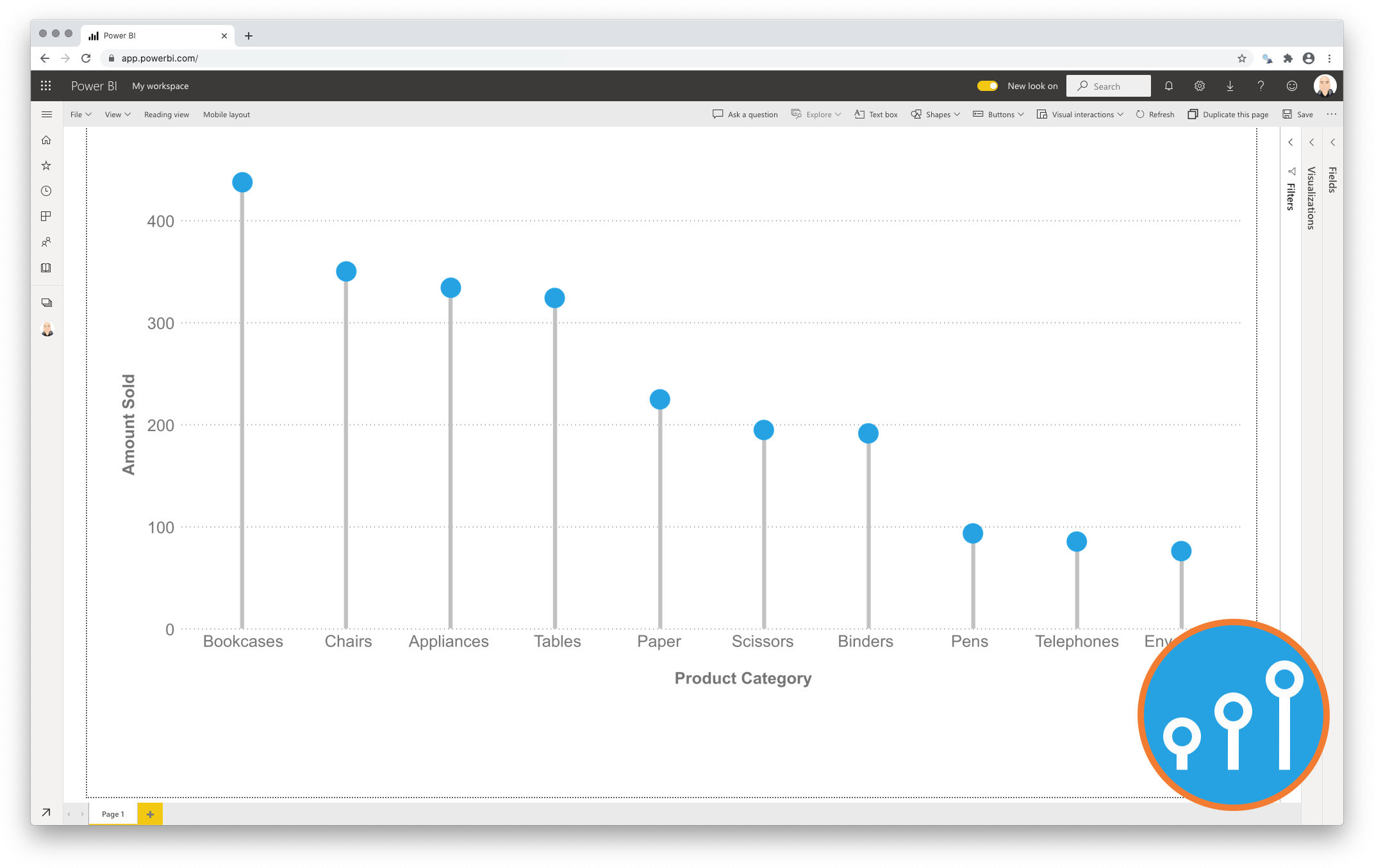
Standard column charts are ideal for showing a single measure per category. You can easily compare each of the categories with the rest. However, if you have larger number of categories (>10) in a column chart it is possible the chart itself becomes “heavy”. The coloured bars will fill large part of the chart surface. To avoid this clutter one can use the Lollipop Column Chart Premium as an alternative.
The Lollipop Column Chart Premium shows a marker (mostly a dot) per category. A subtle line connects the icon to the measure-axis origin. The icon combined with the line make it a Lollipop Column Chart.

Key features of the Lollipop Column Chart Premium
-
Format the objects: By selecting a specific color and size you can format the data point objects (dot and line). You can switch the linking line on or off. And for the dot one can switch on/off the fill color;
-
The Axis formatting options are in line with the options you know from the Power BI Clustered Column Chart, so no need to learn a new interface;
-
Selection & Highlighting: Like in standard Power BI Charts you can make use of the Selection & Highlighting functions within the Lollipop Column Chart;
-
Context menu: Like in standard Power BI Charts you have access to the context menu to Include/Exclude data points;
-
Full tooltip support: Besides the default Tooltip behaviour (show the value of the element you hover) you can also add additional feeds to the tooltip.
Watch the video tutorial of the Lollipop Column Chart for Power BI HERE. Do you want to try the Lollipop Column Chart yourself? Download it from the Microsoft AppSource for free.

