Introduction: Strip Plot

Get to know your data without hiding critical details: the Strip Plot
There are numerous chart types to help us determine the main properties of a distribution (like central tendency, spread and form). The most popular ones are histograms, frequency polygons and box-and-whisker plots.
The challenge with these kind of charts is the fact they group your data in such a way it potentially could hide important features. Histograms and frequency polygons are extremely sensitive to the bin-size you select as user. The box-and-whisker plot is only applicable when you have a bell-shaped distribution, but becomes useless in case of a multimodal distribution.
The Strip Plot is a chart type that addresses these challenges by not aggregating any of the data points, but by simply showing each point individually. This will not only show you where the (concentration of) observations are, but also where gaps are between subsequent observations.
Key features of the Strip Plot are:
- Choose an object for your data points: data points can be displayed by either a round dot, a triangle or a line;
- Format objects: each of the data point objects can be formatted by selecting a fill and stroke color. Also the size and opacity of the objects can be set; theme colors and settings are supported;
- Multiple series: the user can display one or multiple series (distributions) by adding a Category variable;
- Change Details: the column placed in the Details field determines at which detail level the objects are displayed;
- Large number of data points: the Strip Plot can display up to 30,000 data points;
- Selection & Highlighting: like in standard Power BI charts you can make use of the Selection & Highlighting functions within the Strip Plot;
- Context menu: like in standard Power BI charts you have access to the context menu to Include/Exclude data points;
- Full Tooltip support: besides the default Tooltip behavior (show the value of the element you hover) you can also add additional feeds to the tooltip;
- Full Bookmark support: like any of the standard visuals the Strip Plot supports Bookmarks.
How to use: Build visual
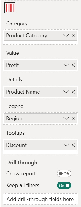
In the Build visual pane, of the five fields you need to specify at least the first three fields, being: Category, Value and Details. Legend and Tooltips are optional.
- Category: here you add the field(s) containing the categories you want to place on the y-axis. If you place multiple fields here you can drill through the different fields as if they were levels of a hierarchy. You can also use any hierarchy you already have in your data set.
- Value: this is where you specify the measure as it will be displayed on the x-axis. The value of this measure will determine the location of each category marker on the y-axis scale. By default it will SUM all the values per category, but you can also select any of the other aggregation functions (like Average, Minimum, Maximum, Count, etc.).
- Details: this field allows you to specify the level of detail you want to show in the chart. For each unique element in the data (here: Product Name) a marker will be shown at its corresponding value.
- Legend: by adding a legend, you can color-code the chart based on a category.
- Tooltips: the fields added here will shown in the tooltip when the user hovers a specific data point.
How to use: Format visual
The Visual specific settings contain formatting properties that allow you to change the default behavior of the visual:
- License: here you can enter your PREMIUM license information to disable any license reminders.
- Value: the formatting options for the x-axis (value axis) are similar to the options available within the Clustered bar chart (standard Power BI visual). These familiar options allow you to change the visibility and formatting of the x-axis elements.
- Range: here you can set the Start and End value.
- Values: you can set the Font, Size, emphasized text (Bold, Italic, Underline), Color, Display units (Auto, None, Thousands, Millions, Billions, Trillions) and Value decimal places.
- Title: here you can rename the label in Title text, set the Font, Size, emphasized text (Bold, Italic, Underline), Title position (Align left, Align center, Align right) and Title color.
- Category: the formatting options for the y-axis (category axis) are similar to the options available within the Clustered bar chart (standard Power BI visual). These familiar options allow you to change the visibility and formatting of the y-axis elements.
- Style: only visible if there are 2 categories mapped and they are at the lowest level. The option Concatenate labels will be by default off, when enabled, the x-axis labels will display in a single row.
- Values: you can set the Font family, text Size, emphasized text (Bold, Italic, Underline), Color, Minimum category width and Maximum size.
- Title: here you can rename the label in Title text, set the Font, Size, emphasized text (Bold, Italic, Underline), Title position (Align left, Align center, Align right) and Title color.
- Gridlines: by default the chart has horizontal and vertical thin and light background lines in the grid.
- Categorical: turn on/off the horizontal gridlines and set the Style (Dashed, Solid, Dotted), the Color and Width.
- Values: turn on/off the vertical gridlines and set the Style (Dashed, Solid, Dotted), the Color and Width.
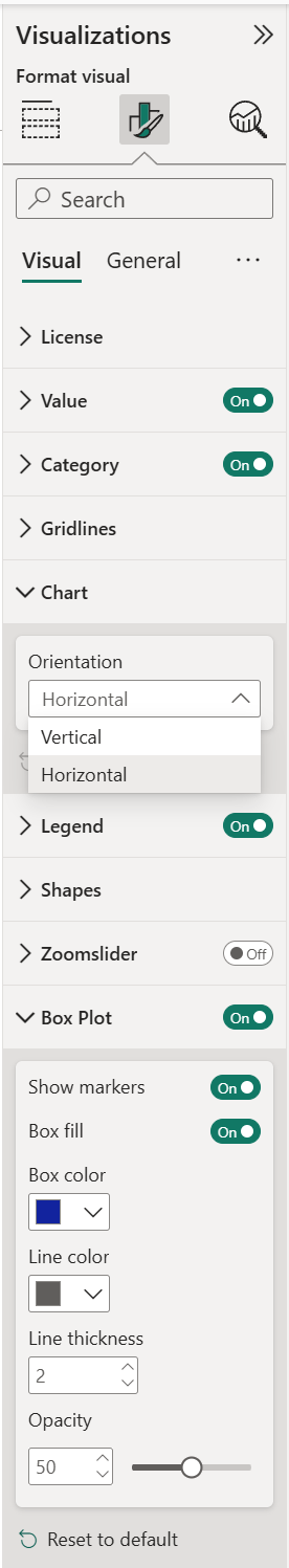
- Chart: switch here the orientation of the chart from (default) Horizontal to Vertical.
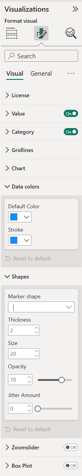
- Data colors: within this section you can change the Default Color of the marker and of the Stroke. This option will automatically switch off when a category is added to the Legend.
- Legend: this option will automatically switch on when a category is added to the Legend field in the Build visual pane. Show/hide the legend by clicking the toggle on/off. Available settings:
- Set the Position of the legend to Top, Bottom, Left, Right, Top Center, Bottom Center, Left Center, Right Center.
- Colors:
- Apply settings to: select the item you want to change the Color from the drop-down menu.
- Title: rename the Legend Name or set it off.
- Style: change the Font family, text Size, emphasized text (Bold, Italic, Underline) and Color of the legend.
- Shapes: here you determine the properties of the marker. First you can select the Marker shape: Bar, Circle, Unfilled Circle, Triangle or Unfilled Triangle. With Thickness you can set the width of the edge of the marker. You can increase/ decrease the Size and Opacity of each marker. This is especially helpful when you have a lot of markers grouped together. Use the Jitter Amount slider to slightly shift overlapping values, this will make the visual easier to read.
- Zoomslider: enable the zoomslider option to easily examine a smaller range of the data in the Strip Plot without having to use a filter. The zoomslider is added on the chart’s x-axis and can be used for horizontal scrolling. Click and drag endpoints on sliders to adjust the dimensions of the chart, slide both endpoints toward the center. The closer the two endpoints are to each other, the more you zoom in to display shorter, finer segments. Click and hold down the left mouse button on the center section of the zoom bar and then scroll left or right to a particular point. If you have a Date as Value, click on the date label to display and select from the Calendar instead. The zoomslider can also be switched off/on. Available formatting options:
- Color: to change the color of the zoomslider (endpoints and line).
- Style: to change the Font family, text Size, emphasized text (Bold, Italic, Underline) and Font color of the zoomslider (date) labels.
- Box Plot: enable the Box Plot to show the spread and distribution of your data. Available options:
- Show Markers
- Box fill
- Box color
- Line color
- Line Thickness
- Opacity
The General settings contain cards that affect the visual container and are consistent across all visual types. Here you find options for customizing the Properties (Size, Position, Padding, Advanced options ), Title, Effects (Background, Visual border, Shadow), Data format, Header icons, Tooltips and Alt text.
How to use: Analytics
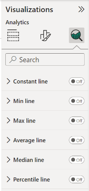
You can highlight many interesting trends and insights by creating dynamic reference lines in the Analytics pane. To see the analytic lines, select the visual and click the Analytics icon (magnifying glass).
Available Analytics lines:
- Constant line: displays the value specified, helps to track metrics and desired goals.
- Min line: displays the lowest value points on the axis.
- Max line: displays the highest value points on the axis.
- Average line: displays the data average.
- Median line: displays the middle value.
- Percentile line: displays the value (or score) below which x% of the observations may be found.
Format your line by specifying the Values (rename line name), Shape (Transparency, Line width, Line style, Position) and Color.
If you want to have a data label, switch Data labels On. You get additional formatting options for your data label, such as: Label color, Text, Horizontal and Vertical position, Display units and Decimal places.
See Adding Analytics lines to a Strip Plot for more information.
For any questions or remarks about this Visual, please contact us by email at Nova Silva Support or visit the community forum.