Introduction: SMART KPI List

Increase the power of your KPI’s by adding context with the SMART KPI List
One of the principal goals of any dashboard is to inform its users by creating an overview of multiple key performance indicators (KPIs). A good dashboard shows all relevant KPIs in a single screen, so we need a compact and effective way to display them. The SMART KPI List is created specifically for this purpose.
Key features of the SMART KPI List are:
- A comprehensive overview of your KPI’s: create a clear overview of your KPIs in the right context to tell the complete story. No more messing around with separate tables, line charts and bar charts;
- Format objects: each of the columns can be formatted individually. Additionally, for the sparkline and bars you can change basic settings like the used colors;
- Formatting options: similar to the options you know from standard Power BI charts, so no need to learn a new interface;
- Selection & Highlighting: like in standard Power BI Charts you can make use of the Selection & Highlighting functions within the SMART KPI List;
- Context menu: like in standard Power BI Charts you have access to the context menu to Include/Exclude data points;
- Full Tooltip support: besides the default Tooltip behaviour (show the value of the element you hover) you can also add additional feeds to the tooltip.
- Full Bookmark support: like any of the standard visuals the SMART KPI List supports Bookmarks.
How to use: Build visual
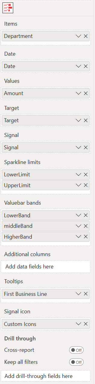
Of the nine fields you need to specify at least the first three fields, being: Items, Date and Values. The remaining fields are optional.
- Items: here you add the field(s) containing the categories you want to place on each row of the list. If you place multiple fields here you can drill through the different fields as if they were levels of a hierarchy. You can also use any hierarchy you already have in your data set.
- Date: this is where you specify the date and/or time values. For each Item the list will display the last (most recent) value as the current value and use all other (older) values to draw the sparkline.
- Values: the field added here will show per Item the most recent value in the value column. That most recent value will also be used to draw the horizontal bar in each row of the list. All remaining (older) values will be used for the sparkline.
- Target: the field added here will show per Item the most recent value in the target column. That most recent value will also be used to draw the vertical line across the value-bar in each row of the list.
- Signal: this field will trigger the red (default color) signal dot for each row to guide the readers attention. When the value of this field equals 1 it will show the signal dot, any other value will hide the signal dot.
- Sparkline limits: specify here two fields, so the Sparkline will include a coloured area behind the line to indicate a range of “normal” values.
- Valuebar bands: add qualitative ranges here, to extend the existing bar chart into a bullet graph.
- Additional columns: add additional columns to the visual to include more context. The columns will be added to the right of the chart. All columns can be set to the exact right width by dragging the edges (if Auto-size column width is Off in the Column headers option).
- Tooltips: the fields added here will show in the tooltip when the user hovers a specific data point.
- Signal icon: add a category to show image URLs for SVG, PNG, JPG, and GIF formats. Icons need to be provided as Base64-encoded images, including the necessary Meta-Data header. SVG images can use
currentColorfor fill and border, allowing the icons to dynamically adapt to signal color settings. For more information see Tutorial: Adding custom icons to Signals.
How to use: Format visual
Besides the standard format sections, the SMART KPI List has specific formatting properties that allow you to change the default behavior of the visual:
- License: here you can enter your PREMIUM license information to disable any license reminders.
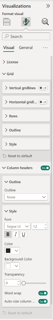
- Grid: these settings allow you to change the formatting of the list grid content (excluding the column headers). This includes adding/removing the grid lines, setting the color and width of the lines, the padding between the rows, changing the row height and changing the outline color and weight, the Font family, text size and emphasized text (Bold, Italic, Underline).
- Column headers: headers can be customized individually in their respective column settings beneath. Here you can set their general settings like, Outline, Font, text size, emphasized text (Bold, Italic, Underline), Color and Background Color, Transparency, Word wrap and Auto-size column width.
Signal/Items
Value/Target
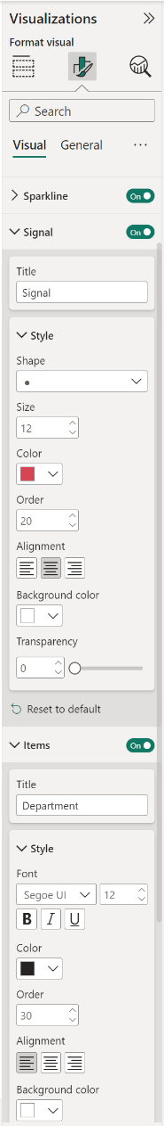
- Sparkline: the sparkline can be customized by changing the Title, Order and Alignment. You can change the Background color and Transparency as well as the Line color, Line thickness and Area color (sparkline limits).
- Signal/Items: the settings for the columns Signal, Items are similar. You can also change the column header (Title) and the column order. Additionally you can set the Shape of the signal, Size, Color, Order, change the Alignment, Background color and Transparency. If you have added SVG icons to the Signal icon category, you can change here the settings.
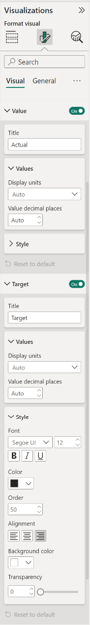
- Value/Target: the settings for the Value and Target columns are the same. They are also similar to the Items settings above. There are two additional settings, being: the Display units and Value decimal places.
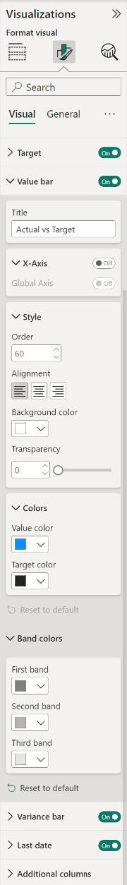
- Value bar: besides changing the column order and the series colors you can set the Axis behavior. You can set one single axis for all items (Global Axis) and show the difference between the value and the target instead of the actual numbers. Additionally you can change the Title, Style and the Value and Target colors.
- Band colors: change the color of the ranges added to the Valuebar bands field.
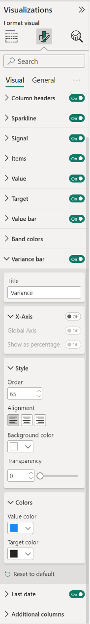
- Variance bar: by default off, switch on to add a Variance bar to your chart. You can change the Title, enable the X-axis (Global Axis) and Show as percentage options. You can also format the variance bar Style and Colors.
- Last date: you can change the column header (Title) and the Style. Available options are: Font, Size, emphasized text (Bold, Italic, Underline), Color, Order, Alignment, Background color and Alignment.
- Additional columns: by default off. This property will be on if a category is set in the Additional columns field (max 4 categories). If you have more than one category in the field, you will be able to format each additional column by selecting from drop-down list. You can change the column header (Title), Font, Size, emphasized text (Bold, Italic, Underline). Additionally you can set the Color, column Order and change the Alignment, Background color and Transparency.
The General settings contain options that affect the visual container and are consistent across all visual types. Here you can also customize the general Title and Tooltips.
For any questions or remarks about this Visual, please contact us by e-mail at Nova Silva Support or visit the Community forums.