Introduction: Merged Bar Chart

Discover the patterns across multiple measures with the Merged Bar Chart
The Merged Bar Chart allows you to compare multiple categories in a single chart, as an alternative to the more complex scatterplot.
Comparing categories is a common goal of data visualizations. In some cases comparing categories on a single measure (e.g. weight per shipment) is enough. This can be done with a standard bar or column chart. However, this is often not enough. Let’s assume we need another measure (like height) to make the comparison more insightful. Now we have one category (shipment) and two independent measures (weight and height). Because these measures are expressed in different units (pounds vs. inches) we can’t combine them in a single bar/column chart. This is when the scatterplot becomes useful.
However, many people find scatterplots hard to read. And it is difficult to expand the number of measures beyond 3 or 4. This is why we created the Merged Bar Chart. This chart can show up to 12 independent measures per category in a comprehensible way. It does this by displaying each measure in its own bar-column and allows you to sort on any of the columns to investigate any possible relations between the measures.
Key features of the Merged Bar Chart are:
- Format objects: each of the bar series can be formatted independently, and supports the theme settings;
- Axis formatting options: in line with the options you know from the Power BI Clustered bar chart, so no need to learn a new interface;
- Selection & Highlighting: like in standard Power BI charts you can make use of the Selection & Highlighting functions within the Merged Bar Chart;
- Context menu: like in standard Power BI charts you have access to the context menu to (amongst others) Drill down and Include/Exclude data points;
- Full Tooltip support: besides the default Tooltip behavior (show the value of the element you hover) you can also add additional fields to the tooltip;
- Full Bookmark support: like any of the standard visuals the Merged Bar Chart supports Bookmarks.
How to use: Build a visual
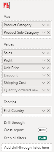
Of the three fields you need to specify at least the first two fields, being: Axis and Values. The last field Tooltips is optional.
- Axis: here you add the field(s) containing the categories you want to place on the y-axis. If you place multiple fields here you can drill through the different fields as if they were levels of a hierarchy. You can also use any hierarchy you already have in your data set.
- Values: this is where you specify the measures as they will be displayed on the x-axis. The value of each measure will determine the location of the markers on the y-axis scale. By default it will SUM all the values per category, but you can also select any of the other aggregation functions (like Average, Minimum, Maximum, Count, etc.). You can add up to 12 measures in the Values.
- Tooltips: the fields added here will show in the tooltip when the user hovers a specific data point.
How to use: Format
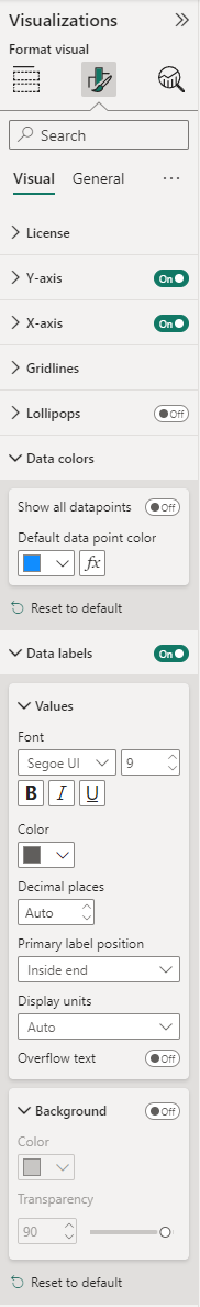
The Visual specific settings contain formatting properties that allow you to change the default behavior of the visual:
- License: here you can enter your PREMIUM license information to disable any license reminders.
- Y-Axis: the formatting options for the Y-axis (category axis) are similar to the options available within the Clustered bar chart (standard Power BI visual). These familiar options allow you to change the visibility and formatting of the y-axis elements (Values and Title). Here you can also find the Style option only visible if there are 2 categories mapped and they are at the lowest level. Concatenate labels will be by default off, when enabled, the y-axis labels will display in a single row. Additional options Inner padding to change the padding between the bars and Max size.
- X-Axis: the formatting options for the x-axis (value axis) are similar to the options available within the Clustered bar chart (standard Power BI visual). These familiar options allow you to change the visibility and formatting of the x-axis elements (like Minimum and Maximum Range, Values and Title). There is also additional features like the Inter chart padding or Single scale: to have all measures use the same scale.
- Gridlines: enable/ disable the Vertical and Horizontal gridlines and change the Style, Color and Width. By default vertical gridlines are on.
- Lollipops: enable this option to show lollipops instead of bars. You can enable/disable the Fill and Lines, change the Shape, Size and Line width of the lollipops.
- Data colors: here you can change the Default data point color which applies to all bars. Enable Show all datapoints to change the color per measure (column) or to apply Conditional formatting.
- Data labels: within this section you can enable and change the format of the data labels. Set the Font, Size and adjust the Color. Change the Decimal places, Primary label position, Display units or enable the Overflow text. Enable the Background and change the Color and Transparency.
The General settings contain cards that affect the visual container and are consistent across all visual types. Here you find options for customizing the Properties (Size, Position, Padding, Advanced options ), Title, Effects (Background, Visual border, Shadow), Data format, Header icons, Tooltips and Alt text.
For any questions or remarks about this Visual, please contact us by email at Nova Silva Support.