Theme settings for the Lollipop Column Chart
Besides setting the properties of the Lollipop Column Chart in the Power BI user interface it is also possible to set the defaults via the Theme. You can read more about how to use them on the following Microsoft page: Use report themes in Power BI Desktop.
As mentioned above the properties can be set in two ways:
- Manually via de Power BI user interface;
- Automatically via a Theme file.
Theme file
The Theme specification is a file in JSON format. The structure for setting the properties is as follows (The elements in blue need to be replaced by a value. This is described in the remainder of this article.):
"visualStyles": {
    "<visualName>": {
        "<styleName>": {
            "<cardName>": [{
                "<propertyName>": <propertyValue>
            }]
        }
    }
}
For the <visualName> and <cardName> sections, use a specific visual and card name. For <visualName> and <cardName>, use an asterisk in quotes if you want that setting to apply to all visuals or cards that have a property. If you use an asterisk for both the visual and card name, you’re effectively applying a setting globally in your report, such as a font size or specific font family for all text across all visuals. Currently, the <styleName> is always an asterisk (*). <propertyName> is the name of the formatting option and <propertyValue> is the value for that formatting option.
If you want to set properties across all visuals and all cards the Theme file will look like this (please note: the properties still need to be specified):
"visualStyles": {
    "*": {
        "*": {
            "*": [{
                "<propertyName>": <propertyValue>
            }]
        }
    }
}
If you want to set the properties specifically for the Lollipop Column Chart visual you need to replace the <visualName> with: “lollipopColumnChart0D874BBC87DE40189C387BBA89739F6C“. This would result in the following file (please note: the cards and properties still need to be specified):
"visualStyles": {
    "lollipopColumnChart0D874BBC87DE40189C387BBA89739F6C": {
        "*": {
            "<cardName>": [{
                "<propertyName>": <propertyValue>
            }]
        }
    }
}
The <cardName> values can be found in the next section named Cards. The <propertyName> values can be found in the section called Properties.
Cards
Let’s first have a look at the available cards within the Power BI user interface and their corresponding Theme names. These Theme names are to be used as a replacement of the earlier mentioned <cardName> variables.
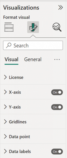
Name on user interface
License
X-Axis
Y-Axis
Data point
Title
Background
Lock aspect
Border
Shadow
Tooltip
Visual header
Name in Theme file
“license”
“categoryAxis”
“valueAxis”
“dataPoint”
“title”
“background”
“lockAspect”
“border”
“dropShadow”
“visualTooltip”
“visualHeader”
Based on these card names our Theme file will look as follows
"visualStyles": {
    "lollipopColumnChart0D874BBC87DE40189C387BBA89739F6C": {
        "*": {
            "license": [{
                "<propertyName>": <propertyValue>
            }],
            "categoryAxis": [{
                "<propertyName>": <propertyValue>
            }]
            "valueAxis": [{
                "<propertyName>": <propertyValue>
            }],
            "dataPoint": [{
                "<propertyName>": <propertyValue>
            }],
            "title": [{
                "<propertyName>": <propertyValue>
            }],
            "background": [{
                "<propertyName>": <propertyValue>
            }],
            "lockAspect": [{
                "<propertyName>": <propertyValue>
            }],
            "border": [{
                "<propertyName>": <propertyValue>
            }],
            "dropShadow": [{
                "<propertyName>": <propertyValue>
            }],
            "visualTooltip": [{
                "<propertyName>": <propertyValue>
            }],
            "visualHeader": [{
                "<propertyName>": <propertyValue>
            }],
        }
    }
}
Properties
Within this section we will describe for each of the mentioned cards above the available properties and related settings.
License properties
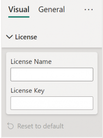
Name on user interface
License Name
License Key
Name in Theme file
“licenseName”
“licenseKey”
Both the license name and license key are supplied to you specifically. The following example is no valid license, so please replace these values between quotes by your own license information.
"visualStyles": {
    "lollipopColumnChart0D874BBC87DE40189C387BBA89739F6C": {
        "*": {
            "license": [{
                "licenseName": "Nova Silva BV | license valid u...",
                "licenseKey": "ptsJi3hcge143AhmkCIDdEofK"
            }]
        }
    }
}
X-Axis properties
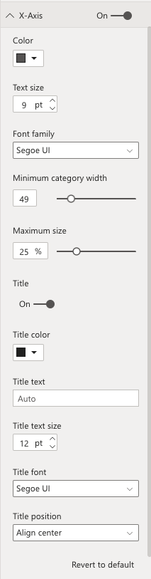
Name on user interface
X-Axis
Color
Text size
Font family
Minimum category width
Maximum size
Title
Title color
Title text
Title text size
Title font
Title position
Name in Theme file
“show”
“labelColor”
“fontSize”
“fontFamily”
“preferredCategoryWidth”
“maxMarginFactor”
“showAxisTitle”
“titleColor”
“titleText”
“titleFontSize”
“titleFontFamily”
“titlePosition”
The following example shows how the Theme file section for the X-Axis could look like.
"visualStyles": {
    "lollipopColumnChart0D874BBC87DE40189C387BBA89739F6C": {
        "*": {
            "categoryAxis": [{
                "show": true,
                "labelColor": { "solid": { "color": "#252423"}},
                "fontSize": 12,
                "fontFamily": "Segoe UI",
                "preferredCategoryWidth": 40,
                "maxMarginFactor": 30,
                "showAxisTitle": true,
                "titleColor": { "solid": { "color": "#252423"}},
                "titleText": "",
                "titleFontSize": 12,
                "titleFontFamily": "Segoe UI",
                "titlePosition": "middle"
            }]
        }
    }
}
Y-Axis properties
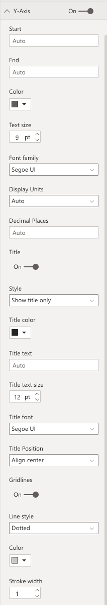
Name on user interface
Y-Axis
Start
End
Color
Text size
Font family
Display Units
Decimal Places
Title
Style
Title color
Title text
Title text size
Title font
Title Position
Gridlines
Line style
Color
Stroke width
Name in Theme file
“show”
“start”
“end”
“labelColor”
“fontSize”
“fontFamily”
“labelDisplayUnits”
“labelPrecision”
“showAxisTitle”
“axisStyle”
“titleColor”
“titleText”
“titleFontSize”
“titleFontFamily”
“titlePosition”
“gridlineShow”
“gridlineColor”
“gridlineThickness”
“gridlineStyle”
The following example shows how the Theme file section for the Y-Axis could look like.
"visualStyles": {
    "lollipopColumnChart0D874BBC87DE40189C387BBA89739F6C": {
        "*": {
            "valueAxis": [{
                "show": true,
                "start": "",
                "end": "",
                "labelColor": { "solid": { "color": "#252423"}},
                "fontSize": 12,
                "fontFamily": "Segoe UI",
                "labelDisplayUnits": 0,
                "labelPrecision": "",
                "showAxisTitle": true,
                "axisStyle": "showTitleOnly",
                "titleColor": { "solid": { "color": "#252423"}},
                "titleText": "",
                "titleFontSize": 14,
                "titleFontFamily": "Segoe UI",
                "titlePosition": "middle",
                "gridlineShow": true,
                "gridlineColor": { "solid": { "color": "#C8C6C4"}},
                "gridlineThickness": 1,
                "gridlineStyle": "dotted"
            }]
        }
    }
}
For the properties “start”, “end” and “labelPrecision” you see a value of “”. This means they are empty and will have no influence on this axis. If you specify a number here you should do this without the quotes. For example: a start value of 500 has to be specified as: “start”: 500,
Data point properties
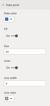
Name on user interface
Data color
Fill
Size
Lines
Line width
Line color
Name in Theme file
“defaultDataPointColor”
“fillDataPoint”
“pointSize”
“showLines”
“lineWidth”
“lineColor”
The following example shows how the Theme file section for the Data point could look like.
"visualStyles": {
    "lollipopColumnChart0D874BBC87DE40189C387BBA89739F6C": {
        "*": {
            "dataPoint": [{
                "defaultDataPointColor": { "solid": { "color": "#26A2E3"}},
                "fillDataPoint": true,
                "pointSize": 5,
                "showLines": true,
                "lineWidth": 4,
                "lineColor": { "solid": { "color": "#B3B0AD"}}
            }]
        }
    }
}
Title properties
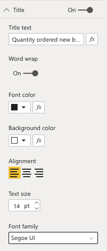
Name on user interface
Title
Title text
Word wrap
Font color
Background color
Alignment
Text size
Font family
Name in Theme file
“show”
“text”
“titleWrap”
“fontColor”
“background”
“alignment”
“fontSize”
“fontFamily”
The following example shows how the Theme file section for the Title could look like.
"visualStyles": {
    "lollipopColumnChart0D874BBC87DE40189C387BBA89739F6C": {
        "*": {
            "title": [{
                "show": true,
                "text": "",
                "titleWrap": true,
                "fontColor": { "solid":{ "color": "#252423"}},
                "background": { "solid":{ "color": "#ffffff"}},
                "alignment": "Left",
                "fontSize": 14,
                "titleColor": { "solid": { "color": "#252423"}},
                "titleText": "",
                "titleFontSize": 12,
                "fontFamily": "Segoe UI"
            }]
        }
    }
}
Background properties
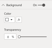
Name on user interface
Background
Color
Name in Theme file
“show”
“color”
The following example shows how the Theme file section for the Background could look like.
"visualStyles": {
    "lollipopColumnChart0D874BBC87DE40189C387BBA89739F6C": {
        "*": {
            "background": [{
                "show": true,
                "color": { "solid":{ "color": "#ffffff"}}
            }]
        }
    }
}
Lock aspect properties
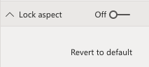
Name on user interface
Lock aspect
Name in Theme file
“show”
The following example shows how the Theme file section for the Lock aspect could look like.
"visualStyles": {
    "lollipopColumnChart0D874BBC87DE40189C387BBA89739F6C": {
        "*": {
            "lockAspect": [{
                "show": true
            }]
        }
    }
}
Border properties
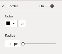
Name on user interface
Border
Color
Radius
Name in Theme file
“show”
“color”
“radius”
The following example shows how the Theme file section for the Border could look like.
"visualStyles": {
    "lollipopColumnChart0D874BBC87DE40189C387BBA89739F6C": {
        "*": {
            "border": [{
                "show": false,
                "color": { "solid":{ "color": "#252423"}},
                "radius": 1
            }]
        }
    }
}
Shadow properties
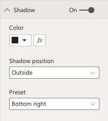
Name on user interface
Shadow
Color
Shadow position
Preset
Name in Theme file
“show”
“color”
“position”
“preset”
The following example shows how the Theme file section for the Shadow could look like.
"visualStyles": {
    "lollipopColumnChart0D874BBC87DE40189C387BBA89739F6C": {
        "*": {
            "dropShadow": [{
                "show": false,
                "color": { "solid":{ "color": "#252423"}},
                "position": "Outer",
                "preset": "BottomRight"
            }]
        }
    }
}
Tooltip properties
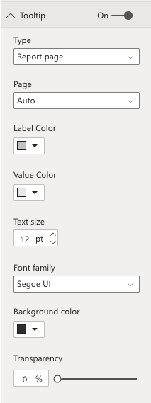
Name on user interface
Tooltip
Type
Page
Label Color
Value Color
Text size
Font family
Background color
Name in Theme file
“show”
“type”
“page”
“titleFontColor”
“valueFontColor”
“fontSize”
“fontFamily”
“background”
The following example shows how the Theme file section for the Tooltip could look like.
"visualStyles": {
    "lollipopColumnChart0D874BBC87DE40189C387BBA89739F6C": {
        "*": {
            "visualTooltip": [{
                "show": true,
                "type": "Default",
                "page": "",
                "titleFontColor": { "solid":{ "color": "#C8C8C8"}},
                "valueFontColor": { "solid":{ "color": "#EAEAEA"}},
                "fontSize": 12,
                "fontFamily": "Segoe UI",
                "background": { "solid": { "color": "#333333"}}
            }]
        }
    }
}