Introduction: Cycle Plot
Discover your seasonal patterns with the Cycle Plot
Introduction
Time series data are great to clarify the changes over time in measures, and the line chart is the favourite chart for this type of data. But displaying results with a normal line chart can also obscure important patterns, especially if the measure contains some form of seasonality. The cycle plot (first introduced by Cleveland, Dunn, and Terpenning in 1978) is a type of line chart specifically developed to show seasonal time series.
The cycle plot helps you to visualize trends within your seasonal data. It has the strengths of common line charts, without obscuring important cyclical patterns. The cycle plot offers a great deal of flexibility in the choice of your variables: think of months vs. year, hours vs. day or months vs. presidential period.
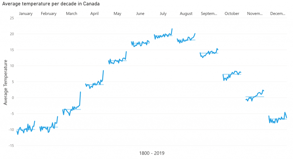
Let’s illustrate this with an example. Say we are looking at temperatures in a certain city over a few years. We expect that Winters are colder than Summers. Plotting this with a line chart will yield a line with a cyclical pattern: low values in Winter, high values in Summer. However, it’s hard to tell if temperatures in January are increasing or decreasing over the years. With the Cycle Plot, a subplot can be created for each month, showing the change in temperatures over time for that month. All the subplots together still show the seasonal pattern as well, as seen in the image above.
Key features of the Cycle Plot are:
- Show central line: add a median or average line per subplot, to provide more context to your chart;
- Format objects: your measurements and central lines can be formatted independently, and supports the theme settings;
- Axis formatting options: in line with the options you know from the Power BI Line chart, so no need to learn a new interface;
- Selection & Highlighting: like in standard Power BI charts you can make use of the Selection & Highlighting functions within the Cycle Plot;
- Context menu: like in standard Power BI charts you have access to the context menu to (amongst others) Drill down and Include/Exclude data points;
- Full Tooltip support: besides the default Tooltip behavior (show the value of the element you hover) you can also add additional fields to the tooltip;
- Full Bookmark support: like any of the standard visuals the Cycle Plot supports Bookmarks.
How to use: Build visual
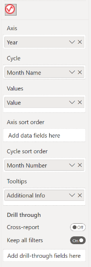
To use the Cycle Plot, you need to have a dataset with at least three fields: a numeric field and two sequential data fields. Sequential data can relate to date / time series, but also to fields like “before, during, after”. The available buckets are:
- Axis: add your first sequential data field here. Usually, this is the field spanning the longest time period.
- Cycle: the other sequential data field goes here.
- Values: this field contains your measurements.
- Axis sort order: you can add a field to this bucket on which the Axis values will be sorted. This can be useful in case your axis contains words or names that shouldn’t be sorted alphabetically. Think of month or day names. This field can be left empty when the sort order is already correct.
- Cycle sort order: this field is used in the same way as the Axis sort order, but instead it will sort the field in the Cycle bucket. This field can be left empty when the sort order is already correct.
- Tooltips: fields added here will show in the tooltip when the user hovers a specific data point.
How to use: Format visual
The Cycle Plot comes with many of the standard Power BI formatting options: Titles, axis labels, line and markers appearance.
The Visual specific settings contain formatting properties that allow you to change the default behavior of the visual:
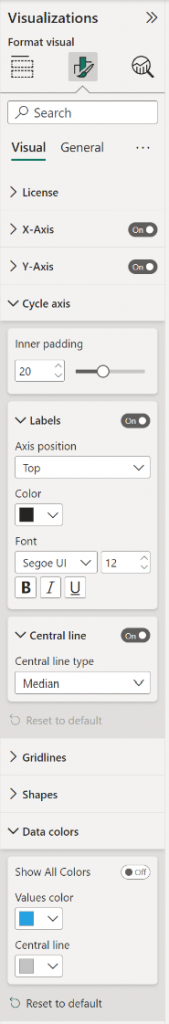
- License: here you can enter your PREMIUM license details to disable any license reminders.
- X-axis: you will find all options needed to format the axes of the subplots, like Max size of labels. For options regarding the cycle labels, position, please refer to the Cycle Axis card. When your data is missing for the first months of the year, the cycles span different periods of time. To prevent confusion, you can use the Show shared axis-values toggle to make all cycles the same length by only showing axis values that are present in all cycles. You can also format:
- Values: format here the Font family, text Size, emphasized text (Bold, Italic, Underline) and Color.
- Title: here you can format the Title text, Font family, text Size, emphasized text (Bold, Italic, Underline), Title position (Align left, Align center, Align right) and Title color.
- Y-axis: here you can to change the visibility and formatting of the Y-axis elements (like: Start and End values, display units, decimal places, title, gridlines, etc.).
- Range: you can set a Minimum and a Maximum value.
- Values: format here the Font, Size, emphasized text (Bold, Italic, Underline), Color, Display units and Value decimal places.
- Title: here you can format the Title text, Title Style, Font, Size, emphasized text (Bold, Italic, Underline), Title position (Align left, Align center, Align right) and Title color.
- Cycle Axis: you can toggle Labels and Central line on/off; change color, size and font of labels. The Inner padding determines the amount of whitespace between two cycles. Use the Axis position to set cycle labels above or below the chart. Select whether the central line is an average or median under the Central line type option.
- Labels: Axis position (Top, Bottom), Color, Font, Size and emphasized text (Bold, Italic, Underline).
- Central line: Central line type (Average, Median)
- Gridlines: by default the chart has horizontal thin and light background lines in the grid.
- Horizontal: turn on/off the horizontal gridlines and set the Style (Dashed, Solid, Dotted), the Color and Width.
- Vertical: turn on/off the vertical gridlines and set the Style (Dashed, Solid, Dotted), the Color and Width.
- Shapes: change here the Line thickness and Line style. This option changes both the value line and the central line. Additional options:
- Markers: set this option on to format the Marker color and Marker size.
- Data colors: here, you can change the Values color of the lines and Central line. The values line initially is the first theme color, while the central line default color is the secondary background elements color (this color is also used for gridlines). Colors can also be set per value by enabling Show All Colors. This will enable data color (lines) and central line color per value.
The General settings contain options that affect the visual container and are consistent across all visual types. Here you can also customize the general Title and Tooltips.
For any questions or remarks about this Visual, please contact us by email at Nova Silva Support or visit the community forum.