

Power BI Visuals
Strip Plot
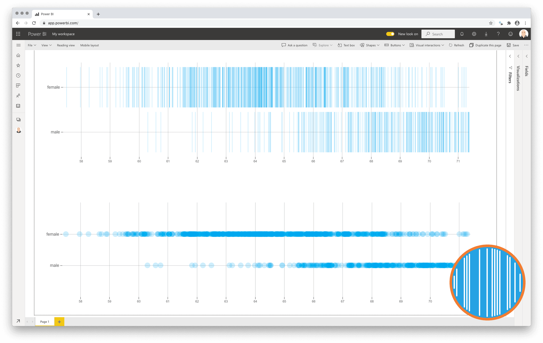
Get to know your data without hiding critical details: the Strip Plot
There are numerous chart types to help us determine the main properties of a distribution (like central tendency, spread and form). The most popular ones are histograms, frequency polygons and box-and-whisker plots.
The challenge with these kind of charts is the fact they group your data in such a way it potentially could hide important features. Histograms and frequency polygons are extremely sensitive to the bin-size you select as user. The box-and-whisker plot is only applicable when you have a bell-shaped distribution, but becomes useless in case of a multimodal distribution.
The Strip Plot is a chart type that addresses these challenges by not aggregating any of the data points, but by simply showing each point individually. This will not only show you where the (concentration of) observations are, but also where gaps are between subsequent observations.
One year license within one Power BI Fabric F32 Capacity or smaller including support for unlimited number of users
€ 1.860