
← Continue shopping 
Power BI Visuals
SMART KPI List
Display your key indicators in one view with the SMART KPI List
One of the principal goals of any dashboard is to inform its users by creating an overview of multiple key performance indicators (KPIs). A good dashboard shows all relevant KPIs in a single screen, so we need a compact and effective way to display them. The SMART KPI List is created specifically for this purpose.
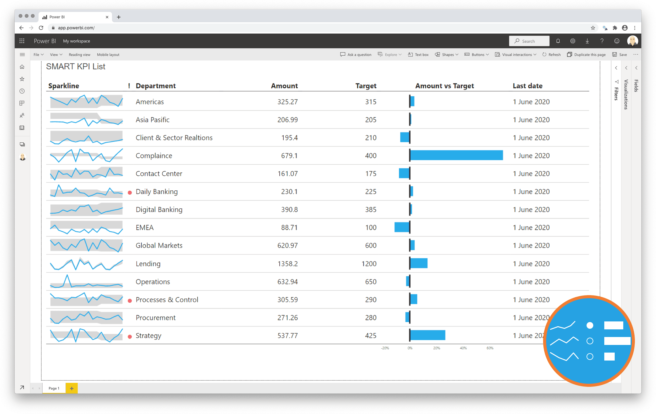
- Specific To allow for our dashboard to be specific we need to display all important indicators in one single overview and make sure we surround the indicator with sufficient context. Measures that need our immediate attention can be highlighted, done with a red dot next to the sparkline;
- Measurable A value on its own is a weak indicator of your performance. By providing context this can be greatly improved. A sparkline shows you the trend to determine if you are moving towards your goal. By including a target value you can determine your distance from that goal. This is done by adding both a number and a target line in the bar chart to visually indicate progress. You can even show the difference between the current value and the target as a percentage by a deviation chart (as shown in the example below);
- Achievable By adding target values you allow the reader to not only determine if a metric has met expectations, but also show the difference with the actual results;
- Relevant Within the sparkline you can add a bandwidth of acceptabel results (the grey area in the example) which helps the user to identify “normal” and “abnormal” results in the past;
- Time-bound The sparkline adds the required historic context to each indicator to enrich the indicators signals. The Last date column provides you insights in the latest refresh date of the indicator.
One year license within one Power BI Fabric F32 Capacity or smaller including support for unlimited number of users
€ 1.860
You will receive your license code by email after payment.