Description
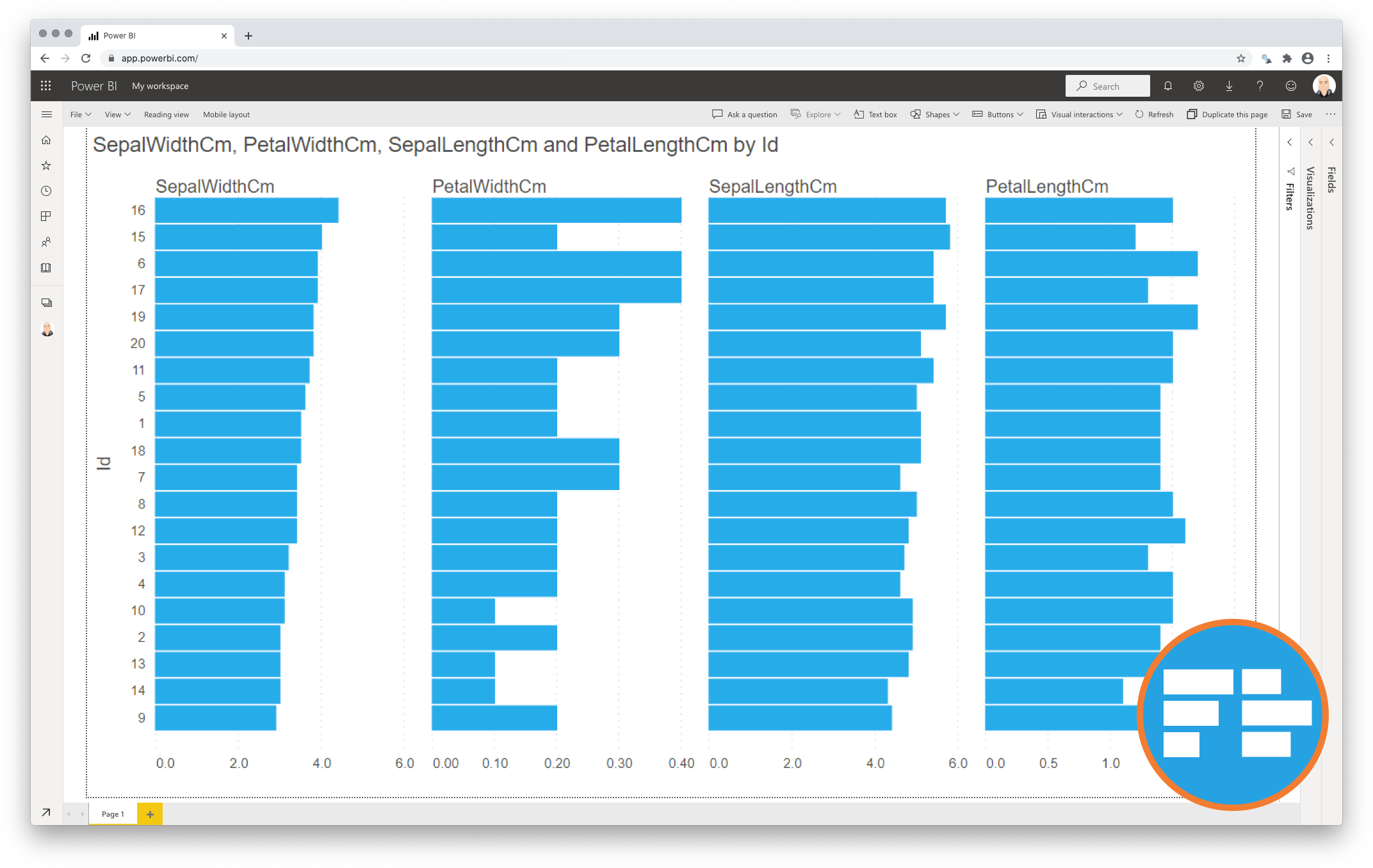
The Merged Bar Chart for Power BI allows you to compare multiple categories in one single chart. This is a great alternative to the more complex scatterplot.
Comparing categories is a common goal of data visualisations. In some cases comparing categories by a single measure (e.g. weight per shipment) is enough. This can be done with any standard bar or column chart. However, this is often not enough. Let’s assume we need another measure (like height) to make the comparison more insightful. Now we have one category (shipment) and two independent measures (weight and height). Because these measures are expressed in different units (pounds vs. inches) we can’t combine them in a single bar/column chart. This is when normally the scatterplot becomes useful.
However, many people find scatterplots hard to read. And it is difficult to expand the number of measures beyond 3 or 4. This is why we created the Merged Bar Chart for Power BI. This chart can display up to 6 independent measures per category in a comprehensive way. The Merged Bar Chart displays each measure in its own column. It also allows you to sort on any of these columns to investigate possible relations between the measures.
Key features of the Merged Bar Chart for Power BI
-
Format the objects: Each of the bar series can be formatted independently, and supports the theme settings;
-
The Axis formatting options are in line with the options you know from the Power BI Clustered Bar Chart, so no need to learn a new interface;
-
Selection & Highlighting: Like in standard Power BI Charts you can make use of the Selection & Highlighting functions within the Merged Bar Chart;
-
Context menu: Like in standard Power BI Charts you have access to the context menu to (amongst others) Drill down and Include/Exclude data points;
-
Full tooltip support: Besides the default Tooltip behaviour (show the value of the element you hover) you can also add additional fields to the tooltip;
-
Full Bookmark support: like any of the standard visuals the Merged Bar Chart supports Bookmarks.
Watch the video tutorial of the Merged Bar Chart HERE. Do you want to try the Merged Bar Chart yourself? Download it from the Microsoft AppSource for free.