Description
Time series data are great to clarify the changes over time in measures. The line chart is the favourite chart for this type of data. But displaying results with a normal line chart can also obscure important patterns. This especially happens when the measure contains some form of seasonality. The Cycle Plot for Power BI is a type of line chart specifically developed to show seasonal time series.
The Cycle Plot for Power BI helps you to visualise trends within your seasonal data. It has the strengths of common line charts. But without obscuring important cyclical patterns. The Cycle Plot for Power BI offers a great deal of flexibility in the choice of your variables. This applies for instance to months vs. years, hours vs. days or months vs. presidential period.
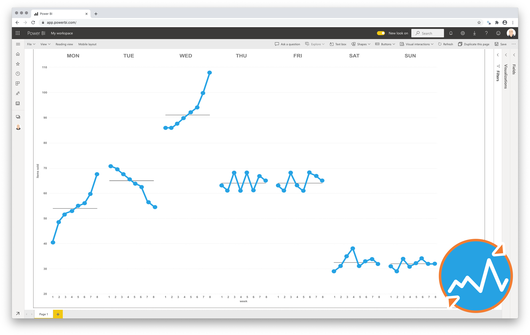
Let’s illustrate this with an example. Say we are looking at temperatures in a certain city over a few years. We expect that Winters are colder than Summers. Plotting this with a line chart will yield a line with a cyclical pattern. It will show low values in Winter, high values in Summer. However, it’s hard to tell if temperatures in January are increasing or decreasing over the years. With the Cycle Plot a subplot can be created for each month. You can show the change in temperatures over time for that month. All the subplots together still show the seasonal pattern as well, as seen in the image below.
Key features of the Cycle Plot for Power BI
-
Show central line: Add a median or average line per subplot, to provide more context to your chart.
-
Format the objects: Your measurements and central lines can be formatted independently, and supports the theme settings;
-
The Axis formatting options are in line with the options you know from the Power BI Line Chart, so no need to learn a new interface;
-
Selection & Highlighting: Like in standard Power BI Charts you can make use of the Selection & Highlighting functions within the Cycle Plot for Power BI;
-
Context menu: Like in standard Power BI Charts you have access to the context menu to (amongst others) Drill down and Include/Exclude data points;
-
Full tooltip support: Besides the default Tooltip behaviour (show the value of the element you hover) you can also add additional fields to the tooltip.
-
Full Bookmark support: like any of the standard visuals the Cycle Plot for Power BI supports Bookmarks.
Watch the video tutorial of the Cycle Plot HERE. Do you want to try the Cycle Plot yourself? Download it from the Microsoft AppSource for free.