

Power BI Visuals
Merged Bar Chart
Discover the patterns across multiple measures with the Merged Bar Chart
The Merged Bar Chart allows you to compare multiple categories in a single chart, as an alternative to the more complex scatterplot.
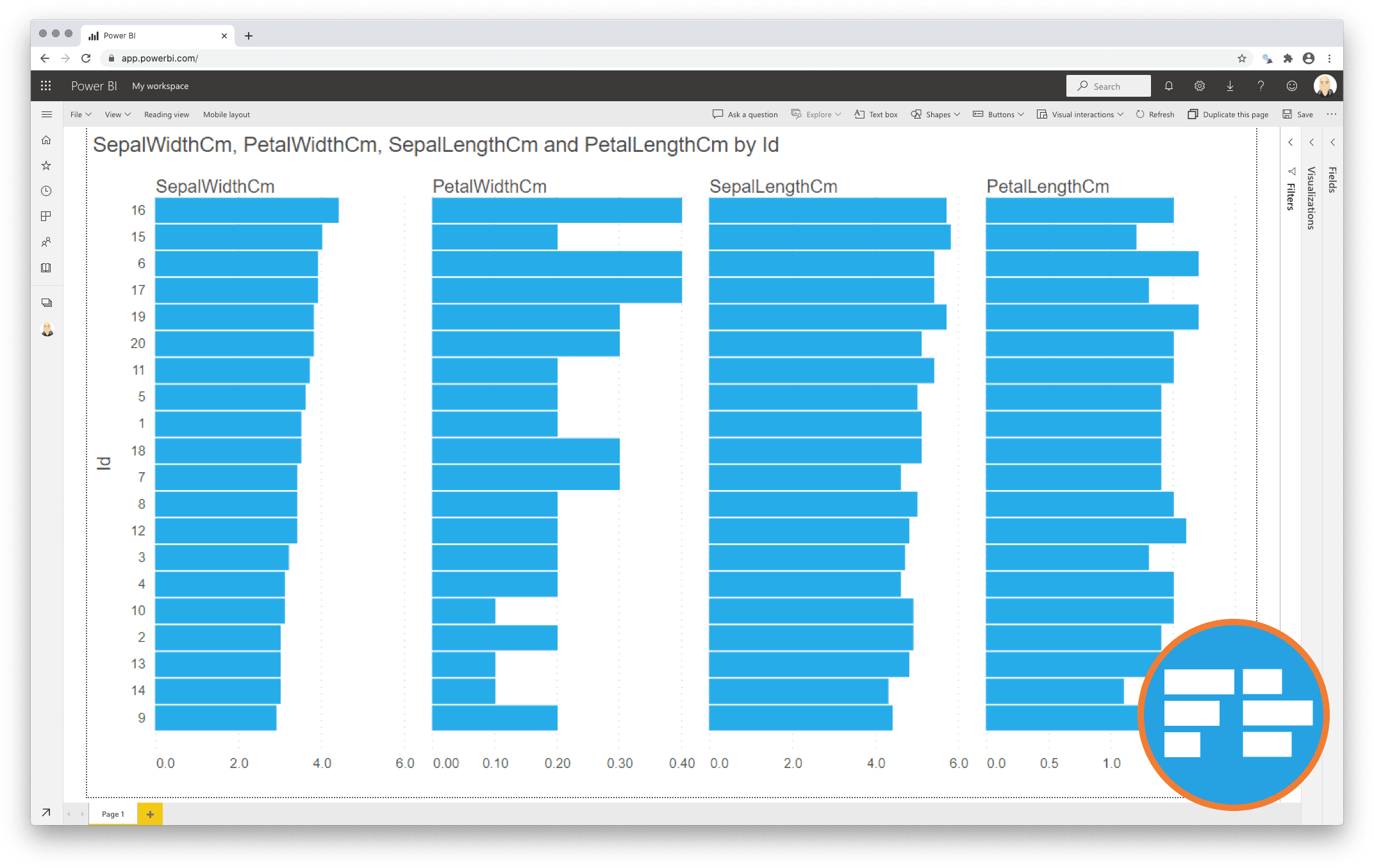
Comparing categories is a common goal of data visualisations. In some cases comparing categories on a single measure (e.g. weight per shipment) is enough. This can be done with a standard bar or column chart. However, this is often not enough. Let’s assume we need another measure (like height) to make the comparison more insightful. Now we have one category (shipment) and two independent measures (weight and height). Because these measures are expressed in different units (pounds vs. inches) we can’t combine them in a single bar/column chart. This is when the scatterplot becomes useful.
However, many people find scatterplots hard to read. And it is difficult to expand the number of measures beyond 3 or 4. This is why we created the Merged Bar Chart. This chart can show up to 6 independent measures per category in a comprehensible way. It does this by displaying each measure in it’s own bar-column and allows you to sort on any of the columns to investigate any possible relations between the measures.
One year license within one Power BI Fabric F32 Capacity or smaller including support for unlimited number of users
€ 1.860