

Power BI Visuals
Lollipop Column Chart
Declutter your comparisons with a Lollipop Chart
Standard bar/column charts are ideal for showing a single measure per category so you can easily compare each of the categories with the rest. However, if you have larger number of categories (>10) in a bar/column chart it is possible the chart itself becomes “heavy” because large part of the surface of the chart will be filled with the bar color(s).
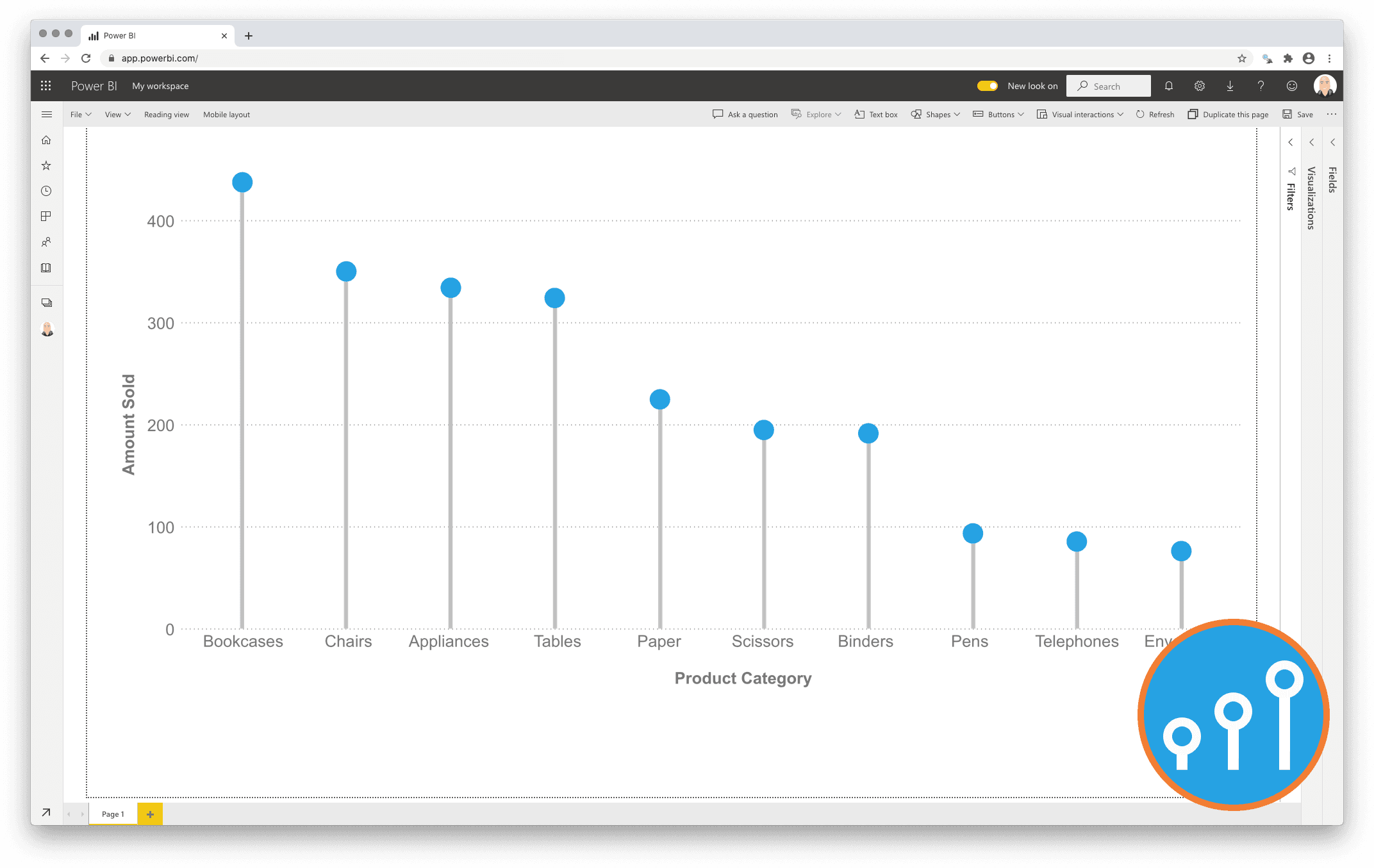
To reduce clutter one can use the Lollipop Column Chart as an alternative to the standard Column chart. It shows an icon (mostly a dot) per category at the corresponding measure value for each category. The icon is connected to the measure-axis origin by a subtle line. The icon combined with the line make it a Lollipop Column Chart.
One year license within one Power BI Fabric F32 Capacity or smaller including support for unlimited number of users
€ 1.860