
← Continue shopping 
Power BI Visuals
Lipstick Column Chart
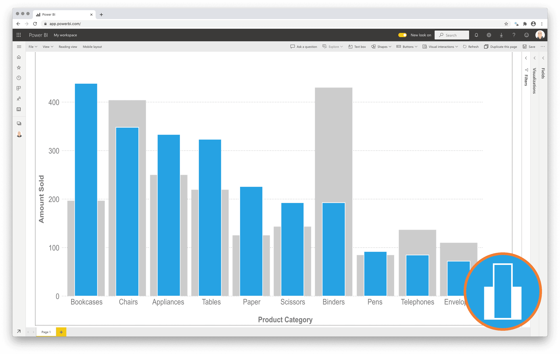
Compact and precise visual comparison of two measures with a Lipstick Column Chart
Regularly the standard Column Chart is used to compare two measures within a number of categories. If one of these measures has been added as a reference (secondary measure) to increase the context of the primary measure it would be better to clearly show this priority difference.
This is precisely what the Lipstick Column Chart does: It shows the primary measure per category on the foreground, and places the secondary measure behind it for a precise comparison of both values. Since both values are placed on top of each other it also becomes a more compact alternative to show both measures per category.
One year license within one Power BI Fabric F32 Capacity or smaller including support for unlimited number of users
€ 1.860
You will receive your license code by email after payment.