
← Continue shopping 
Power BI Visuals
Dumbbell Column Chart
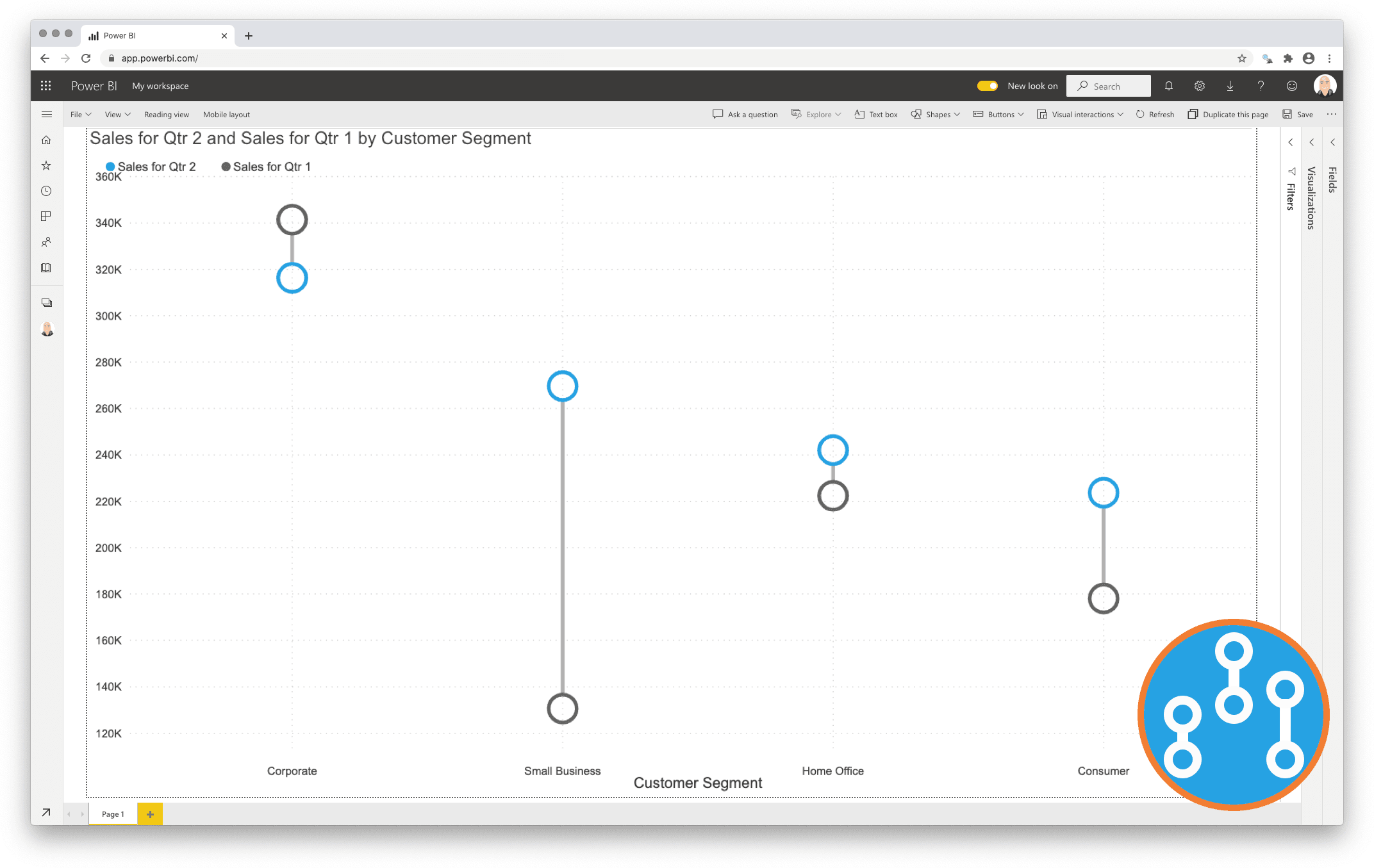
Unleash the power of comparison with the Dumbbell Column Chart
Data visualisations play a fundamental role in answering an important data question:”How does result A compare to result B?”. Typical examples of these questions are:
- How does the sales of this month compare to the sales of last month?
- What is the difference between the number of documents processed this year compared to 2017?
- How does the number of planned-visitors compare to the number of unplanned-visitors at our locations?
Key in answering this kind of question is explicitly visualising the difference between the two results. This is the strength of the Dumbbell Column Chart: showing both the values and the difference between them.
One year license within one Power BI Fabric F32 Capacity or smaller including support for unlimited number of users
€ 1.860
You will receive your license code by email after payment.