

Power BI Visuals
Cycle Plot
Discover your seasonal patterns with the Cycle Plot
Time series data are great to clarify the changes over time in measures, and the line chart is the favourite chart for this type of data. But displaying results with a normal line chart can also obscure important patterns, especially if the measure contains some form of seasonality. The Cycle Plot (first introduced by Cleveland, Dunn, and Terpenning in 1978) is a type of line chart specifically developed to show seasonal time series.
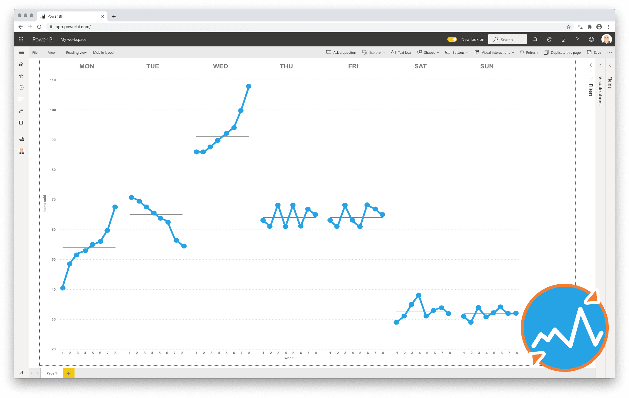
The cycle plot helps you to visualise trends within your seasonal data. It has the strengths of common line charts, without obscuring important cyclical patterns. The cycle plot offers a great deal of flexibility in the choice of your variables: think of months vs. year, hours vs. day or months vs. presidential period.
Let’s illustrate this with an example. Say we are looking at temperatures in a certain city over a few years. We expect that Winters are colder than Summers. Plotting this with a line chart will yield a line with a cyclical pattern: low values in Winter, high values in Summer. However, it’s hard to tell if temperatures in January are increasing or decreasing over the years. With the cycle plot, a subplot can be created for each month, showing the change in temperatures over time for that month. All the subplots together still show the seasonal pattern as well, as seen in the image above.
One year license within one Power BI Fabric F32 Capacity or smaller including support for unlimited number of users
€ 1.860