

Power BI Visuals
Control Chart XmR
The most useful way to see true signals of change in your KPI is to use a Control Chart (XmR chart)
By default all data is noise, but sometimes it contains a real signal. To detect the signals and ignore the noise you can use Control Charts. Without need to know all the statistical details this visual will allow you to see the real signals in your time-series data.
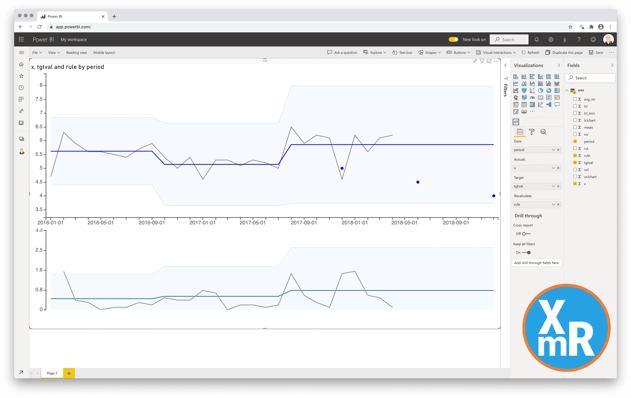
The Control Chart chart is actually two charts. The X is the data point being measured and mR the Moving Range which is the difference between consecutive data point measurements.
The upper chart (X-Chart) displays the data-points over time (Actuals) together with a calculated average (Average – center-line (CL)). The calculated average is then used to calculate the Upper and Lower Control Limits. The lower chart displays the Moving Range (mR-Chart) with its Average and Upper Control Limit. There is no lower control limit as the value of the difference between consecutive actual-values is recorded as an Absolute Value (positive number).
In this custom visual you can hide the lower chart (mR-Chart).
The calculation of the charts can set to Automatic in this visual. The rules being used for the automatic recalculation are:
- 7 points in a row are above or below the center-line
- 10 out of 12 points are above or below the center-line
- 3 out of 4 points are closer to the UCL or LCL than the center-line
You also can add a data-value that enables manual calculation. The charts will be recalculated at the date-value where the value is set to 1.
One year license within one Power BI Fabric F32 Capacity or smaller including support for unlimited number of users
€ 1.860